Since Islam prohibits the representation of the human or animal form in religious contexts, Islamic art finds its ultimate spiritual expression in beautiful calligraphy and illumination of the sacred script. It should be stressed that neither calligraphy nor illumination can be divorced from the other, the two being unified by page design. While beautifying the Qur’an manuscript can be considered as an act of religious devotion, the decorations on its pages have the additional function of facilitating reading. Hence, Qur’an illumination highlights the structural division of the text and the points at which the believer should prostrate during the recitation of the Qur’an. In manuscripts from other cultures the initial letters are often illustrated; however, since there are no capital letters in Arabic script, Qur’an illumination emphasizes key words and headings. These are generally illuminated in gold or other colors, or written in a different script from the rest of the text, and sometimes even with a combination of all three.
![The carpet pages of the Uljaytu Qur'an, remarkable for their Mongol style of illumination and exquisite colouring. 'Ali ibn Muhammad al-Husayni [calligrapher], Part ( juz’ ) 25 of the Qur’ān commissioned by the Ilkhanid ruler Sultan Uljaytu. Written in a fine large gold muḥaqqaq script, outlined in black, with illuminated frontispiece. Mosul, 710 AH (1310/11) (British Library)](https://smarthistory.org/wp-content/uploads/2021/05/Sultan-Uljaytu-Quran-Or_4945_f2r-1v-870x625.jpeg)
The carpet pages of the Uljaytu Qur’an, remarkable for their Mongol style of illumination and exquisite colouring. ‘Ali ibn Muhammad al-Husayni [calligrapher], Part ( juz’ ) 25 of the Qur’ān commissioned by the Ilkhanid ruler Sultan Uljaytu. Written in a fine large gold muḥaqqaq script, outlined in black, with illuminated frontispiece. Mosul, 710 AH (1310/11) (British Library)
What was the role of the illuminator?
The task of embellishing the Qur’an would have been undertaken by the illuminator on completion of the text by the calligrapher, although it was not uncommon for them to have been the same person. Where they were not, it can be assumed that they worked together, collaborating in the planning of the page layout and the format of the volume. Their names were often included in the colophon, sometimes accompanied by a date and location.
![Ornate frontispiece of a 10th-century Qur'an, probably from Egypt, with arabesque decoration in gold and overlapping chain-patterns in white. CORANUS, literis Cuficis. Codex membranaceus, sec. fortassis xi. In Quarto minori. [l3,735.], 900–100 (British Library)](https://smarthistory.org/wp-content/uploads/2021/05/10th-century-Quran-add_ms_11735-f001v-2r-rotated-1-870x637.jpeg)
Ornate frontispiece of a 10th-century Qur’an, probably from Egypt, with arabesque decoration in gold and overlapping chain-patterns in white. CORANUS, literis Cuficis. Codex membranaceus, sec. fortassis xi. In Quarto minori. [l3,735.], 900–100 (British Library)
Was the entire Qur’an illuminated?
Early kufic Qur’ans from the 9th century C.E. exhibit the beginnings of illumination and decoration, but from the late 10th century onwards these were accompanied by more elaborate illumination. As the decoration became progressively complex, certain pages—such as the frontispiece—were treated more elaborately than others. Because of its lavish and costly production, an ornate Qur’an required a wealthy patron—usually a ruling sultan or an influential courtier—who gifted it to a mosque or other religious institution. The name of the patron is often documented in the volume, testifying to their power and piety. The elaborate frontispieces, with full-page illuminations, are sometimes referred to as ‘carpet’ pages since their appearance resembles oriental carpets. In architectural terms, opening a Qur’an volume might be compared to entering a sacred building, with the carpet page as the gateway or portal to the holy text itself.
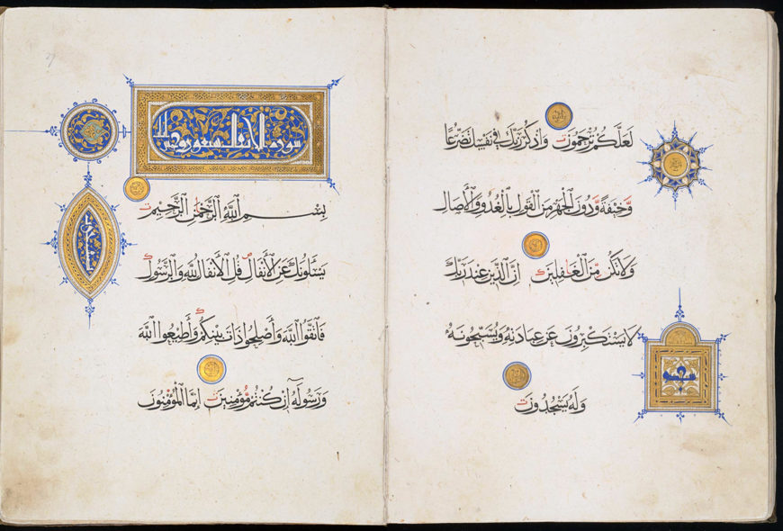
The pages immediately following the frontispiece were also especially embellished. The first chapter of the Qur’an, Surat al-fatihah (‘opening chapter’), was often embellished. For Muslims this chapter is particularly significant because it is recited during the five daily prayers. In multi-volume Qur’ans, the initial decorated pages carry the opening of the relevant section. Other elaborately illuminated pages are generally found in the centre opening of the volume and the final openings containing the shortest chapters which, according to tradition, were revealed to Muhammad in Mecca. At the end of the volume a full-page illumination is also often found, balancing the frontispiece both functionally and decoratively. A number of design features characterize these illuminations such as arabesques (interwoven flowing patterns of floral motifs) and geometric patterns.
Did illumination of the Qur’an always follow the same format?
Illustrative of ornate illumination, which is in places unconventional, is the Baybars Qur’an, so named after its patron, Rukn al-Din Baybars al-Jashnagir. Produced in Cairo between 1304 and 1306, this is the earliest dated Qur’an of the Mamluk period (1250–1517). It has seven volumes, each of which has a magnificent double frontispiece; these carpet pages are illuminated in the Mamluk style, which is characterized by the extensive use of geometric patterns and gold filigree work.
![The carpet pages from volume four of Sultan Baybars' seven-volume Qur'an. Muhammad ibn al-Wahid [calligrapher], Abu Bakr [master illuminator], also known as Sandal, Volume one of a seven-volume Qur’an commissioned by Rukn al-Dīn Baybars, later Sultan Baybars II, 1304 (British Library)](https://smarthistory.org/wp-content/uploads/2021/05/Sultan-Baybars-Quran-add_ms_22409_f001v-002r-870x645.jpeg)
The carpet pages from volume four of Sultan Baybars’ seven-volume Qur’an. Muhammad ibn al-Wahid [calligrapher], Abu Bakr [master illuminator], also known as Sandal, Volume one of a seven-volume Qur’an commissioned by Rukn al-Dīn Baybars, later Sultan Baybars II, 1304 (British Library)
Whereas in earlier Qur’ans the design of these pages is mainly without text of any kind, the Baybars Qur’an introduces into its carpet pages quotations from the Qur’an and, because of its multi-volume presentation, the specific number of the particular volume.
The whole Qur’an is written in gold thuluth script and is outlined in black ink, with vowels marked in red and other spelling signs in blue. The choice of thuluth as the script is unconventional, as it was generally considered ornamental, being used primarily for chapter headings and not for the body of the text. The layout of the calligraphy is also of special interest as each page of the Baybars Qur’an carries an even number of lines. This is virtually without precedent; most Qur’ans have an odd number of lines per page. Of interest, too, is the fact that the text layout is continuous and chapter headings are merely indicated by a change of color, with red ink overlaying the gold, but with no additional spacing between the lines. It would seem that the calligrapher did not wish to interrupt the visual flow of the page.How did sacred architecture influence illumination?
An outstanding example of the balance between function, ornament, script and layout is the 14th-century Qur’an donated to a mosque in Cairo by the Mamluk sultan Faraj ibn Barquq (r. 1399–1412). The inspiration of a mosque is immediately evident from the gold architectural structure containing the word ‘prostration’ (sajdah) in blue kufic.
This feature has a liturgical purpose, instructing the believer when to prostrate during the recitation of the Qur’an. The chapter heading within the rectangular panel is in white kufic. This monumental angular script contrasts with the refined cursive black rayhani script of the body of the text, while the unframed layout gives an impression of infinite space.
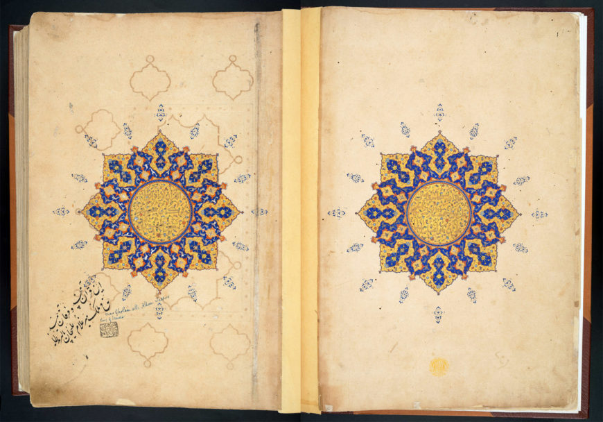
Shamsah (‘sun’) medallions from a 16th-century Qur’an, Afghanistan or possibly India (British Library)
How has qur’anic illumination developed?
By the time the Safavid dynasty came to rule in Persia—between 1501 and 1732—a new delicacy and refinement had begun to replace the established style of illumination. One feature of the development was the changing function of the carpet pages. As seen in a 16th-century Qur’an from Afghanistan (or possibly India), the carpet pages were replaced by a large sunburst in the form of a medallion, often presented within a star-shaped design. The name of this medallion in Arabic is shamsah (‘sun’), so-called because its shape and illumination resemble the sun and its brightness.
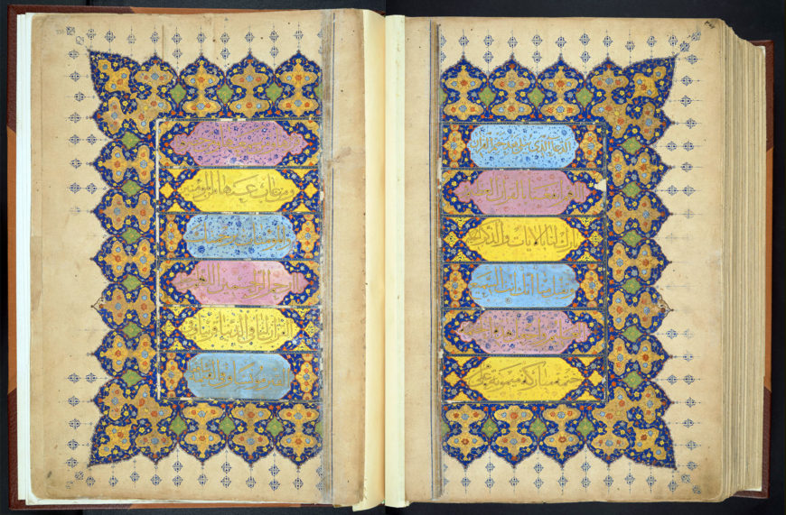
Once the shamsah medallion replaced the carpet page as a frontispiece, the carpet page became incorporated elsewhere. The concluding prayer, which Muslims recite on completing a reading of the whole Qur’an, can be found at the end of the volume. Here the prayer pages have the same format as a carpet page, with each line of text on the right-hand page in gold set against an alternating background of blue, pink and yellow cartouches. For theological and doctrinal reasons, since only God is perfect, the symmetry of design in the decorative pages of Qur’ans is not exact. Usually the symmetry is broken subtly; in this case, however, the asymmetry is obvious in the colored cartouches.
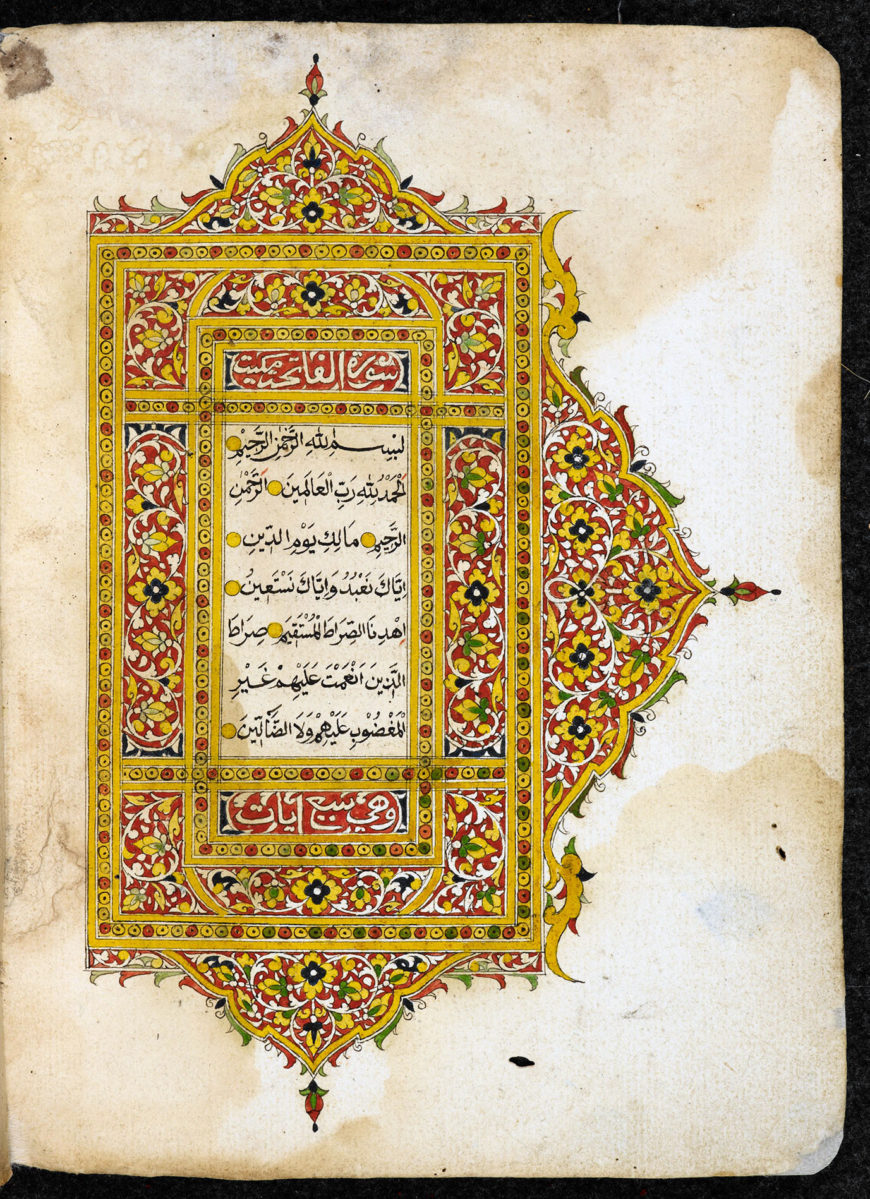
This exquisite illuminated Qur’an manuscript probably comes from the northeast coast of the Malay peninsula, either from Kelantan in present-day Malaysia, or from Patani in southern Thailand. The opening shows the Surat al-Fatihah. 19th century (British Library)
Have Qur’ans around the world been decorated differently?
Islam became firmly established in Indonesia and the Malay world when the rulers of Pasai in North Sumatra converted in the 13th century and the religion soon spread to other parts of the archipelago. A distinctive characteristic of Malay Qur’ans is seen in their use of vibrant color as an integral part of the design. Particularly illustrative is a 19th-century Qur’an from the east coast of the Malay Peninsula with its broad range of colors, the most prominent of these being red, yellow, green, and blue, with white for emphasis.
In this first opening of the volume—containing chapter one and the beginning of chapter two—the text is encased in central panels. Typical of Qur’ans from this region, these rectangular frames are elaborately ornamented on three sides only, here with wave-like arches protruding into the margins. Local flora and vegetation appear to have been the inspiration for the stylized background of petals and leaves within the overall design. As for the text itself, the Arabic script has not been influenced by local calligraphy. The script is traditional naskhi in black, with yellow roundels to mark the end of each verse.
Qur’an manuscripts have been devoutly and assiduously copied throughout the centuries, exhibiting diverse styles in calligraphy and illumination, which often reflect their place of origin and date of production. Calligraphy and illumination evolved to such a degree of subtlety in Qur’an manuscripts, imbuing its sacred script with spiritual resonance.
Originally published by the British Library
The text in this article is available under the Creative Commons License.

![The carpet pages from volume one of Sultan Baybars' seven-volume Qur'an. Muhammad ibn al-Wahid [calligrapher], Abu Bakr [master illuminator], also known as Sandal, commissioned by Rukn al-Dīn Baybars, later Sultan Baybars II, 1304 (British Library)](https://smarthistory.org/wp-content/uploads/2021/05/Sultan-Baybars-Quran-add_ms_22406_ff001v-002r-870x640.jpeg)
![Sultan Baybars' Qur'an written in gold thuluth script. Muhammad ibn al-Wahid [calligrapher], Abu Bakr [master illuminator], also known as Sandal, Volume one of a seven-volume Qur’an commissioned by Rukn al-Dīn Baybars, later Sultan Baybars II, 1304 (British Library)](https://smarthistory.org/wp-content/uploads/2021/05/Sultan-Baybars-Quran-add_ms_22406_ff086v-087r-870x628.jpeg)
