Art as a primary source: three key principles
Essay by Dr. Beth Harris and Dr. Steven Zucker
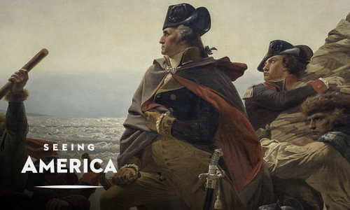
When you envision the history of the United States, what first comes to mind? For many, it might be a painting of George Washington, during the Revolutionary War, silently crossing the Delaware river at night; or a photograph of a destitute mother during the Great Depression. There are many images that have defined American history—some are well known, and some are waiting to be discovered, but all of them tell complex stories that can help us better understand our world today.
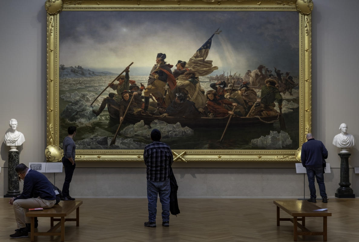
Emanuel Leutze, Washington Crossing the Delaware, 1851, oil on canvas, 378.5 x 647.7 cm (The Metropolitan Museum of Art)
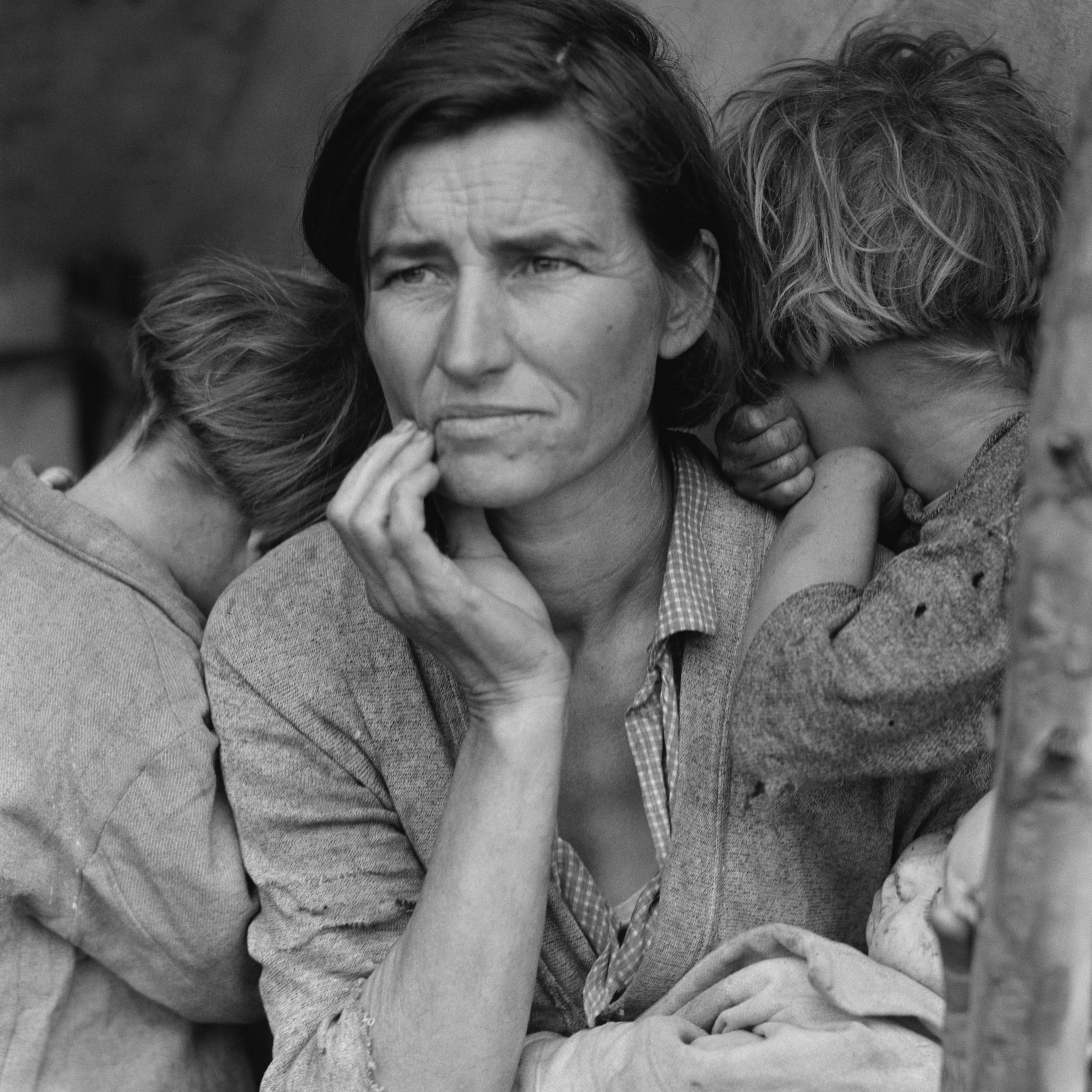
Dorothea Lange, Migrant Mother, Nipomo California, 1936, printed later, gelatin silver print, 35.24 x 27.78 cm (Los Angeles County Museum of Art, PG.1997.2)
Works of art are not illustrations that support the telling of a story. Instead, they are primary documents every bit as important as written materials such as treaties and letters. Historical paintings, sculptures, photographs, and architecture can offer vivid expressions of a particular moment in history.
Historians have developed methods that allow them to carefully analyze historical documents. In a similar way, art historians have developed methods to understand works of art. The key principles listed below will help you to draw meaning from works of art and will help bring the visual history of the United States to life.
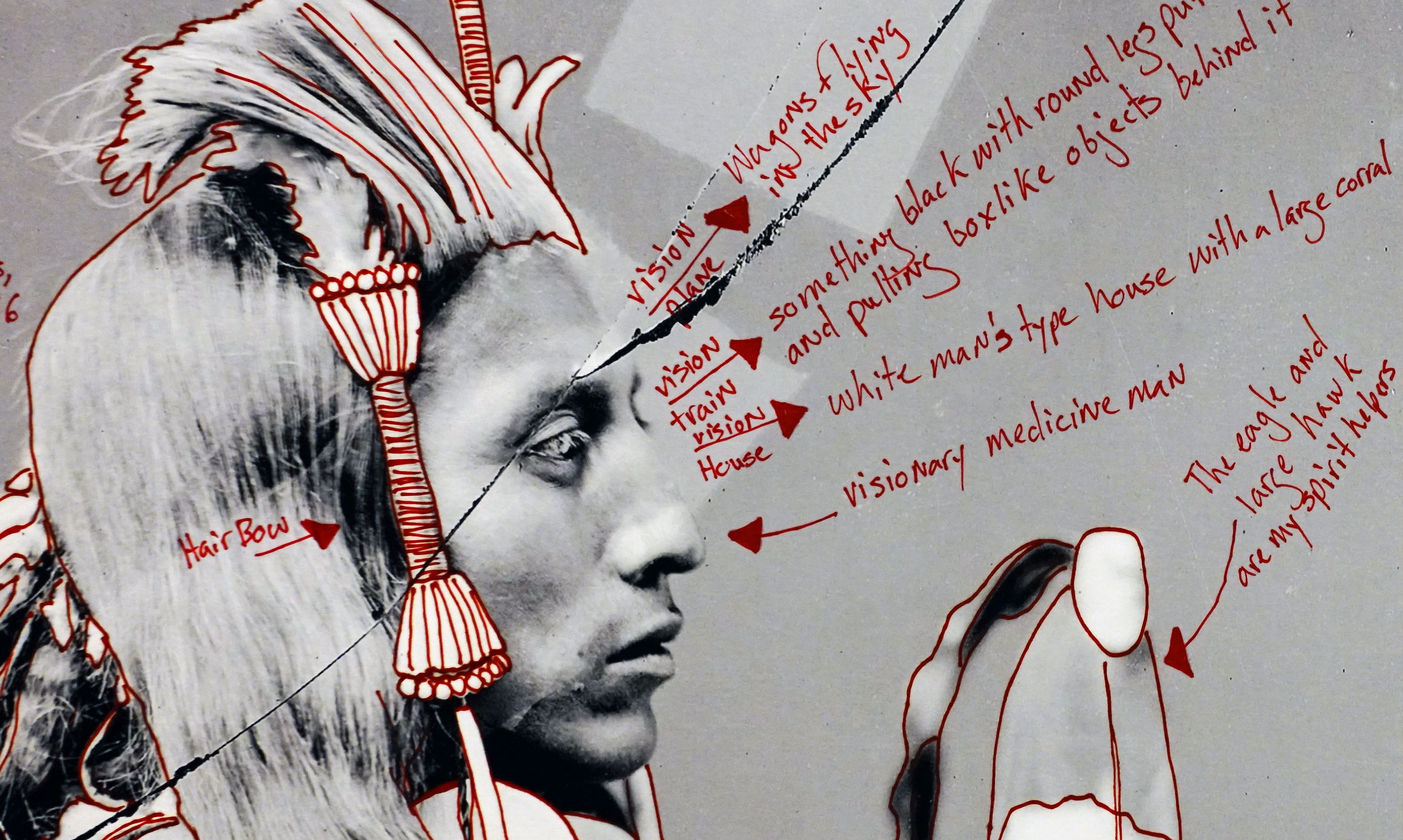
Wendy Red Star, 1880 Crow Peace Delegation, 2014, inkjet print and red ink on paper, 16 15/16 x 11 15/16 inches ©Wendy Red Star (Portland Art Museum)
Key principles
1. Approach all images — even photographs — skeptically
Images are not as “real” as they may appear — they all tell us something, or, even more often, try to convince us of something.
Just because an image looks documentary — doesn’t mean that what it is showing us is actually real. Remember, the creation of a work of art was often an expensive undertaking. It may be useful to think about who paid for a work of art, why they wanted it made, and the story they wanted to tell.
In some ways, the artist Wendy Redstar’s series, 1880 Crow Peace Delegation, is about precisely this dilemma. She annotated a copy of a portrait of Medicine Crow that was taken in 1880 when Medicine Crow and five other chiefs traveled to Washington D.C. to meet with the president to discuss territorial rights. The artist had noted that images of Medicine Crow were being used in commercial advertisements, and in this way, a portrait of a great man was entirely decontextualized from his life as a powerful chief of the Crow people. Worse, Medicine Crow’s name was left off so that his portrait became a generic symbol of American Indians of the 19th century. This powerful warrior’s identity and his culture had been devalued through the misuse of this image. Redstar’s annotated photographs, based on her extensive historical research, reclaims Medicine Crow as an important historical figure and reinserts this image into the broader history of the United States in the 19th century.
2. Don’t underestimate the power of images
Images have become more and more a part of our world and they remain as powerful as ever.
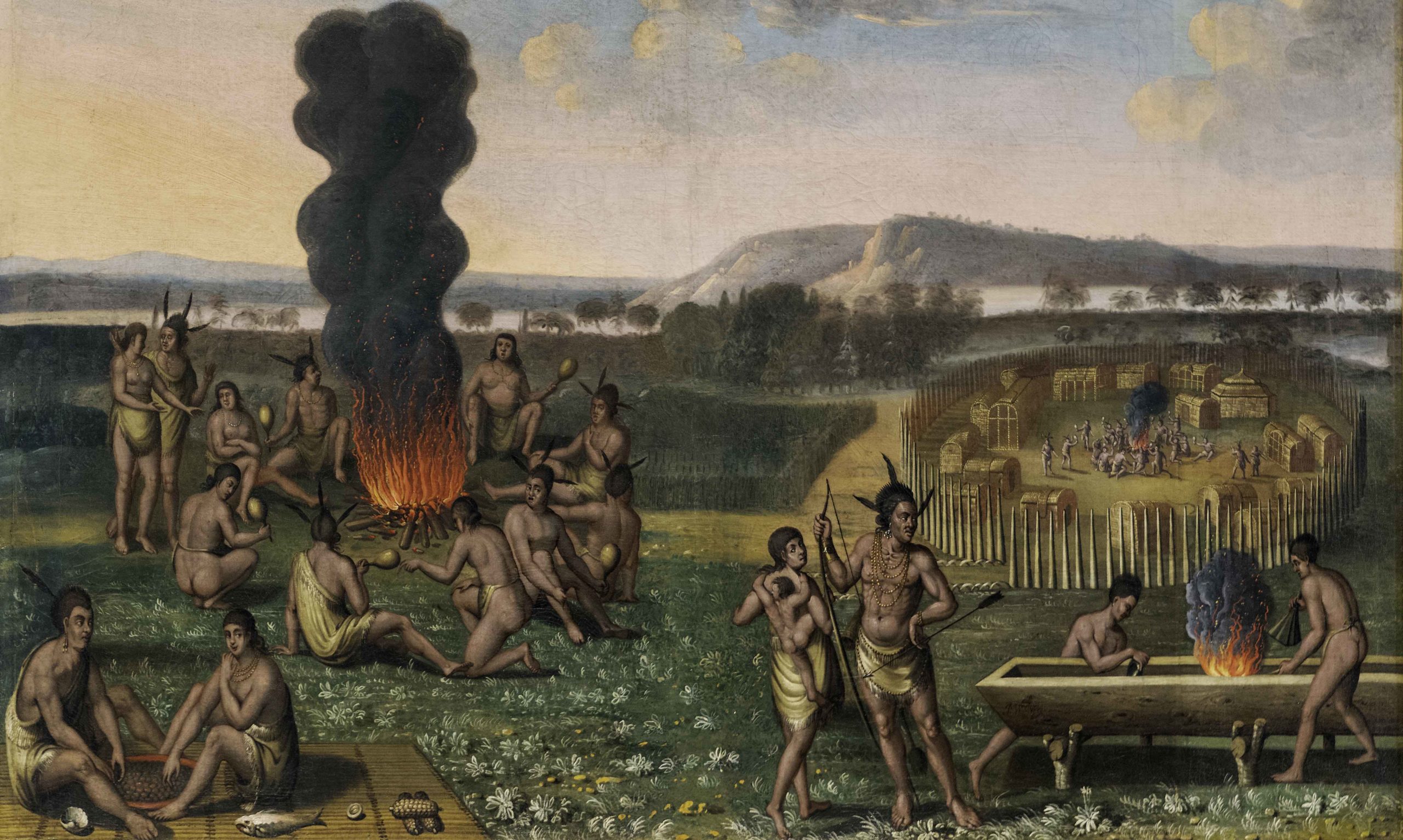
James Wooldridge, Indians of Virginia, c. 1675, oil on linen, 75.6 x 108.6 cm (Crystal Bridges Museum of American Art)
The history of the settlement and colonization of North America is, in some ways, a history of the increasing availability and presence of images. One sign of the power of images is in their afterlife. Once created, images can often take on a life of their own —they can get copied, transformed, or even erased.
The colonization and settlement of the United States coincides with the beginnings of the reproductive technology of printmaking in Europe. Until then, images were relatively rare (we know it’s hard to imagine this!). The dissemination of prints allowed people in Europe to envision the Americas — but the works of art they created were distinctly European.
James Wooldridge’s Indians of Virginia (c. 1675) depicts Algonquian Indians in what is today North Carolina. The painting was made for the British Earl of Conway, whose grandfather was a shareholder in the 1609, Virginia Company (formed by the British crown which was interested in exploring areas that had not yet been claimed in the Americas in order to bring back gold and silver). But this painting was itself based on a very popular series of prints, that were made in the late 16th century. And those prints were in turn based on an earlier set of watercolors. As this image was successively transformed over more than a century — from a watercolor to a print and then to an oil painting, European artists brought their own point of view and their own conventions for how to represent the world.
For Europeans, this scene represented something exotic and very different from life in Europe. But the image is also intended to be reassuringly familiar, as if to say, “don’t worry — this may look very different from your world — but it is filled with familiar things as well.” In this way, the “new world” was represented as available to potentially enrich the wealth of Europeans.
3. Think about both content and form
The power of an image is derived from two sources — what it shows (it’s subject, or content) and how it shows it (the form the image takes).
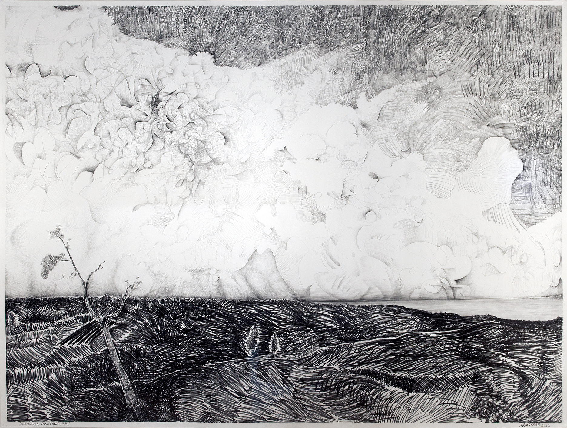
Kenseth Armstead, Surrender Yorktown 1781, 2013, graphite on paper, 86 x 68 inches (Newark Museum, ©2012 Kenseth Armstead)
The subject of a work of art can sometimes be a little tricky to pin down. A drawing might depict something specific, say a battle scene, but the artist could also be using that scene to make a bigger point. Similarly, the way the artist draws an image lets us see, for example, a landscape, but it can also change the way we see it. An artist might use a pencil to render a tree full of leaves. Nevertheless a series of sharp diagonal lines will give a very different feeling than layers of soft rounded lines. The sharp lines may create a sense of drama and danger, while the rounded forms may create a more tranquil feeling.
The contemporary artist, Kenseth Armstead, created his own version of a late 18th century painting that depicts the surrender of the British to the American revolutionary army. Not long after the American Revolutionary War, the king of France commissioned Louis-Nicolas van Blarenbergh to commemorate this event with a painting (since he had invested significant funds to the revolutionaries). Now, keep in mind, van Blarenbergh had never traveled to North America. Centuries later, Armstead decided to create a new version, this time in pencil. The artist made a conscious decision to remove everything in the earlier painting that was not historically accurate. In the end, this meant that he took out just about everything. All that is left is a vacant landscape.
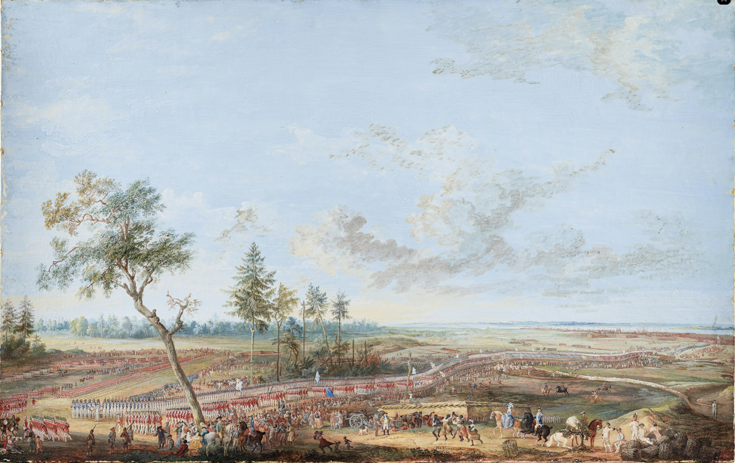
Louis-Nicolas van Blarenbergh, Rochambeau receiving the surrender of British troops at Yorktown, October 19, 1781, 1785, gouache on paper, 60.1 x95.2 cm (Palace of Versailles)
Although Armstead offers us a drawing of a landscape, this drawing’s true subject is the complexity of the task of understanding history, and the ways our understanding changes over time, ideas we don’t see explicitly depicted. Nevertheless, the artist uses an amazing array of lines, some delicate and beautiful, some sharp and violent, to draw attention to the true subject of the work of art. In this way a work of art’s formal aspects, its scale, composition, line, color, tone, texture, etc. can support the subject of the work.