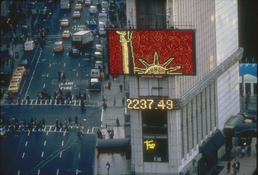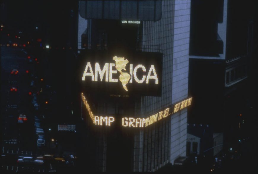
Alfredo Jaar, A Logo for America, 1987, Spectacolor animation, Times Square, New York City, 42 seconds (photos: Jane Dickson/Public Art Fund)
In the spring of 1987, visitors to Times Square were confronted by a puzzling 45-second animation among the glittering billboards characteristic of this part of Manhattan. The animation consisted of three digital renderings that each combined images (maps and a flag) with simple lines of text. What mystified some viewers were not the images themselves, but the text that accompanied them: in the first frame, “This is Not America” was superimposed on a map of the United States; in the second frame, “This is Not America’s Flag” was superimposed on the image of the United States flag; and in the last frame, the single word “AMERICA” was superimposed on the image of the North and South American continents together.
In less than a minute, artist Alfredo Jaar succeeded in provoking patriotic inhabitants of the United States by asserting that they are not the only “Americans.” Jaar’s message gave credence to a long-standing belief among Latin Americans in other countries that they, too, have the right to call themselves by that term. Nearly thirty years later, Jaar’s A Logo for America remains a powerful example of art that uses the language of commercial advertising to convey a pointed political message.
Messages in Spectacolor

Catalina Parra, USA, Where Liberty is a Statue, 1987, Spectacolor animation, Times Square, New York City (photo: Jane Dickson, Public Art Fund)
In 1982, New York City’s Public Art Fund launched the Messages to the Public program with the goal of exposing viewers to media-based artworks through Times Square’s Spectacolor board. For nearly a decade, dozens of artists created short animations that would appear within loops of commercial advertising. A new “Message” would appear every month, providing the viewing public with a fresh animation. According to the project’s originator, the painter Jane Dickson (who was working as a designer for Spectacolor at the time), the purpose was to inject a political message into daily life. “I picked that title,” she said of Messages to the Public, “because I thought the propaganda potential from this project was terrific.” [1] Other Latin American artists involved in the Messages project also used this opportunity to highlight their critical perspectives on U.S. culture. For example, Catalina Parra’s USA, Where Liberty is a Statue (see image) critiques the promise of the modern immigrant experience using the country’s most iconic symbol of liberty.
Jaar’s message
Jaar illustrates two iconic symbols of the United States of America—the map of the country and the flag—and embeds them with messages that subvert their traditional meanings. The contrast is meant to pose the question, What exactly is America? As a potential answer, Jaar ends his animation with a rendering suggesting that the entire hemisphere is, in fact, “America.” For those living in Mexico, Central, and South America, this is an argument that has often fallen on deaf ears. For example, it is common for someone from Chile—Jaar’s country of birth—to simultaneously consider themselves a Chilean and an American. The distinction is simply the difference between national and continental affiliations. When Jaar was commissioned to create this work of art, he had only been living in the United States for a few years, and it would likely have struck him as odd to hear the term “America” being used to define only citizens of the United States.
Defining “America”

Alfredo Jaar, A Logo for America, 1987, Spectacolor animation, Times Square, New York City (Photos: Jane Dickson/Public Art Fund)
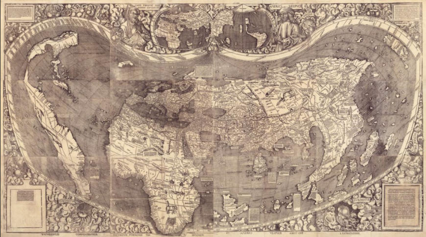
However, for many people living within the United States, this question is likely rarely, if ever considered: for them, “America” implies one country, one flag, and one nationality. According to Jaar, “Some of [the viewers] said live on national radio, ‘This is illegal. How could they let him do this?’ It is so embedded in their education that the U.S. is America, whereas the rest of the continent is erased.” [2] Jaar elicited this reaction by appropriating a national symbol to critique mainstream ideas about Americanness—not only about the definition of the term itself, but the ways that the term’s use in the United States implies superiority over other American countries and cultures. The final frame of his animation, which shows the outline of North, Central, and South America along with the word “AMERICA,” is the new “logo” referenced in Jaar’s title. It is a literal re-rendering—a “rebranding,” to use the language of advertising—of the American continents that Europeans encountered in the late fifteenth century. Afterall, the lands of the Western hemisphere which came to be called America after the explorer and mapmaker Amerigo Vespucci, were perceived as one geographic entity, despite political subdivisions.

The first map to name America (after the explorer and cartographer, Amerigo Vespucci) and to show America and Asia as separate continents. Martin Waldseemüller, Universalis Cosmographia, 1507, composite map, 128 x 233 cm (Library of Congress, Washington D.C.)
Pop and propaganda
What does it mean to make this logo for America, a type of symbol normally used to represent products or corporations? A useful example can be seen in the earlier movement, Pop Art, and its use of consumer culture as a source of inspiration. Artists like Richard Hamilton, Roy Lichtenstein, and Andy Warhol appropriated the slick, graphic sensibility of mid-century advertising as well as the means and materials of industrial production. Warhol’s Brillo Boxes, for instance, perfectly mimicked factory-made boxes, simultaneously drawing attention to the aesthetic appeal of what might otherwise be passed over as an unremarkable, mass-produced package, while critiquing high-minded notions of art that fetishized unique, handmade objects.

Andy Warhol, Brillo Boxes, c. 1964, house paint and silkscreen on plywood (Whitney Museum of American Art, photo: Dr. Steven Zucker)
However, unlike Warhol’s Brillo Boxes which are exhibited within galleries and museums, Messages to the Public existed within a stream of actual advertising, emphasizing its critical opposition. Like the Pop artists before him, Jaar not only made use of the formal language of advertising, but in taking it out of the object-centric realm of the gallery and into the virtual space of the advertising screen, he also questioned the very definition of art-making, which he described as primarily a process of thinking:
I think that artists are thinkers, they’re intellectuals. And art is about thinking. For me, art is about 99% thinking and 1% making. So I spend most of my time, and I ask my students to spend 99% of their time, thinking. […] Only at the end of a very long thinking process [do] we make something […] And in my case I do not work with a specific medium. The medium I use is the one that I feel speaks the better for the ideas I’m working with. [3]
Just as Jaar asserted the importance of thinking in creating his art, the viewer is also rewarded for investing time considering it—something one might not normally do in the face of advertising.
A Logo for America is still considered a seminal work of Latin American Art. It was acquired by the Guggenheim Museum as part of the Guggenheim UBS MAP Global Art Initiative and was featured in the museum’s 2014 exhibition, Under the Same Sun: Art from Latin America Today. Concurrent with this show, Jaar’s video returned to Times Square for a month-long reenactment, playing every night on dozens of screens. Despite its simplicity, Jaar’s message continues to stir emotions and serve as a daring intellectual exercise.

