Hue

Colors of the visible light spectrum (image: Meganbeckett27, CC BY-SA 3.0)
Artists can use colors for many reasons other than to simply duplicate reality including setting moods and highlighting importance.
The colors of the world can be divided in different ways. When we use the term “color” casually, what we usually mean is hue. Hues appear on the visible spectrum. On the spectrum, we see the pure hues. These can be divided into primary, secondary and tertiary colors, as on this color wheel.
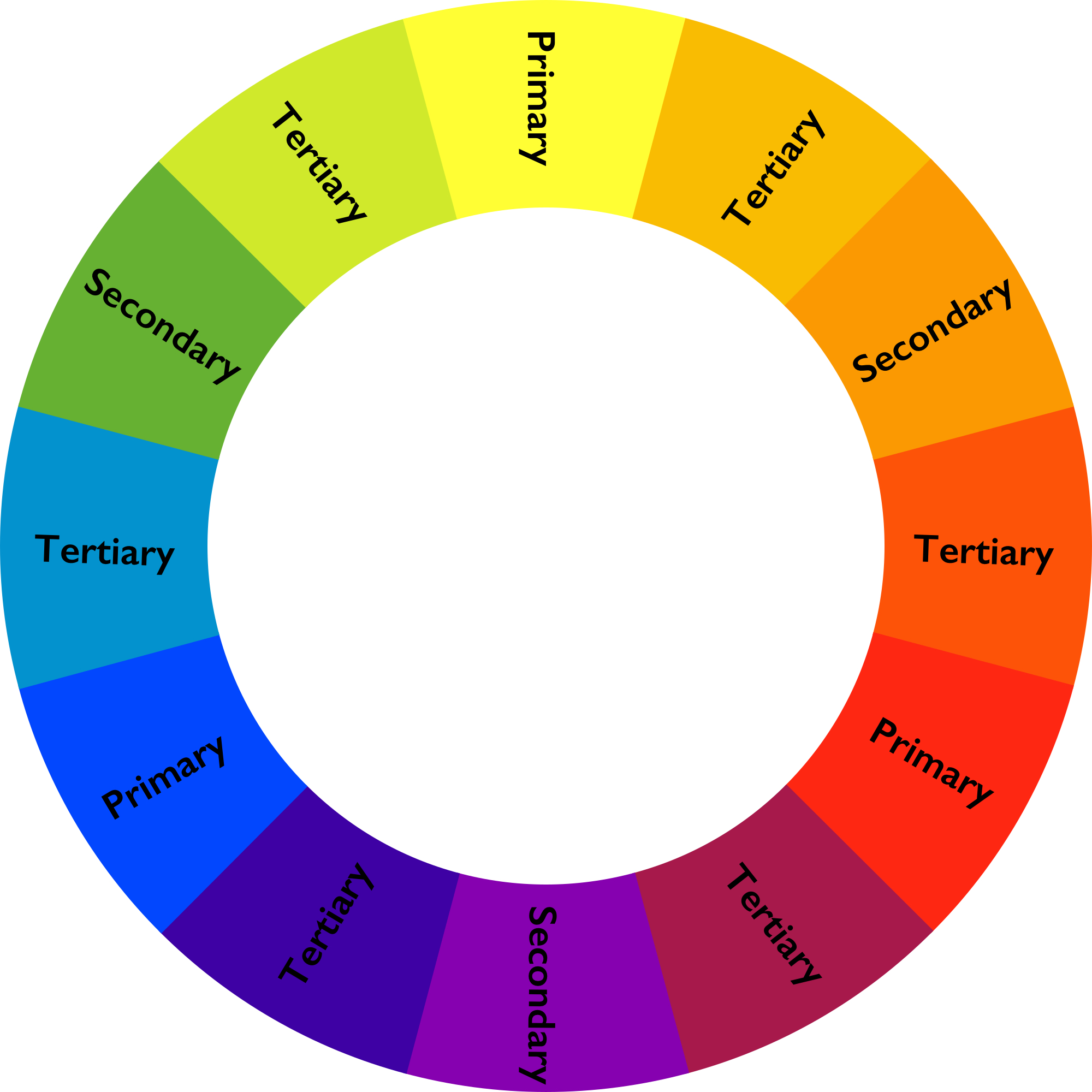
Color wheel (image: public domain)
Primary, secondary and tertiary colors
Primary colors are, for most art media, red, yellow and blue (the exception is the additive color system, which is used in computer screens, theater lighting and the like, and has red, green, and blue as its primary colors). All the rest of the colors can be made from these.
Secondary colors are made by mixing two primary colors: Red and yellow make orange, and so on.
Tertiary colors are made by mixing a primary color with a secondary color.
Complementary and analogous colors
The colors opposite one another (like red and green or blue and orange) are complementary colors, which tend to stand out boldly next to one another. These are therefore often used for university colors and sport team logos. Colors next to one another (like red and orange or blue and green) are analogous colors, and these tend to blend together more smoothly.
Warm and cool colors
The colors on the left of this wheel are called cool colors and those to the right are warm colors. Using cool or warm colors in an image can create moods. Pierre Auguste Renoir used warm colors for his Mother and Child, 1886, creating a warm, cheerful, inviting scene. The oranges, pinks and yellows dominate the image.
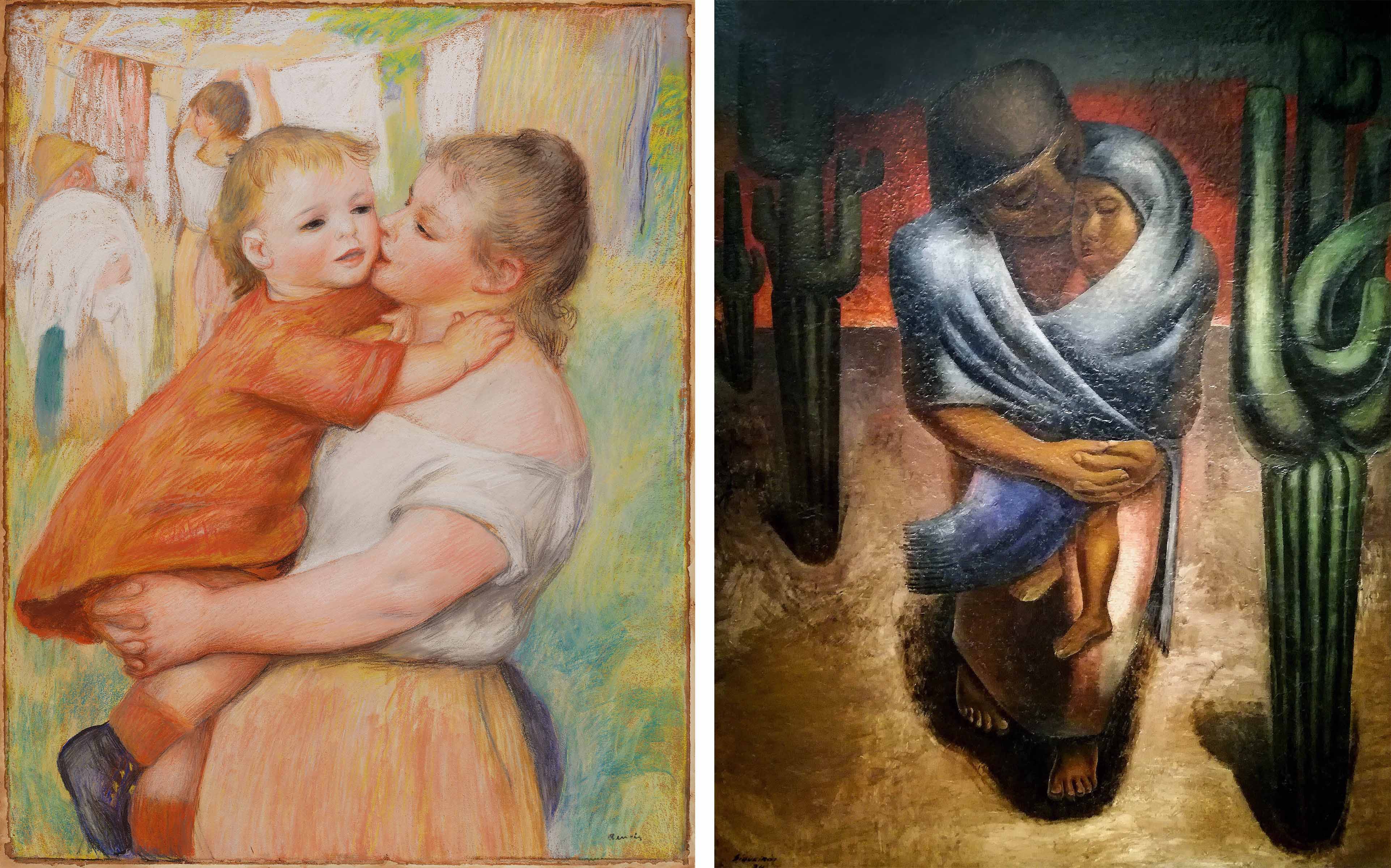
Left: Pierre-Auguste Renoir, Mother and Child, 1886, pastel, 79.1 x 63.5 cm (Cleveland Museum of Art); right: David Alfaro Siqueiros, Peasant Mother, c. 1924, oil on burlap, 249 x 180 cm (Museo de Arte Moderno, Mexico City) © David Alfaro Siqueiros
David Alfaro Siqueiros presents a similar subject in his Peasant Mother, but through the use of cool colors, instead creates a sad, cold scene dominated by figures of blues and greens. Neither of these artists was worried about portraying the world as it really looked. Instead, they used color to inspire feelings in the viewer.
Value (tint and shade)
Color can also be considered in terms of value, which is the degree of lightness or darkness of a color. If we add white to a hue, we get a tint. If we add black, we get a shade. As we might expect, tints tend to be more cheerful—pastel colors are all tints. Shades tend to be gloomier. Indeed, our terms for moods are based on these properties, so that we say that we are lighthearted, or in a dark temper. There are many tints in the Renoir’s Mother and Child, and many shades in Siqueiros’ Peasant Mother.
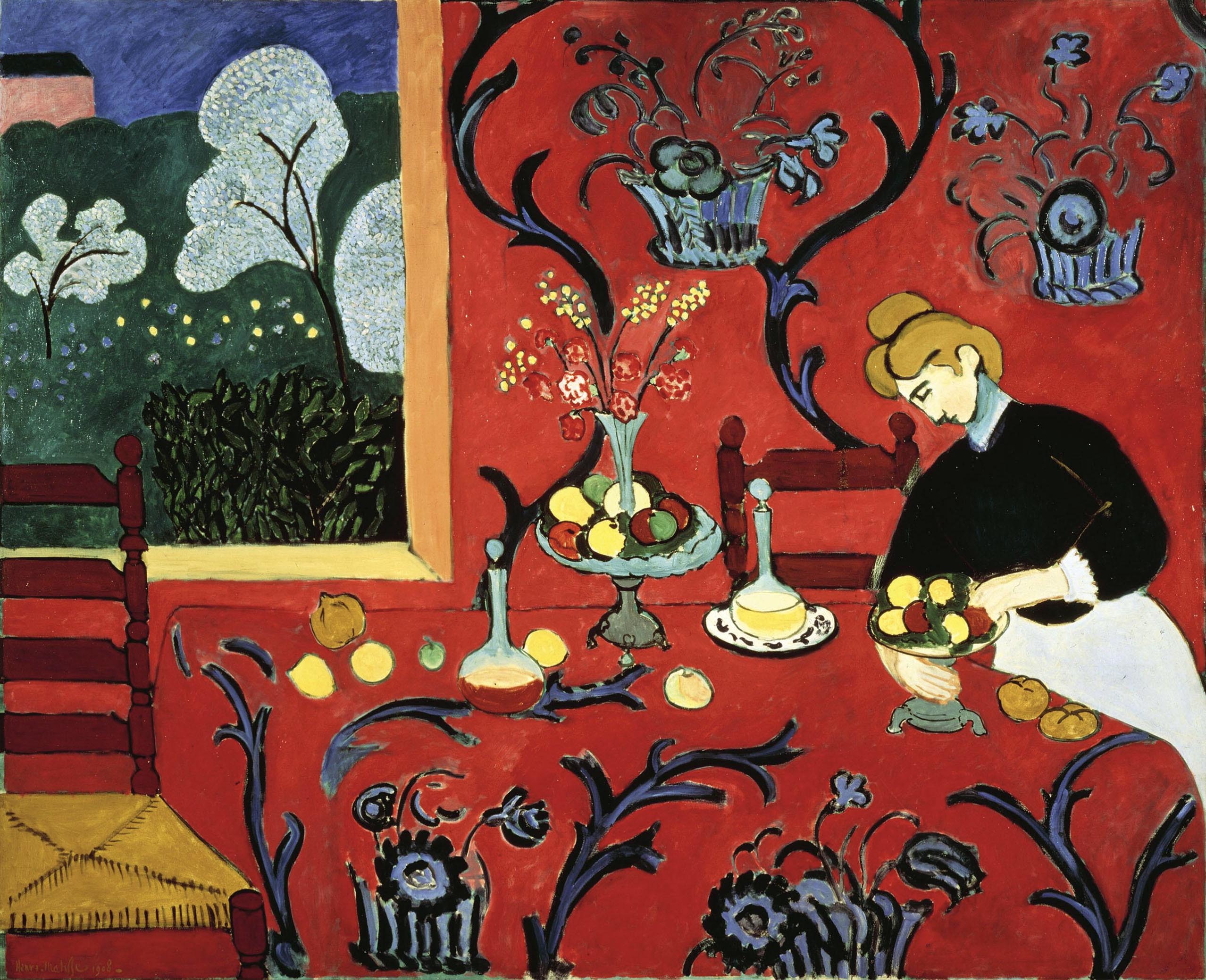
Henri Matisse, Red Room (Harmony in Red), 1908, oil on canvas, 180.5 x 221 cm (The State Hermitage Museum)
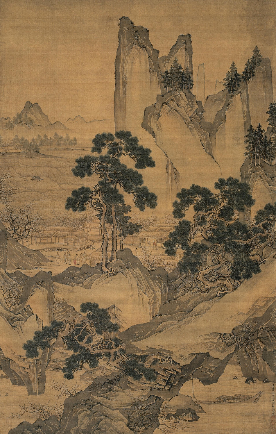
Zhou Chen, Peach Blossom Spring, 102.5 X 161.5 cm (Suzhou Museum)
Saturation
Finally, intensity or saturation is how bright or dull a color is. Henri Matisse tended to use very saturated colors, as in Red Room (Harmony in Red) (1908), whereas in Peach Blossom Spring (1533), Zhou Chen relied on a much more muted palette with very little saturation of colors.
The landscape is almost entirely in shades of brown and beige. The grey-green of the trees is low in saturation, leaving the single splash of red on the child’s clothes the only moment of high saturation in the image. Therefore, we notice this tiny detail within this large painting. The Matisse painting, on the other hand, is a blaze of colors. The vibrant red of the wall and tablecloth dominates the image, in sharp contrast with the green grass showing through the window and the blues and purples curving throughout the image.
Contrast
Contrast is the amount of variation between the highest and lowest values in a work. This is perhaps most commonly used to talk about photography, but can be applied to any work. Hiroshi Sugimoto’s Cliffs of Moher (1989) has very low contrast. There are no dark blacks, no stark whites; everything is in very similar shades of gray.
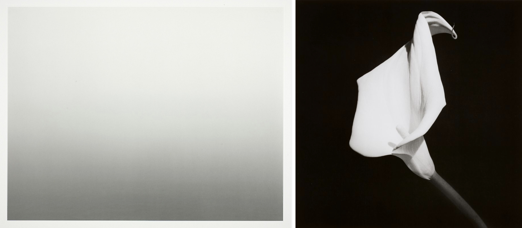
Left: Hiroshi Sugimoto, Atlantic Ocean, Cliffs of Moher, 1989, offset lithograph, 24 x 31 cm (Art Institute of Chicago) © Hiroshi Sugimoto; right: Robert Mapplethorpe, Calla Lily, 1987, gelatin silver print, 17.94 × 17.78 cm (Minneapolis Institute of Art) © Robert Mapplethorpe / The Robert Mapplethorpe Foundation
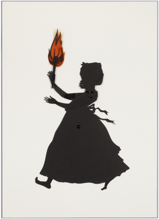
Kara Walker, Untitled (from Testimony), 2004, cut black paper with pencil, pressure-sensitive tape, metal fasteners, and synthetic polymer film on paperboard, 52.7 x 38.1 cm (The Museum of Modern Art)
The low contrast conveys the soft and gentle feeling of a heavy mist over quiet water. On the other hand, Robert Mapplethorpe photograph, Calla Lily (1987) has much higher contrast, meaning that the difference in the whites and blacks is much greater. The effect is much sharper and crisper, making this simple flower appear grand and impressive.
Moving yet further, in Kara Walker’s silhouette image, Untitled (from Testimony), the contrast is absolute. We see only black and white (and here, some red).
In this case, the artist is using the power of this contrast to draw the viewer’s attention to some of the problems in American race relations, and their origins in the institution of chattel slavery. Therefore, while visual elements produce visual effects, their implications can extend well beyond the purely visual.
Additional resources:
Art terms in action: tint, shade and tone (video from MoMA)
Making purple: the science of art (video from The National Gallery)
Making Green: Tempera versus Oil (video from The National Gallery)
The Alchemy of Color and Chemical Change in Medieval Manuscripts


