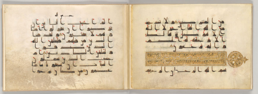
Qur’an fragment, in Arabic, before 911, vellum, MS M. 712, fols 19v–20r, 23 x 32 cm, possibly Iraq (The Morgan Library and Museum, New York)
The Qur’an: From recitation to book
The Qur’an is the sacred text of Islam, consisting of the divine revelation to the Prophet Muhammad in Arabic. Over the course of the first century and a half of Islam, the form of the manuscript was adapted to suit the dignity and splendor of this divine revelation. However, the word Qur’an, which means “recitation,” suggests that manuscripts were of secondary importance to oral tradition. In fact, the 114 suras (or chapters) of the Qur’an were compiled into a textual format, organized from longest to shortest, only after the death of Muhammad, although scholars still debate exactly when this might have occurred.
This two-page spread (or bifolium) of a Qur’an manuscript, which contains the beginning of Surat Al-‘Ankabut (The Spider), is now in the collection of The Morgan Library and Museum in New York. Other folios that appear to be from the same Qur’an survive in the Chester Beatty Library (Dublin), the Topkapı Palace Museum and the Museum of Turkish and Islamic Art (Istanbul), and the National Museum of Syria (Damascus). One page includes an inscription, which states that ʿAbd al-Munʿim Ibn Aḥmad donated the Qur’an to the Great Mosque of Damascus in 298 A.H. (July, 911 C.E.), although we do not know where or how long before this donation the manuscript was produced.
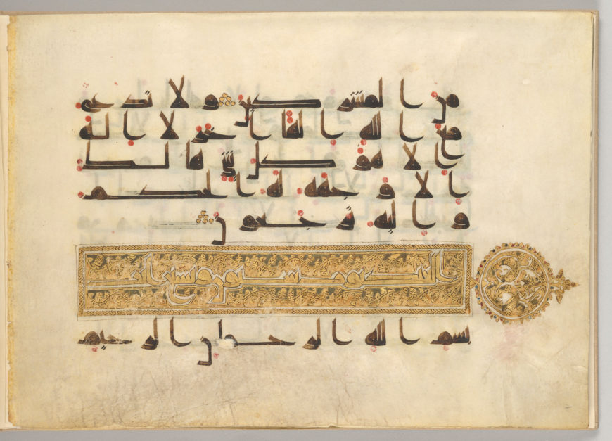
Qur’an fragment (detail), in Arabic, before 911, vellum, MS M.712, fols. 19v–20r, 23 x 32 cm, possibly Iraq (The Morgan Library and Museum, New York)
A roadmap for readers
The main text of the mushaf (pronounced muss-hoff), as manuscripts of the Qur’an are known, is written in brown ink. Arabic, the language of the divine word of Islam, is read from right to left. Several consonants share the same basic letterform, and these are usually distinguished from each other by lines or dots placed above or below the letter. Short vowels such as a, u, and i, are not normally written in Arabic, but in order to avoid misreadings of such an important text it quickly became standard to include vowels in the Qur’an. In this manuscript, these short vowels are marked with red circles positioned above, next to, or below the consonants, depending on the vowel.
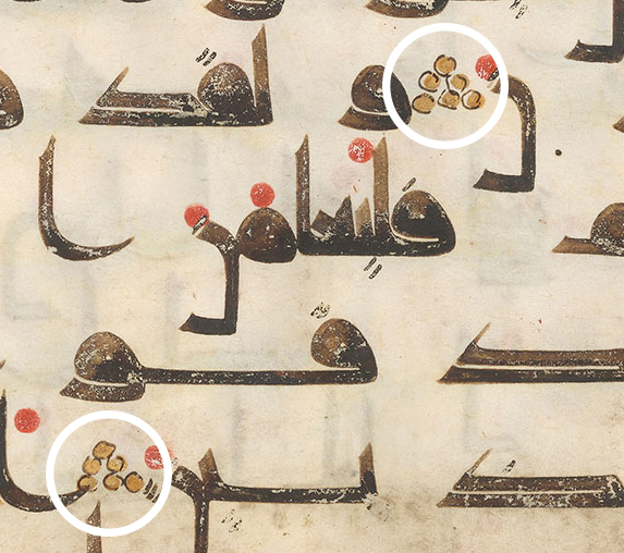
Sura, Qur’an fragment (detail), in Arabic, before 911, vellum, MS M.712, fols. 19v–20r, 23 x 32 cm, possibly Iraq (The Morgan Library and Museum, New York)
The text of each sura is further divided into verses by triangles made up of 5 gold circles located at the end of each verse (left).
The title of each sura is written in gold ink, and surrounded by a rectangle, filled here with an undulating golden vine (below). Combined with a rounded palmette extending into the margin of the folio, it allows readers to quickly locate the beginning of each sura.
Because figural imagery such as human or animal forms was considered inappropriate for the ornamentation of sacred monuments and objects, artists relied on vegetal and geometric motifs when they decorated mosques and sacred manuscripts. Vines and palmettes like the ones that surround the sura heading here appear alone in sacred contexts, but they also accompanied animal and human forms in the secular decoration of palaces and textiles.

Sura title, Qur’an fragment (detail), in Arabic, before 911, vellum, MS M.712, fols. 19v–20r, 23 x 32 cm, possibly Iraq (The Morgan Library and Museum, New York)
Planning the proportions of the page
The art of producing a mushaf began well before a pen was ever dipped into ink. The dimensions of each page were calculated before the parchment was cut, and the text was carefully situated relative to the edges of the pages. Each page of costly parchment (or vellum) in this Qur’an is larger than a standard sheet of printer paper, and contains only nine lines of calligraphy. These materials suggest both the dignity of the sacred text and the wealth of its patron, who was probably a member of the aristocratic elite.
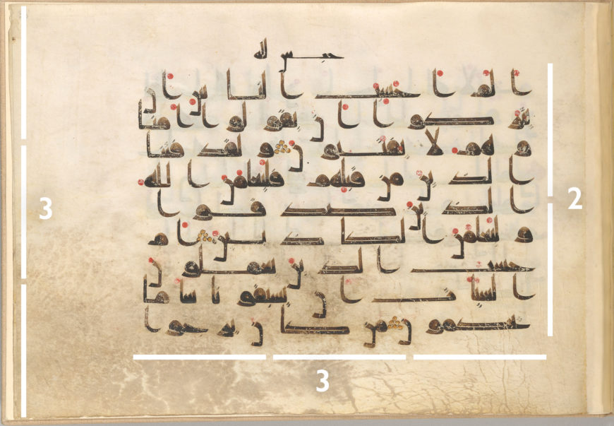
Diagram of proportions, Single folio, Qur’an fragment, in Arabic, before 911, possibly Iraq (The Morgan Library and Museum, New York)
In addition to the high quality and large quantity of materials used, the deliberate geometric planning of the page conveys the importance of the text that it contains. As in many of the mushafs produced between 750 and 1000 C.E., the pages of this manuscript are wider than they are tall.
The text-block of this manuscript has a height-to-width ratio of 2:3, and the width of the text-block is approximately equal to the height of the page. The height of each line of text was derived from the first letter of the alphabet, alif, which was in turn derived from the width of the nib of the reed pen used by the calligraphers to write the text.
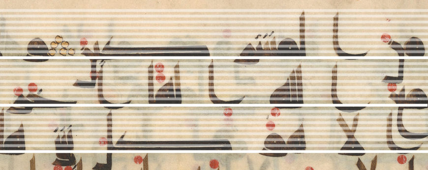
Interlines, Single folio, Qur’an fragment (detail), in Arabic, before 911, vellum, 23 x 32 cm, possibly Iraq (The Morgan Library and Museum, New York)
Each line was further divided into a set number of “interlines,” which were used to determine the heights of various parts of individual letters. There is no ruling on the parchment, however, so scribes probably placed each sheet of the semi-transparent parchment on a board marked with horizontal guidelines as they wrote. Memorizing and producing the proportions of each pen stroke, however, must have been part of the training of every scribe.
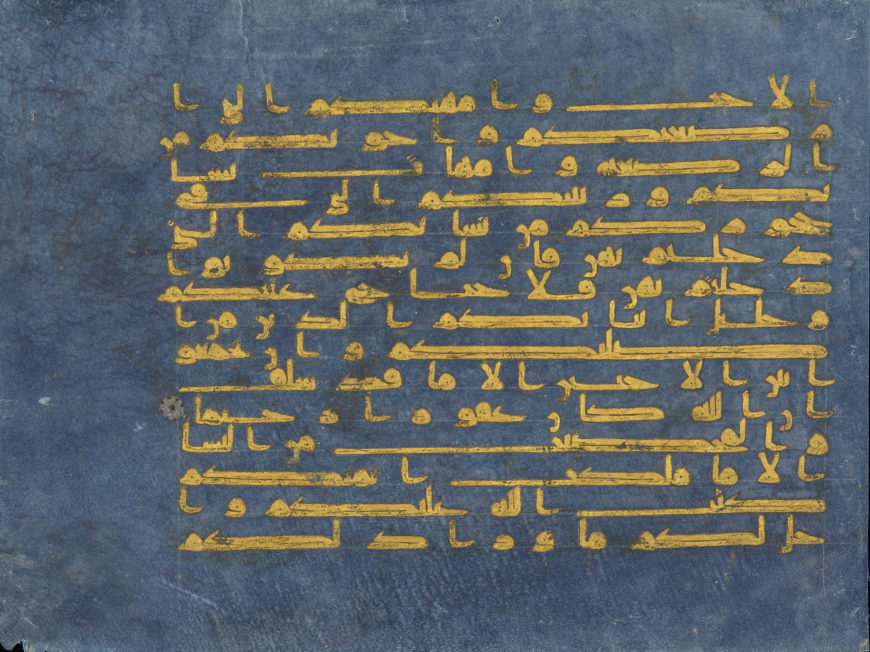
Kufic script in folio from a Qur’an, c. 900–950 C.E., gold leaf, silver and ink on parchment with indigo, 28.5 x 37.5 cm, probably made in Tunisia, Qairawan (Los Angeles County Museum of Art)
Kufic script and the specialization of scribes
Writing in the tenth century C.E., the Abbasid court secretary Ibn Durustuyah noted that letters of the alphabet were written differently by Qur’anic scribes, professional secretaries, and other copyists. The calligraphic style used by these early scribes of the Qur’an is known today as Kufic. Only two or three of the more than 1300 fragments and manuscripts written in Kufic that survive contain non-Qur’anic content.
Kufic is not so much a single type of handwriting as it is a family of 17 related styles based on common principles, including a preference for strokes of relatively uniform thickness, short straight vertical lines and long horizontal lines, and a straight, horizontal baseline.
Various types of kufic were popular from the seventh century C.E. until the late tenth century C.E. Scribes used a wide reed pen dipped in ink to write. In some letters the angle of the pen was adjusted as the scribe wrote in order to maintain an even thickness throughout the entire letterform, but in others the angle could be held constant in order to produce both very thick and very thin lines. Although letters and even entire words at first appear to consist of a single stroke of the pen, in fact individual letters were often formed using multiple strokes.
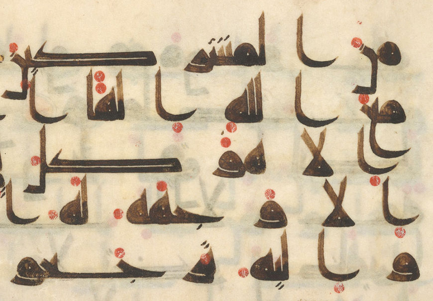
Qur’an fragment (detail), in Arabic, before 911, vellum, 23 x 32 cm, possibly Iraq (The Morgan Library and Museum, New York)
The regularity and precision of the penmanship in the fragment from The Morgan Library reveals the skill of the scribes who produced it. Each of them deliberately imitated a single style in order to produce a unified finished product.
Scribes also had some freedom in composing a page. They could emphasize individual words and balance the widths of lines of different length by elongating certain letters horizontally (a technique known as mashq). They could also adjust spacing between words and letters, and even split words between two lines, in order to balance positive and negative space across the page.

Graphic showing negative space, Qur’an fragment (detail), in Arabic, before 911, vellum, 23 x 32 cm, possible Iraq (The Morgan Library and Museum, New York)
In this mushaf, the spaces between non-connecting characters within a word are as wide as the spaces that separate different words (sometimes even wider!). For readers unfamiliar with the text, it is therefore difficult to figure out which letters should be grouped together to form words. This deliberate obfuscation would have slowed down readers, and it suggests that anyone who read aloud from these manuscripts had probably already memorized the text of the Qur’an and used the lavish manuscript only as a kind of mnemonic device.
Additional resources:
This manuscript at the Morgan Library and Museum
Glossary from the British Museum’s Catalogue of Illuminated Manuscripts
The development and spread of calligraphic scripts from The Metropolitan Museum of Art
Scripts in development from The Metropolitan Museum of Art
Islamic Manuscripts from the Cambridge Digital Library
Sheila Blair, Islamic Calligraphy (Edinburgh: Edinburgh University Press, 2006).
Alain George, The Rise of Islamic Calligraphy (London: Saqi, 2010).
Alain George, “The Geometry of Early Qur’anic Manuscripts.” Journal of Qur’anic Studies volume 9, no. 1 (2007), pp. 78–110.
Alain George, “Calligraphy, Colour and Light in the Blue Qur’an.” Journal of Qur’anic Studies volume 11, no. 1 (2009), pp. 75–125.
Estelle Whelan, “Writing the Word of God: Some Early Qur’an Manuscripts and Their Milieux, Part I,” Ars Orientalis volume 20 (1990), pp. 113–147.

