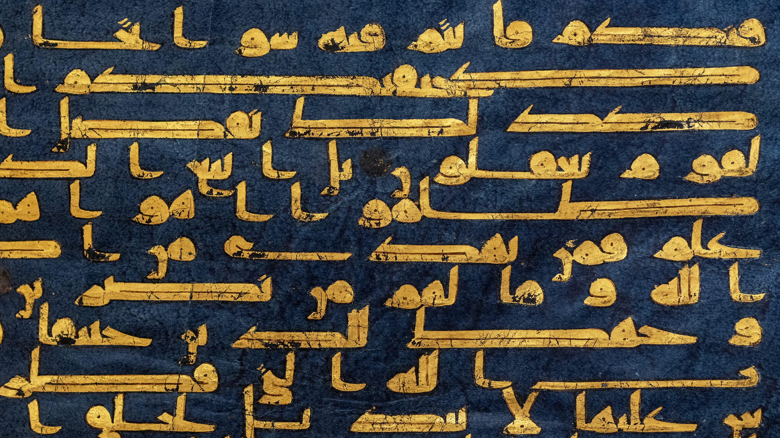
Upper right corner (detail), Folio from the “Blue Qur’an” with Sura 30 (al-Rum, “The Romans”), verses 25–32, late 9th–early 10th century C.E. (Tunisia) or 9th century (Spain), gold and silver on indigo-dyed parchment, 30.4 x 40.2 cm (The Metropolitan Museum of Art, New York; photo: Steven Zucker, CC BY-NC-SA 2.0)
The Qur’an is the scripture of Islam, the words of God revealed to the Prophet Muhammad in the language of Arabic between the years 610 and 632 C.E. Having been memorized and passed orally during Muhammad’s lifetime, these revelations were written down for the first time soon after the prophet’s death, and as later centuries progressed, special scripts were devised and unique manuscript forms were developed to carry the words of God.
The earliest copies of the Qur’an do not survive as complete manuscripts but rather as individual folios or small groups of folios. This makes it difficult to reconstruct a history of this period of development: single pages do not necessarily convey much information about the larger manuscripts to which they belonged, and inscriptions at the end of manuscripts that might have given information about where and when they were produced have been lost. This essay therefore presents one narrative around these developments, and an introduction to how to approach the visual features of Qur’ans made between the 7th and 12th centuries C.E., when the scripts used to copy the Qur’an shifted from being plain and unadorned to what could properly be considered calligraphy (beautiful writing) and a major art form in Arabic-speaking regions.
Qur’ans in hijazi scripts
Falling on the plainer end of the spectrum is one group of early Qur’ans, dating from the 7th and 8th centuries C.E., that is written in a family of scripts called hijazi. As seen on a page from an 8th century manuscript, the script is characterized by the accentuation of the vertical strokes of the letters. The letters slant to the right (to the beginning of each line, since Arabic is read from right to left). There are no dots that help distinguish letter forms from one another, and no dashes to mark the short vowels (in Arabic, short vowels do not have their own characters, and some consonants share character forms and are only distinguished with the addition of dots above or below these forms). It is also quite difficult to discern one word from another; spacing is uneven and words that come at the end of the line might be split and carried over to the next line, sometimes leaving just a single letter on its own.
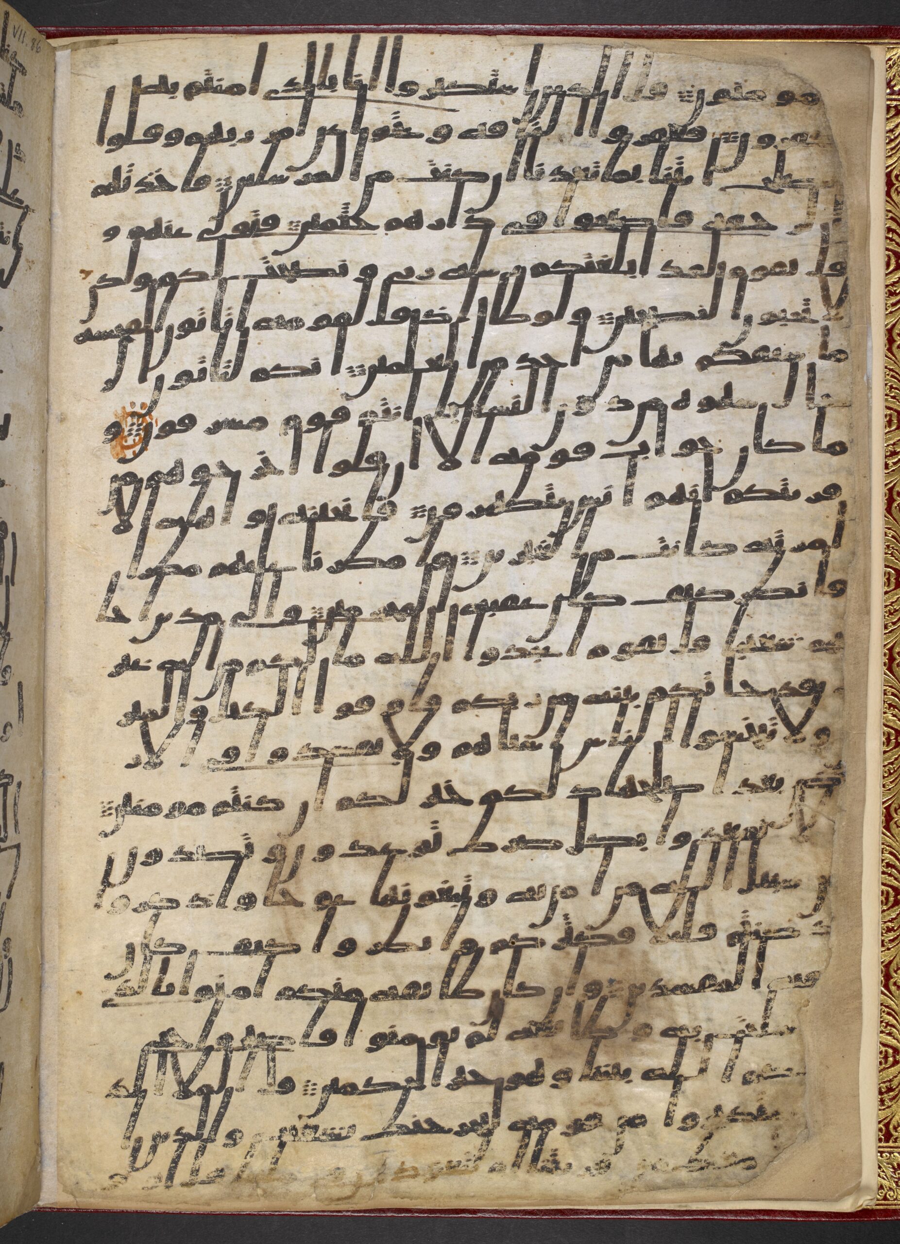
An example of hijazi script. Folio from a partial Qur’an manuscript, 8th century C.E. (Saudi Arabia), ink on parchment, 31.5 x 21.5 cm (British Library, London, Or. 2165, folio 2 verso)
This folio also exemplifies the physical and material attributes of typical hijazi Qur’ans. It is written in black ink on parchment (prepared animal skin). It is oriented vertically, with a height greater than the width. There are many lines of writing, in this case, 24. In these Qur’ans, the beginning of a new chapter might only be marked by a blank space or at most a small band of decoration in colored ink.
Because of the general difficulty in deciphering the text of manuscripts like this, scholars have postulated they were probably not used for a straight-forwarding reading, or by a reader who was not already familiar with the text; most think it was used to guide a reading or recitation by someone who had memorized the text already but might need a reminder along the way. Another supposition is that the Qur’an manuscript itself had a sanctity, and copies were kept in places like mosques, religious schools, tombs, or the home because of its sacred aura.
Qur’ans in kufic scripts
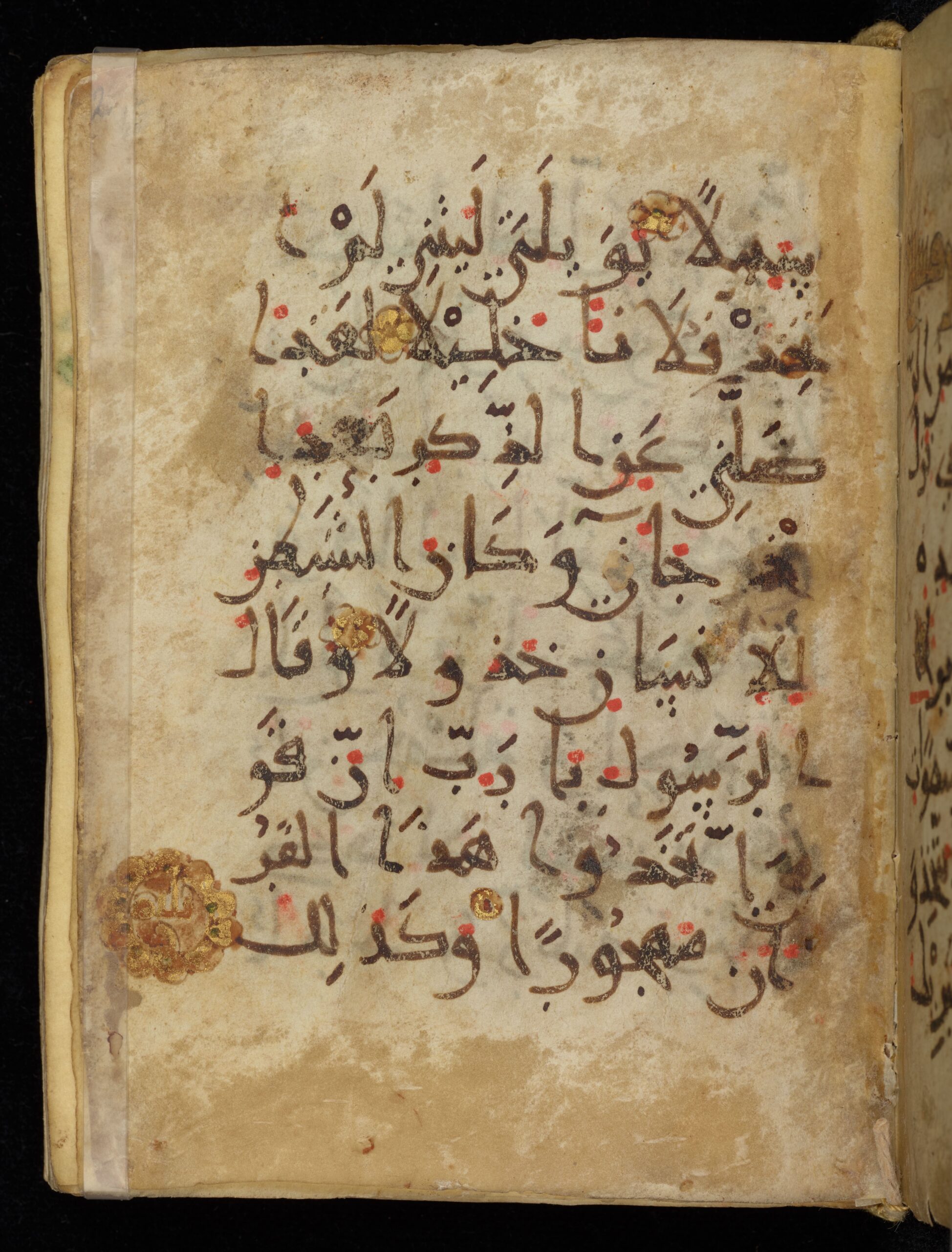
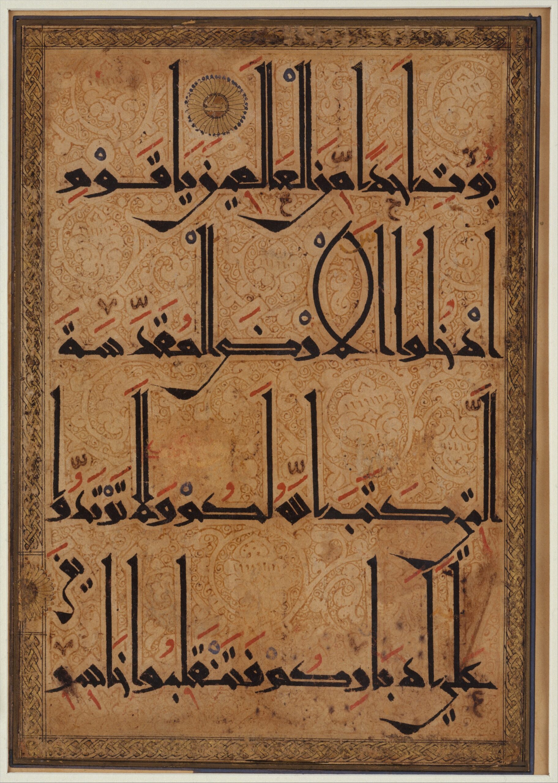
During this period, but perhaps in other regions, another script family was also in use. The kufic set of scripts is distinguished by the angularity of its letter forms, and the use of thicker strokes than in the hijazi scripts. As seen in this example, attributed variously to Spain in the 9th century or Tunisia in the mid-9th to mid-10th century, another major difference from hijazi scripts is the horizontal orientation of the script and the way that letters are often stretched across the page so that the words precisely fill the space for each line. The vertical strokes of letters are frequently shortened or bent over to the left.
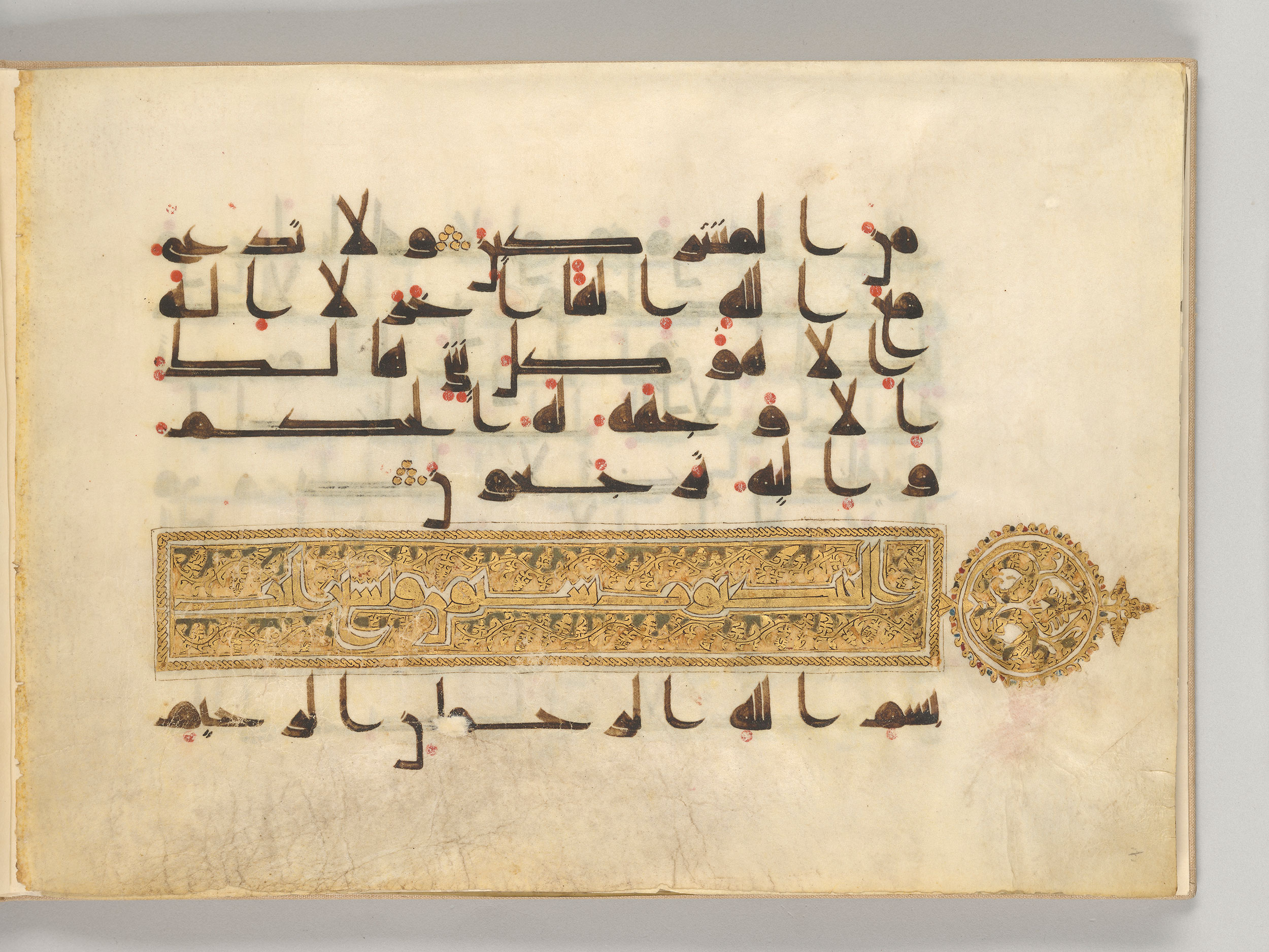
An example of kufic script. Folio from a partial Qur’an manuscript, before 911 C.E. (possibly Iraq), ink on vellum, folio 19 verso, 23 x 32 cm (The Morgan Library and Museum, New York, MS M.712)
Unlike Qur’ans in hijazi script, kufic Qur’ans tend to make use of diacritics (the marks that help distinguish letters written with the same form), as well as dots that indicate different short vowels. In some manuscripts, these dots (called vocalizations), are given in different colors that indicate variant readings of the Qur’an. On this page of a 10th century C.E. Qur’an from Iraq, the dots have been included in a red ink. The inclusion of these marks helps avoid confusion about which letter has been written, and also assists someone reciting the Qur’an aloud to pronounce the words correctly.
Another point of difference is that in kufic Qur’ans, decorated bands that mark the beginnings of chapters appear more consistently, and include the numbers of verses in the chapter along with the chapter name. The Qur’an shown here presents a useful example. Its golden illumination includes the words, ‘al-ankabut, nine and sixty ayat ,’ indicating that this is sura al-ankabut (the spider), with 69 verses.
An example of kufic script. Folio from the “Blue Qur’an” with Sura 30 (al-Rum, “The Romans”), verses 25–32, late 9th–early 10th century C.E. (Tunisia) or 9th century (Spain), gold and silver on indigo-dyed parchment, 30.4 x 40.2 cm (The Metropolitan Museum of Art, New York; photo: Steven Zucker, CC BY-NC-SA 2.0)
In terms of format, Qur’ans in kufic scripts tend to have folios that are oriented horizontally. Most have a limited number of lines per page, sometimes as few as three or five. This means that enormous amounts of parchment would have been required to create each Qur’an, and they would therefore have been expensive to produce. By way of example, the page from the “Blue Qur’an” has fifteen lines of writing on it; from this basis, it has been estimated that it would have originally had 650 parchment folios requiring the hides of many animals. The folios were additionally dyed with indigo and inscribed with gold ink, making it an even more costly production.
Qur’ans in rounded scripts
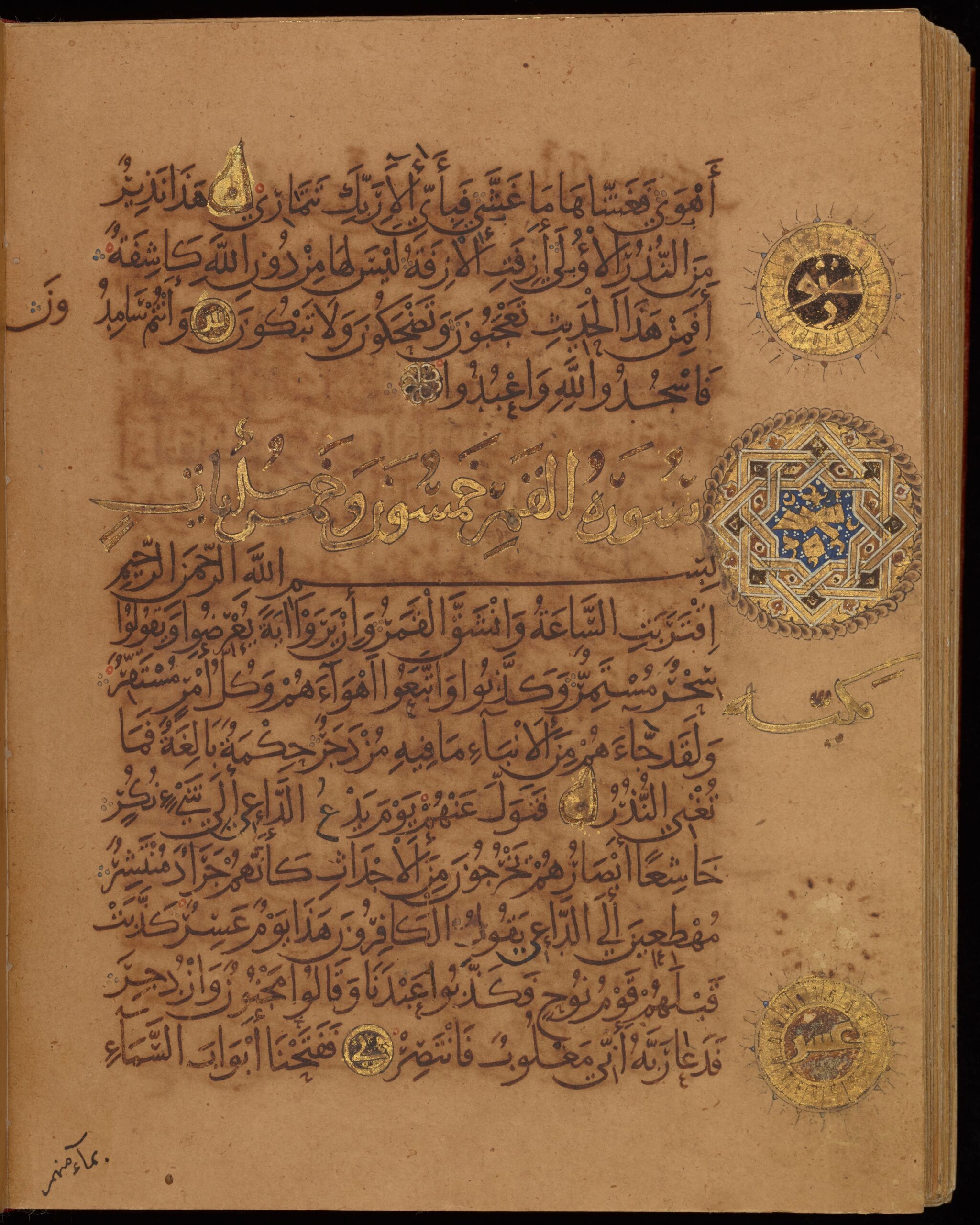
The hijazi and kufic styles, often described as rectilinear or angular, continued to appear into the 11th century by which time a group of what are called “round scripts” increased in use. These scripts had already been employed for many kinds of other texts, but had not apparently been considered appropriate for the Qur’an (a deliberate distinction had previously been made between the scripts used to write out the words of God and those used for other purposes). The reasons for the rise and eventual acceptance of round scripts for use in copying Qur’ans are not universally agreed on by scholars, but may have to do with changes in the type of people who wrote out the Qur’an, which over time shifted from clerics to those employed as secretaries or scribes in the government infrastructure. These scribes were more accustomed to using round, or cursive, scripts that were faster and easier to write, and which, unlike the hijazi and kufic styles, did not require lifting the pen repeatedly to form individual letters. The new scripts were much simpler to read which would have also added to their general popularity.
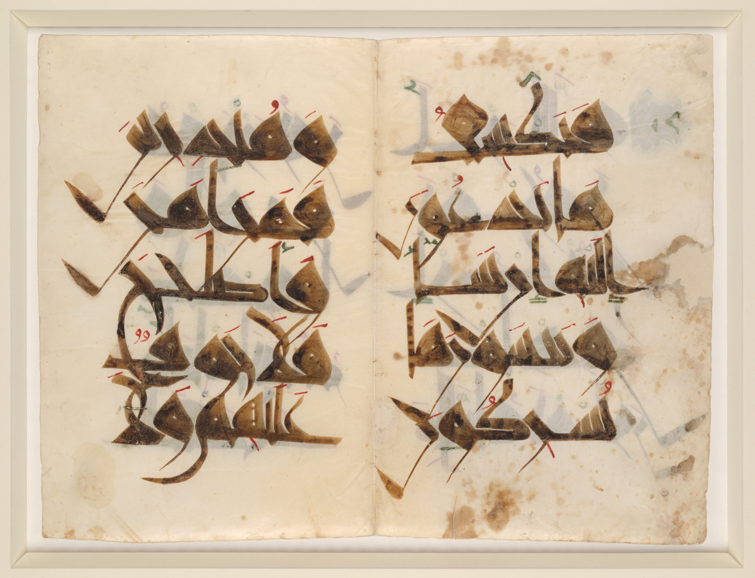
Bifolium from a Qur’an manuscript in round script, with last word of Sura 26 (al-Shu‘ara, “The Poets”), verse 227 and Sura 27 (al-Naml, “The Ant”), verses 1–7, late 9th–early 10th century C.E. (Iran; a note in Persian says it was corrected in 905 C.E.), ink on parchment, 12 x 9 cm, folios 33b–34a (Chester Beatty Library, Dublin, Is 1417d)
The transition to cursive scripts was gradual, however, and many styles flourished in 9th–12th centuries as variations developed in different geographic regions, some retaining more aspects of the angular scripts (like hijazi and kufic) than others. In Iran, for instance, a very early attempt at a rounded script hints at the attributes that were appealing in the new style. In this late 9th–early 10th century manuscript, there is greater uniformity in the width and length of the letters compared to the kufic and hijazi scripts, and the letter forms are distinct and legible, not having been stretched or flattened. The rounded extensions of letters that descend below the line of writing visually link one word to the next and help guide the eye across the page. Yet at the same time there is significant variation in the thickness of the strokes composing the letters, and the spacing between words is uneven, creating a certain visual busy-ness.
These matters would be resolved as various guidelines for writing cursive scripts were introduced. These advancements have traditionally been associated with three calligraphers, the first of whom, Ibn Muqla is said to have created a system of proportions between the letters based on a basic unit of the diamond shape made when the scribe’s reed pen is applied to the writing surface. The height and width of each letter in the script was then a given number of these units.
Qur’an of Ibn al-Bawwab with Sura 53 (al-Najm, “The Star”), verse 53 and Sura 54 (al-Qamar, “The Moon”), verses 1–11, dated 391 A.H./1000–1001 C.E. (Baghdad, Iraq), ink and gold pigment on paper, 18.3 x 14.5 cm, folio 243b (Chester Beatty Library, Dublin, Is 1431)
The next major advancement is attributed to Ibn al-Bawwab, who perfected a graceful, flowing, and highly readable style of writing based on this idea of proportions. This can be best seen in a Qur’an signed by him and dated to the year 1000–1001. The letters on its pages are of an even thickness and are arranged in a steady rhythm across each line, united by the rounded strokes of the letters that extend into the spaces between words. The text includes a complete set of diacritics and vocalization marks, given in the same color ink as the text, which further aids in its legibility.
Vocalization marks (note the dashes above the word) from the bottom line of the page (detail), Qur’an of Ibn al-Bawwab with Sura 53 (al-Najm, “The Star”), verse 53 and Sura 54 (al-Qamar, “The Moon”), verses 1–11, dated 391 A.H./1000–1001 C.E. (Baghdad, Iraq), ink and gold pigment on paper, 18.3 x 14.5 cm, folio 243b (Chester Beatty Library, Dublin, Is 1431)
It is believed these innovations were introduced because by this time the Muslim population had multiplied, and many Muslims were not native Arabic speakers so these additions made it easier for those learning the Qur’an to read and understand its language. They also help to distinguish the different readings of the Qur’an, some of which were established during these centuries. Though there is only one version of the text of the Qur’an, there are different traditions about where certain verses end, how certain words are pronounced, the intonation to use when reading the words aloud, and other such details.
These changes to the script coincided with changes to the way that Qur’an manuscripts were made. This one was copied on pages made of paper, and vertically-oriented paper pages would become the norm for most Qur’ans after this time because they were much easier and cheaper to produce than those made of parchment. [1]
Continued variation
Although Ibn al-Bawwab’s Qur’an is considered a landmark in the study of art history, and rounded scripts would eventually gain nearly universal popularity, there was still considerable variety in the Qur’ans being produced through the 12th century. These variations could reflect the region where a particular Qur’an was made, or factors such as the cost of the manuscript and its intended use (with simpler versions for daily prayer contrasting with those presented as endowments to important mosques).
Bifolium from the “Nurse’s Qur’an” with Sura 6 (al-An‘am, “The Cattle”), verses 40–41, 48–49, c. 1019–20 (Tunisia), ink, opaque watercolor, and gold on parchment, 44.5 x 60 cm (The Metropolitan Museum of Art, New York)
For example, the “Nurse’s Qur’an” presents a different, rather angular script. This manuscript was likely made in Tunisia, a commission by the nursemaid to a sultan of the Zirid dynasty, and is an example of a lavish production, made as a gift to the Great Mosque of Qairawan. Its large parchment folios each have five lines of writing in brown ink, along with short vowels written in red, blue, and green colored inks. Its distinctive style of calligraphy is characterized by thickly-formed letters with contrasting thin strokes for parts of certain letter forms. The letters are distributed evenly across each line with minimal spacing between words, giving the pages a powerful graphic impact, but making it quite hard to read the letters until one becomes accustomed to the script’s internal logic.
Folio from a Qur’an manuscript with Sura 5 (al-Ma’idah, “The Feast”), verses 20–21, c. 1180 (Iran or Afghanistan), ink, opaque watercolor, and gold on paper, 29.8 x 22.2 cm (The Metropolitan Museum of Art, New York)
A Qur’an made later, in the 12th century in Iran or Afghanistan, similarly presents a highly stylized script. The vertical strokes of some letters are accentuated, while others bend and stretch horizontally. Most notably, the rounded edges of the letter forms have been squared off, in contrast again to Ibn al-Bawwab’s writing. Knowing that these forms would be difficult to distinguish, the calligrapher has written an easier-to-decipher version of some letters in a lighter ink just below the lines of writing (as seen near the right-hand side of the first line).
Conclusion
In the first centuries of the religion of Islam, the many developments in writing Arabic that took place were initially propelled by the desire to copy the Qur’an in a suitably reverential manner. Later there arose the need to provide a clear and legible version of the text that might be easily read in many different parts of the world. These orthographic changes took place in parallel with changes to the scripts being developed for use in the governmental structure, as Arabic started being used as the language of administration in a wider geographic span than ever before. Together these influences led to a significant transformation in the appearance and functionality of the Qur’an. After this time, even more variations in scripts and illuminations would be developed, as many regional traditions gained in prominence.
Notes:
[1] Some two hundred years later, a calligrapher named Yaqut al-Musta’simi would then establish six different proportional scripts based on Ibn Muqla’s system. Each script used a different sized pen, that created different sizes and thicknesses for its letters.
Additional resources
The Qur’an of Ibn al-Bawwab online
Sheila Blair, Islamic Calligraphy (Edinburgh: Edinburgh University Press, 2006).
François Déroche, “Written Transmission,” The Wiley Blackwell Companion to the Qur’an, Second Edition (Chichester: John Wiley and Sons Ltd, 2017), pp. 184–99.