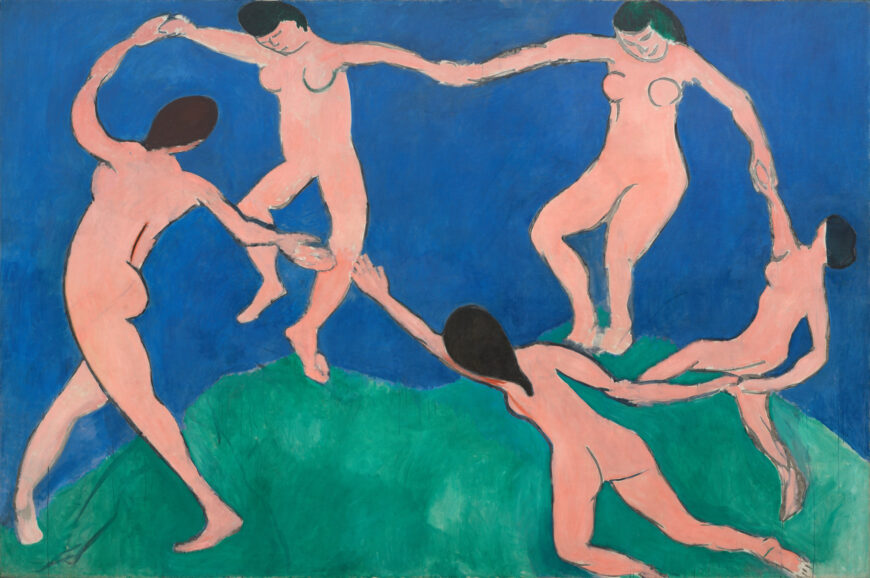
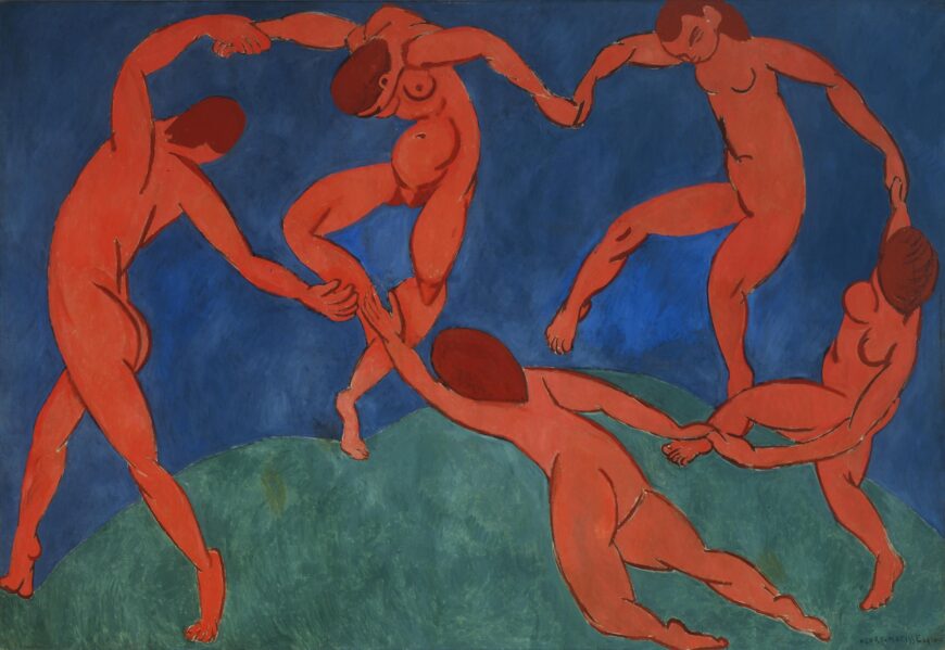
Henri Matisse, Dance I, 1909, oil on canvas, 259.7 x 390 cm (The Museum of Modern Art, New York)
In 1909 Henri Matisse received an important commission. An extremely wealthy Russian industrialist named Sergei Shchukin asked Matisse for three large scale canvases to decorate the spiral staircase of his mansion, the Trubetskoy Palace, in Moscow. The large and well loved painting, Dance I at MoMA, is somewhat disingenuously titled. Although it is full scale and in oil, Matisse did not consider it more than a preparatory sketch. Yet a comparison between the initial and final versions is instructive. Matisse borrowed the motif from the back of the 1905–06 painting Bonheur de Vivre, although he has removed one dancer.
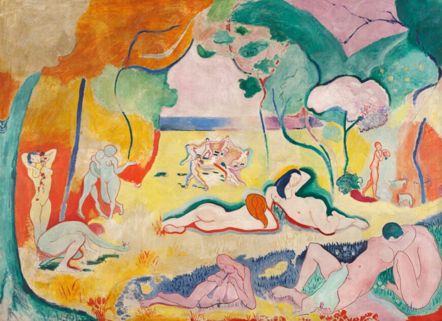
Henri Matisse, Bonheur de Vivre (Joy of Life), 1905–06, oil on canvas, 176.5 x 240.7 cm (The Barnes Foundation, Philadelphia)
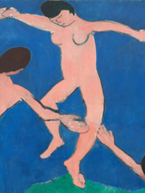
Dancer on a green field with a blue backdrop (detail), Henri Matisse, Dance I, 1909, oil on canvas, 259.7 x 390 cm (The Museum of Modern Art, New York)
In Dance I, the figures express the light pleasure and joy that was so much a part of the earlier Fauve painting. The figures are drawn loosely, with almost no interior definition. They have been likened to bean bag dolls because of their formless and unrestricted movements. The bodies certainly don’t seem to be restrained by way. But don’t let this childlike spontaneity fool you. Matisse works very hard to make his paintings seem effortless. Imagine for a moment, that instead of this childlike style, Matisse had decided to render this figures with the frozen density of Jacques Louis David. Would the sense of pure joy, the sense of play have been as well expressed? Matisse has done something that is actually very difficult. He has unlearned the lessons of representation so that he can create an image where form matches content.
The dancers inhabit a brilliant blue and green field. But what exactly does the green represent? Many people would quickly reply, “a grassy hilltop.” Okay, but what then is the blue intended to represent? If I were lecturing at MoMA, as I often do, many listeners would offer that “the blue is the sky that rises above the hill.” But others in my group might begin to look frustrated. One might then say, “that’s not what I see, the blue is really water moving back into the distance.”
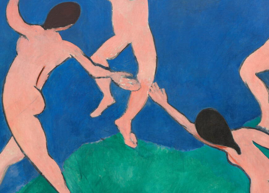
Parted two hands of the two front dancers (detail), Henri Matisse, Dance I, 1909, oil on canvas, 259.7 x 390 cm (The Museum of Modern Art, New York)
What Matisse has done here, even in seemingly simple rendering, is use spatial ambiguity to explore one of the key issues in modern painting, the conflict between the illusion of depth and an acknowledgment of the flatness of the canvas. One final point here, did you notice the break in the circle? The hands of the two front dancers are parted. Matisse has been careful to allow this break only where it overlaps the knee so as not to interrupt the continuity of the color. Why do this? The part is often interpreted in two ways, as a source of tension that requires resolution or, as an invitation to us the viewer to join in, after all, the break is at the point closest to our position.
Henri Matisse, Dance, 1910, oil on canvas, 260 x 291 cm (The Hermitage, St. Petersburg)
The final version of Dance has a very different emotional character. It has been described as forbidding, menacing, ritualistic, even demonic. Drum beats almost seem to be heard as the simple pleasure of the original is overwhelmed. What causes these dramatic changes in mood? Beyond the color shift, which is pretty obvious, the figures of the 1910 canvas are drawn with more interior line, line which often suggests tension and physical power. See for instance, the back left figure. Another more subtle change occurs where the two back figures touch the ground. In the 1909 canvas, the green reaches up to the feet of the two back most dancers, in the 1910 canvas, something else happens, the green seems to compress under the dancer’s weight. This subtle change creates either a sense of lightness or a sense of weight and contributes to the way we perceive each painting. While Matisse’s artistic style may exhibit a child-like quality, he was fully aware of his deliberate choices and intentions.
Additional resources

