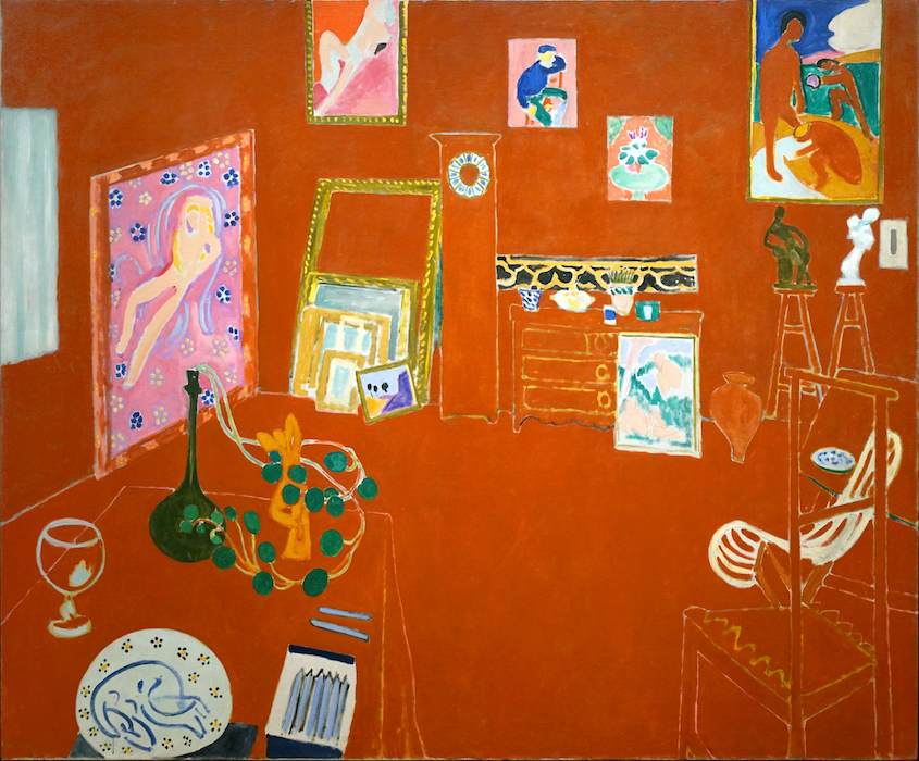
Henri Matisse, The Red Studio, 1911, oil on canvas, 181 x 219.1 cm (Museum of Modern Art, New York). Speakers: Dr. Steven Zucker and Dr. Beth Harris
Dismantling spatial illusion
Since Manet (and Degas, Monet, and Cezanne), artists have sought to undermine the illusion of space that had ruled painting since about 1425. Spatial illusion was increasingly seen as a defect that reduced the integrity of painting. But as the earlier painters of the avant-garde have shown, ridding a painting of illusion is almost impossible. The audience is trained to expect three dimensional space and sees it given the opportunity. This is Matisse’s challenge. He meets this challenge–the destruction of spatial illusion, in three stages.

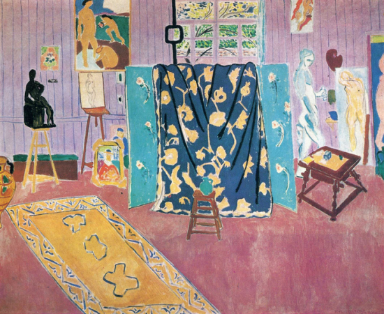
Henri Matisse, The Pink Studio, 1911, oil on canvas, 181 x 221 cm (Pushkin Museum of Fine Art, Moscow)
The color red
Red is often thought of as the most aggressive color. It has the most punch, and that’s what Matisse needed here. This canvas was a part of a series, there is, for instance, a Pink Studio too. But that canvas was concerned with different issues. Here, the red is an attempt to find a color that is forceful enough to resist the illusion of deep space by pushing to the surface. The red is, of course painted onto the flat canvas but actually fails to remain there visually. Instead, the red becomes the walls and furnishing of the room seen in space. Illusion triumphs–Matisse is thwarted.

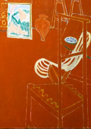
Chair (detail), Henri Matisse, The Red Studio, 1911, oil on canvas, 181 x 219.1 cm (Museum of Modern Art, New York)
Illusionism
This triumph of illusion is due in part to the linear perspective that defines the table, chairs, and the walls and floor of the studio. But look! Matisse has constructed some of the worst linear perspective ever seen. Receding lines should converge, but look at the chair on the lower right. The lines widen as they go back. And look to rear left corner of the room. The corner is defined by the edge of the pink canvas but above that painting, the line that must define the corner is missing! Matisse is literally dismantling the perspective of the room but it makes no difference, we still see the room as an inhabitable space. Illusion still triumphs.
Figure-Ground Relationship
Although it is very difficult to see in reproduction, if seen in person at MoMA, it is clear that the whitish lines that define form in the red field are not painted on top of the red. Instead, they are reserve lines. In other words, the white lines are actually the canvas below. Matisse painted the red planes up to the line on either side, leaving a narrow gap of white canvas in between. This is really IMPORTANT. Stay with me on this. The white line is actually emerging from below the red. It is beneath. The red is of course painted on top of the white canvas.
Okay, now pay attention. Matisse has realized that illusion is almost certain to triumph no matter how aggressively he tries to undermine it. We, as the audience, will see space if given the slightest opportunity. So if we see illusion at such a basic level, what hope does Matisse have of destroying it? In fact, his reserve line are his really brilliant solution. The chairs, the dresser, the clock, each object, or figure in The Red Studio is constructed out of the canvas below. At the same time, the ground which supports those figures, is constructed out of a plane of red that is physically above the canvas. What Matisse has done then is reverse the figure ground relationship. He has made the figure out of the ground (the canvas) and made the ground out of the figure (the red paint on top). When seen in person, the recognition of this does finally destroy illusion, Matisse triumphs!
Additional resources:
Smarthistory images for teaching and learning:
[flickr_tags user_id=”82032880@N00″ tags=”matissered,”]
[0:00] [music]
Dr. Steven Zucker: [0:10] We’re on the fifth floor of the Museum of Modern Art in New York City, looking at Henri Matisse’s large canvas, “The Red Studio.”
Dr. Beth Harris: [0:13] There is a tradition of artists in their studio shown working.
Dr. Zucker: [0:22] That tradition goes back to the 17th century, but this is interesting because Matisse is not physically represented in this room. Instead, the entire room functions almost like a self-portrait.
Dr. Harris: [0:28] He may not be here, but his surrogates are here, his works of art.
Dr. Zucker: [0:33] These are not invented paintings, these are actual works of art. In fact, the museum has the plate that’s in the lower left on display in the center of the gallery, but Matisse is not being faithful to these works. He’s changing them, he’s transforming them, he’s creating themes and variations on his earlier work.
Dr. Harris: [0:48] It’s a difficult painting. It is saturated in red. It’s not what we’re expecting, and yet I keep thinking to myself how much more interesting this painting is than if we were to approach a naturalistic image of an artist’s studio. This seems much more personal and much more philosophical.
Dr. Zucker: [1:07] Virtually the entire canvas is covered with this deep red. The only exceptions are his art, the frames for his art, light coming through the curtains that have been closed, the face of the clock, a cutting of nasturtium leaves. Besides that, the only things that are not red are the lines that define the forms.
Dr. Harris: [1:26] Lines that define the architecture of the space and the furniture of the space. There’s no sense of naturalistic light coming in through a window the way we might see in an earlier painting by Matisse, or in an Impressionist painting of a domestic interior.
Dr. Zucker: [1:40] There’s almost no highlight, there’s certainly no shadow. Everything has been simplified and is structured by only color and line. This is very particular. Matisse did not paint white on top of red, instead he painted red up to the borders of the forms that he was defining.
[0:00] So what we might take first as white is actually paint underneath the red.
Dr. Harris: [2:00] And that has a particular name, that’s called a reserve line.
Dr. Zucker: [2:04] This has to do with the impact of Matisse looking at the earlier work of Cézanne, and the breaking of the traditions of Renaissance painting in the early 20th century.
Dr. Harris: [2:14] We think about oil paint as being a layering of paint, but here it’s an intentional leaving absent of paint, which is something that we also see in the work of Cézanne.
Dr. Zucker: [2:25] He seems to be consciously dismantling the architecture of linear perspective.
Dr. Harris: [2:29] Which is such a crucial part of the tradition of Western painting, creating that illusion of space, and artists since the Renaissance have used a sense of atmosphere. Both of those are missing here.
[2:39] He’s given us the floor, for the most part. The line that would form the corner up to the ceiling is intentionally missing, reminding us of the flatness of the canvas.
Dr. Zucker: [2:49] The canvas itself is indulging in this tension between the pictorial space and the physical two-dimensional surface of the canvas.
Dr. Harris: [2:56] He’s playing with it. He flips back and forth, like the reserve line seeming on top but then being the paint that’s underneath, because if we look closely, we do have some orthogonals on that table on the left corner. We get a bit of a sense of space.
[3:21] Even the chair on the right has some orthogonals, although they don’t really work spatially. Then, against all of those vertical and horizontal lines, we have these lovely curvilinear forms of the nasturtiums and of that chair.
[3:24] Other curvilinear forms include the figures in the paintings themselves. The nude figure on the left that’s swirling drapery around her, or the curving backs of the figures in the upper right. One feels a sense of oppositions here.
Dr. Zucker: [3:38] Matisse is not interested in destroying space entirely, but he is interested in dismantling enough of it to make the viewer conscious of the choices that he’s making.
Dr. Harris: [3:48] What really strikes me, though, are those drawing tools on the lower left, because they’re so close to us, and they’re tipped upward and two of them are out, almost inviting us to paint and draw ourselves.
Dr. Zucker: [3:59] This painting is not simply a rendering of the artist’s studio. It’s clearly more than a self-portrait defined through an artist’s space and artist’s work. This is a painting that functions as a discussion of what it means to create a canvas after hundreds of years of Renaissance illusionism in the early 20th century, when artists like Picasso, like Cézanne, have begun to force us to rethink the conventions of the past and to invent an entirely new visual vocabulary.
[0:00] [music]


