In 1899, the artist Paul Signac rejected the “Pointillist” label and asserted, “The Neo-Impressionist does not dot, he divides.” He laid out a four-part argument outlining how division achieves the goals of “luminosity” and “harmony” by means of:
- The optical mixture of solely pure pigments (all the tints of the prism and all their tones);
- The separation of the different elements (local color, color of the lighting, their interactions, etc.);
- The equilibration of these elements and their proportions (according to the laws of contrast, of gradation, and of irradiation);
- The choice of a brushstroke commensurate with the dimensions of the painting. [1]
Signac’s argument is dense with the technical vocabulary of late-nineteenth century color theory. The Neo-Impressionists prided themselves on bringing scientific rigor to the hitherto largely intuitive Impressionist project. By understanding the contemporary meanings of Signac’s terms, we can trace how scientific color theory affected Neo-Impressionist practice.
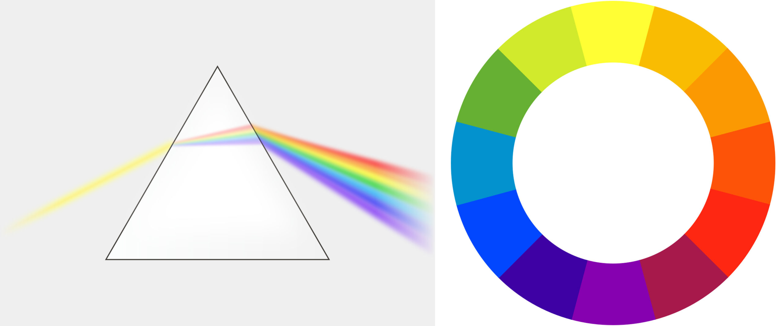
Left: a prism breaking visible light into the color spectrum; right: the color wheel
The Neo-Impressionist uses “solely pure pigments,” which Signac specifies as the colors of the “prism.” This wording already suggests a scientific basis for Neo-Impressionist color usage. In the seventeenth century the English physicist Sir Isaac Newton used a glass prism to separate white light into a rainbow. In painters’ terms, the colors of the prism correspond to the primary colors red, yellow, and blue, the secondary colors orange, green, and violet, and the tertiary colors blue-violet, blue-green, yellow-green, etc.
The Neo-Impressionists would mix these hues or “tints” only with white to produce different values or “tones” (all the gradations of blue from light to dark, for example). Above all, they avoided the muddy earth colors that dominated European painters’ palettes before the late-nineteenth century.
In their quest for pure, bright colors, the Neo-Impressionists were aided by new pigments created through chemical synthesis, as opposed to the ground-up minerals or organic matter of traditional pigments. Analysis has shown that Seurat’s palette of 1889-90 consisted of many colors that were not available before the 19th century, including chrome yellow (invented 1797), cobalt blue (1803-04), cadmium orange (1820s), french ultramarine (1826), and manganese violet (1860s).
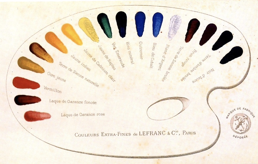
Samples of Lefranc & Company’s oil paints from 1891, painted onto a printed diagram
Brushstroke and optical mixture
The nickname “Pointillism” was given to the movement because of the artists’ tendency to paint in small dots (points in French). Signac objected to the term because it suggests a stylistic gimmick, but executing paintings in small, discrete brushstrokes was crucial to another key concept of the movement that he mentions above: optical mixture.
As any painter quickly realizes, whenever you blend two pigments, the resulting mixture is duller than either of the original pigments. This dulling effect is magnified the farther apart the colors are on the color wheel. Mixing blue and green results in a fairly bright blue-green, but mixing blue and orange creates dull grays and muddy browns.
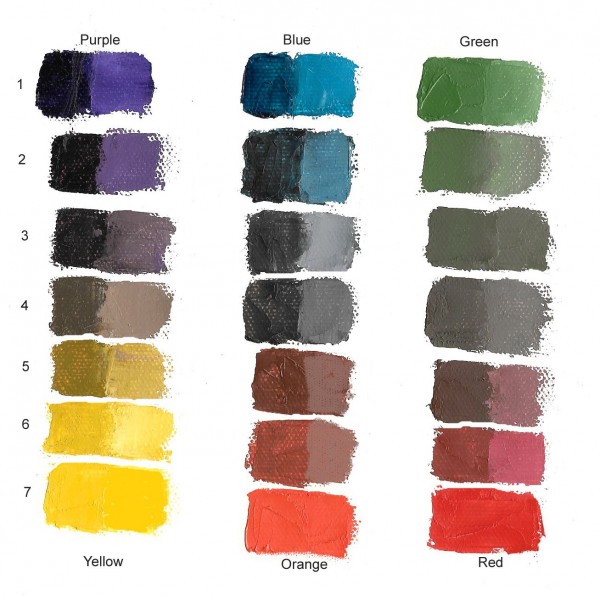
Mixing complementary colors (image: Munsell Color Blog)
Rather than mixing colors on the palette, the Neo-Impressionists would juxtapose them on the canvas in small dots. Seen from a suitable distance, these dots mix in the eye, and achieve the intended effects without losing the chromatic intensity of the original pigments.
For example, the flesh of the women in Seurat’s The Models is made up of thousands of tiny dots of colors ranging from the expected light yellows, peaches, and pinks, to surprising blues, violets, and greens. Viewed from a sufficient distance, these colors blend in the eye to create a convincing and very luminous representation of the play of light and shadow across the models’ bodies.
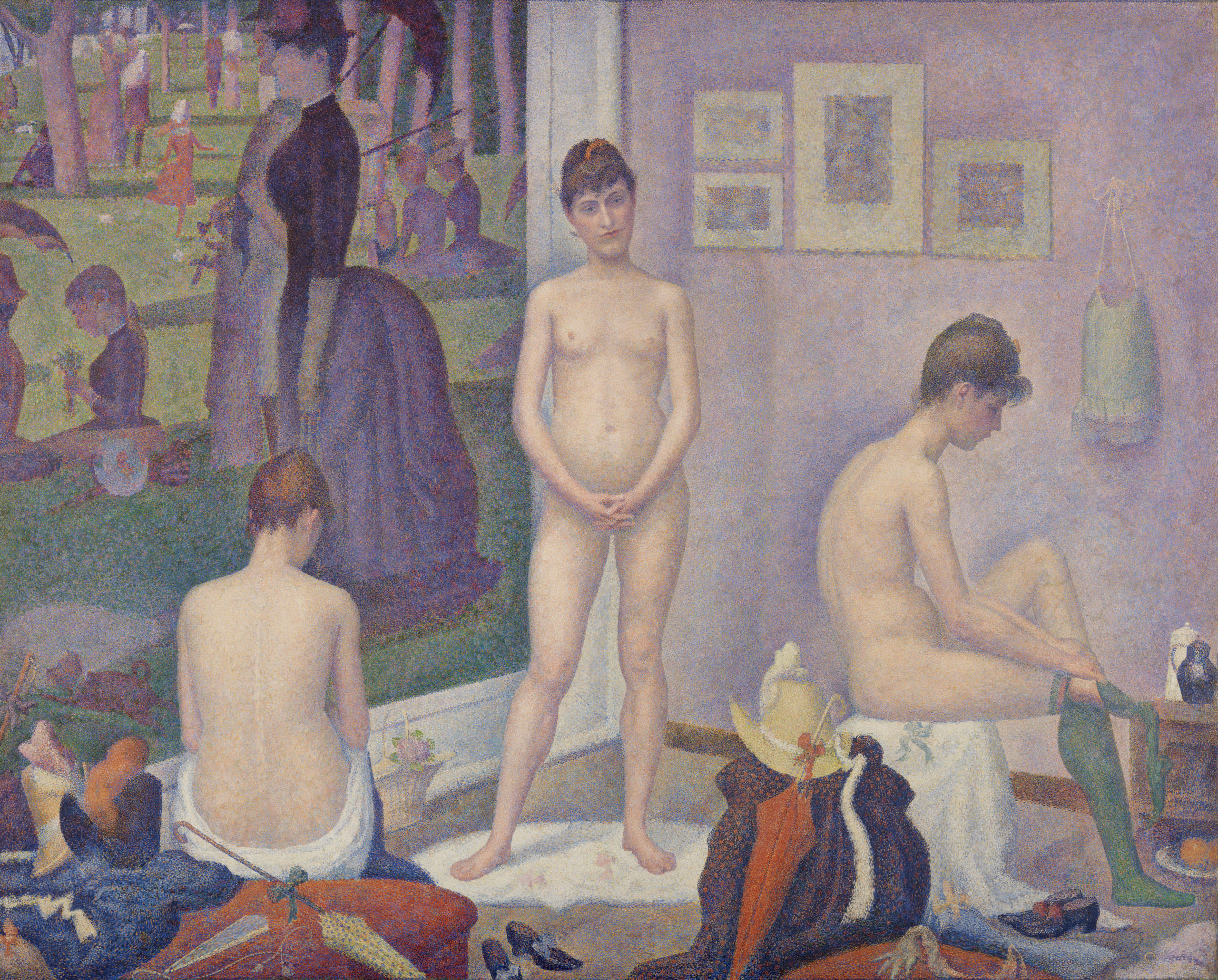
Georges Seurat, Models (Poseuses), 1886-88, oil on canvas, 200 x 250 cm (Barnes Foundation)
The dots of color must be quite small in order for optical mixture to occur, although as Signac notes, their size could vary relative to the size of the painting. A mural meant to be read from a distance of several meters could use larger dots than a small landscape meant to be viewed up close.
Local color vs. perceived color
Signac’s preferred term “division” refers to the way the artist isolates all the component influences that contribute to a given perceived color. In the excerpt above, he lists the two main components: local color and the color of the light, along with “their interactions, etc.” Local color is what we think of as the actual color of the object itself: a yellow bus, a red apple, a white shirt. But simply painting an object in its local color ignores the effects of light on the object.
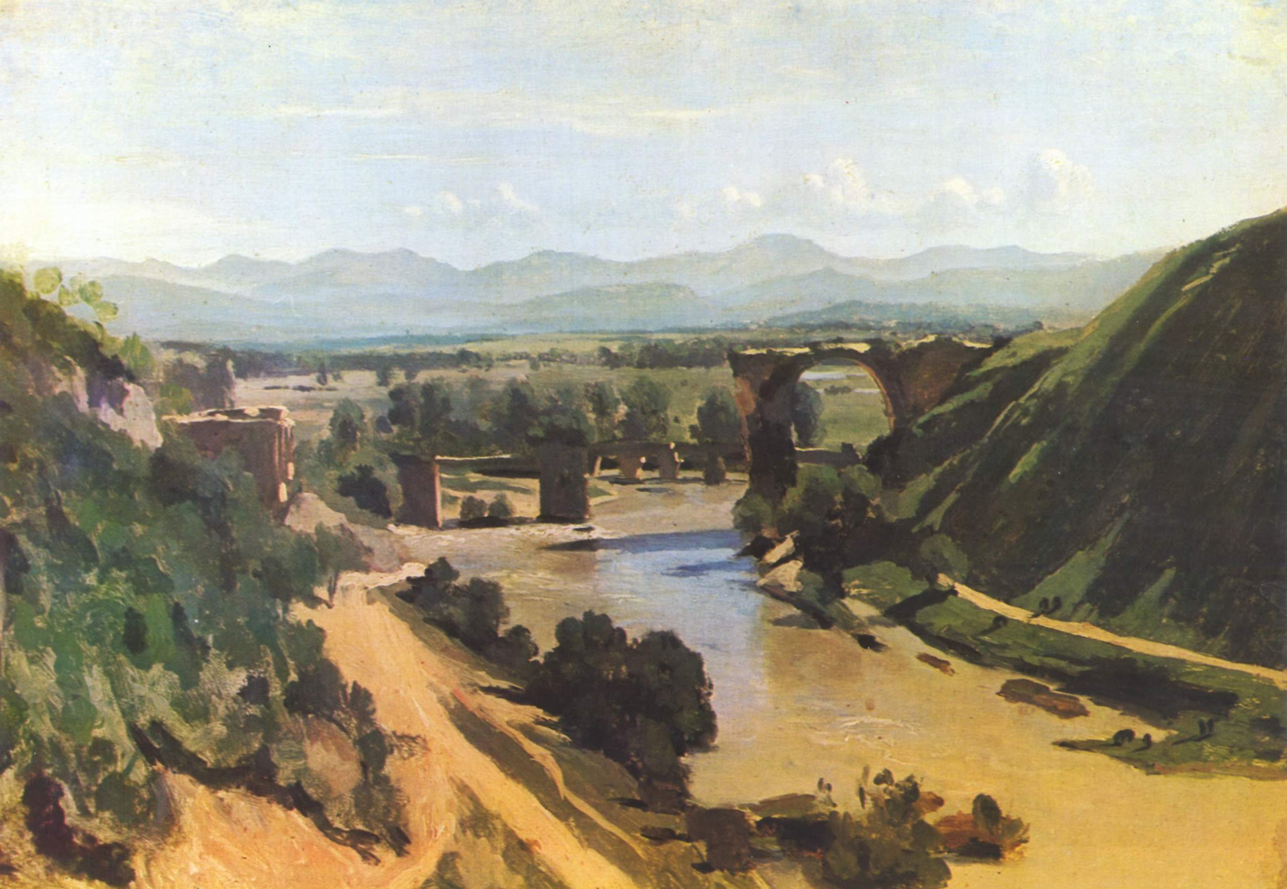
Camille Corot, The Bridge at Narni, 1826, oil on paper mounted on canvas, 34 x 48 cm (Musée du Louvre)
One of the effects of light is of course chiaroscuro: parts of the object struck by light are lighter than the parts in shadow. Camille Corot’s Bridge at Narni is a good example of a traditional landscape painted in local color and chiaroscuro. The bulk of the painting is in three basic colors: the green of the grass, the reddish tan of the dirt and bridge (and muddy water), and the blue of the sky and distant mountains. Corot has mixed darker and lighter values of each of these colors to show how the scene is affected by light coming from the sun in the upper right.
What Corot doesn’t emphasize, however, is what is called the color temperature of the light itself. A white shirt seen in a warm light will appear to be yellowish-orange, while viewed under cool light it will be tinted blue-violet.
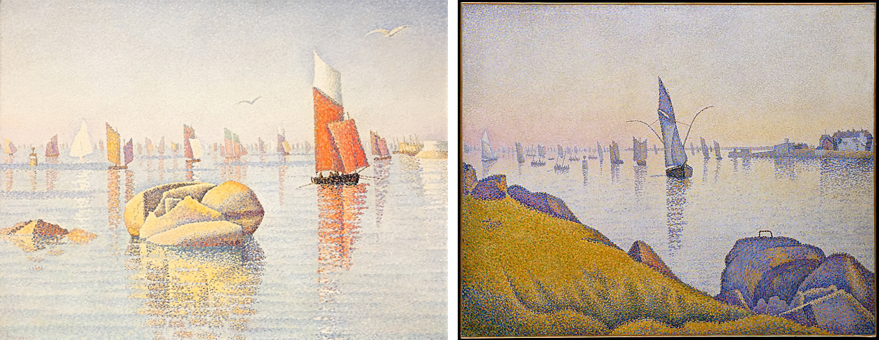
Left: Paul Signac, Morning Calm, Concarneau, Opus 219 (Larghetto), 1891, oil on canvas, 65.7 x 81.6 cm (private collection); right: Paul Signac, Evening Calm, Concarneau, Opus 220 (Allegro Maestoso), 1891, oil on canvas, 64.9 x 81.3 cm (The Metropolitan Museum of Art)
The color temperature of outdoor light is affected by the time of day, the season, and the weather. In these two paintings executed in the French coastal town of Concarneau, Signac pays close attention not just to the local colors of the objects, but also to their perceived colors — the colors that we actually see as they are affected by the temperature of the light. A palette based on orange and light blue depicts the bright, clear qualities of morning light, while a pinkish-yellow atmosphere with heavy, violet shadows conveys the effect of twilight.
Divisionism
The perceived color of any given object is the result of multiple factors, including the local color of the object, the color temperature of the light striking that object, possible reflected color from nearby objects, atmospheric perspective (which makes distant objects appear more blue-gray) and, as we shall see, the effect of “simultaneous contrast” with adjacent colors. Instead of blending all of these factors together, divisionism keeps them separate. The foreground grass in Signac’s Evening Calm includes dots of yellow and orange — the color of the light— to show how the greens are warmed by the light of the evening sun.
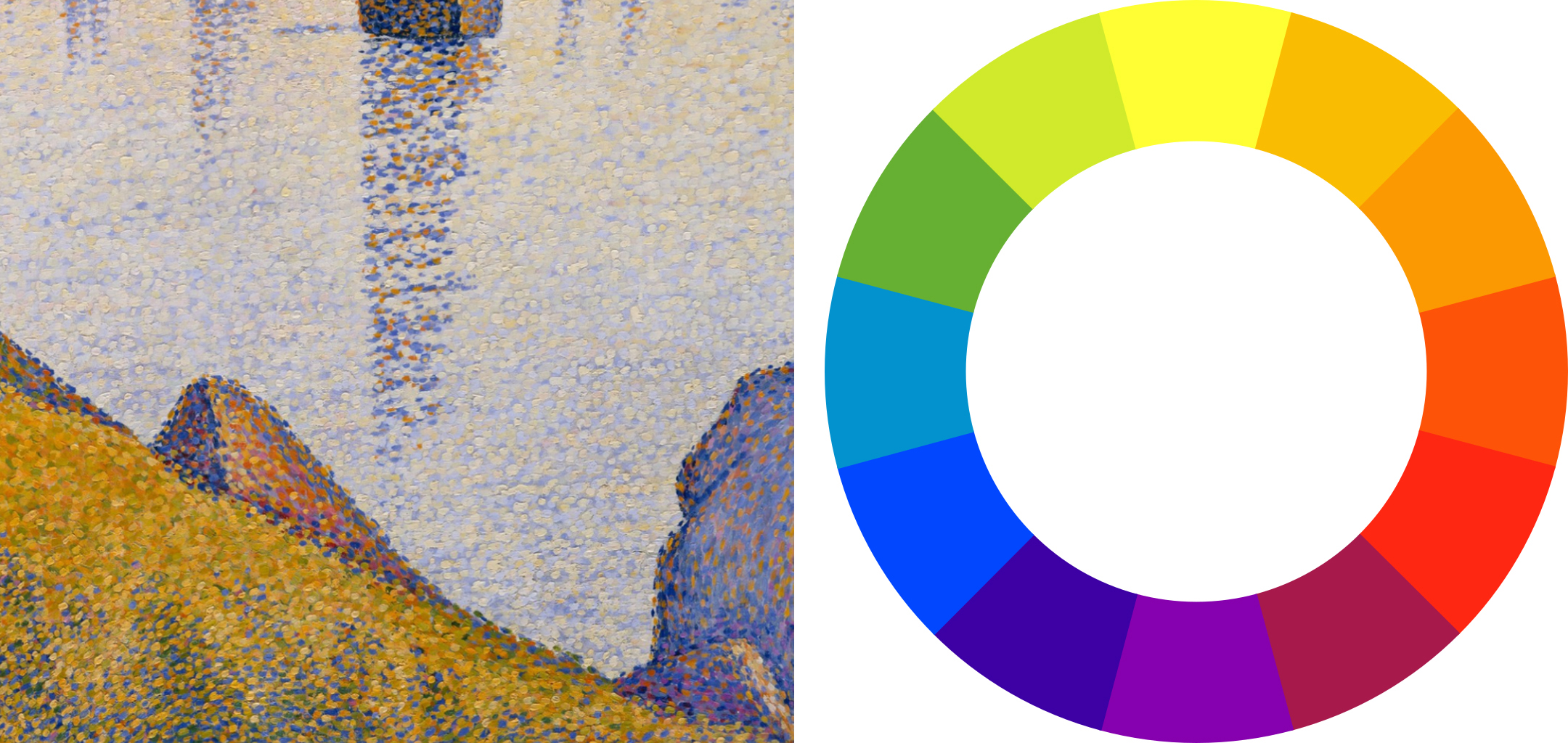
Left: Paul Signac, Evening Calm, Concarneau, Opus 220 (Allegro Maestoso), detail, 1891, oil on canvas, 64.9 x 81.3 cm (The Metropolitan Museum of Art); Right: The color wheel
In the shadowed portions of the grass, Signac intersperses the greens with dots of cerulean and ultramarine blue. This is because shadow colors are the “complement” of the color of the light. Complementary colors are colors opposite one another on the color wheel, so the yellow-orange evening light produces violet-blue shadows.
This effect is even more strongly marked in the triangular rock jutting up from the center foreground, the lit side of which is shown glowing in the sunset through dots of orange, yellow, and rose. The shadowed side is dotted with mostly dark ultramarine blue, the complement of orange, although some interspersed oranges and even crimsons show the warm reflected light received from the grass. Rather than blending these complementary colors together, which would produce a dull muddy gray, Signac keeps them separate or divided, maintaining an overall intensity of color. Despite the improbable component colors, viewed from a proper distance, optical mixture produces a very convincing overall illusion of a rock bathed in warm evening light.
The law of contrast
Signac also mentions the artist’s need to take into account “the laws of contrast, of gradation, and of irradiation.” These “laws” refer to principles of color interaction discovered by nineteenth-century theorists such as Michel Chevreul, Ogden Rood, and Charles Henry, which seemed to promise that the entirety of art could be subsumed to rigorous scientific principles.
Chevreul’s most famous contribution to color theory is the “law of simultaneous contrast,” which takes account of how our perception of color changes relative to adjacent colors. Look at how different the same color swatch of blue appears against a field of bright green versus a field of dull orange, for example.
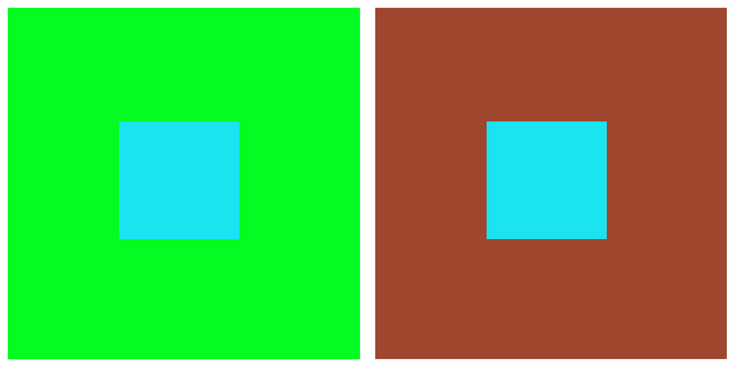
Demonstration of the effect of simultaneous contrast
The general form of the law of simultaneous contrast is that two juxtaposed colors will appear maximally different from one another. Thus the blue appears both darker and duller when it is seen in a field of light, high-chroma yellow-green on the left, and it appears lighter and higher in chromatic intensity when seen against a field of dark, dull orange on the right.
Viewed against a white field, a swatch of color will actually gain a “halo” of its complementary color as a result of this effect. For example, if you gaze at the green swatch without focusing for several seconds, you will begin to see magenta edges emerge around it.
Georges Seurat, Models (Poseuses), 1886-88, oil on canvas, 200 x 250 cm (Barnes Foundation)
Seurat records this effect in his painting The Models. Notice how the seated model on the right has a dark, violet-blue halo around the light orange flesh of her back, and a light halo against the dark blue-violet shadowed side of her stomach and upper arm. This natural “irradiation” effect is exaggerated by Seurat in order to help intensify colors and values by juxtaposition with their opposites through simultaneous contrast.
Color perception, color harmony, color expression
We have concentrated here on how the Neo-Impressionists used color theory to help duplicate perceptual effects. They employed divisionism to keep their paintings as luminous as possible while recording how perceived color is affected by factors such as the temperature of the light, reflected color, and simultaneous contrast with adjacent colors.
The aims of the Neo-Impressionists went beyond perceptual accuracy to also include the purely aesthetic effects of color: how they can be used to create pleasing color harmonies based on certain principles. Signac’s “laws of contrast and gradation” evokes two of these principles: “gradation” is the aesthetic harmony produced by gentle transitions between largely analogous colors, and “contrast” is produced by the sharper juxtaposition of opposites. Later works by Signac seem more concerned with such harmonies than with perceptual accuracy.
The Neo-Impressionists also recognized that color has expressive effects. Signac claimed that “joy” is evoked by paintings with dominant warm and light tones, while “sorrow” is evoked by dominant cool and dark colors. [2] Ideally, a Neo-Impressionist painting will take into account all three qualities: perceptual accuracy, formal harmony, and emotional expression. The artists believed that all of these were susceptible to rigorous scientific laws that were just being recognized and systematized in their period.
Notes:
- Paul Signac, From Eugene Delacroix to Neo-Impressionism, as translated in Linda Nochlin, ed., Impressionism and Post-Impressionism, 1874-1904: Sources and Documents (Englewood Cliffs, N.J.: Prentice-Hall, 1966), p. 118. This passage is very close to Georges Seurat’s own formulation of his method in a letter to Maurice Beaubourg of August 28, 1890: “The means of expression is the optical mixture of tones and colors (both of local color and of the illuminating color–sun, oil lamp, gas lamp, etc.), i.e., of the lights and their reactions (shadows) according to the laws of contrast, gradation, and irradiation” (in Nochlin, ed., p. 114).
- Ibid., p. 121.
Additional resources: