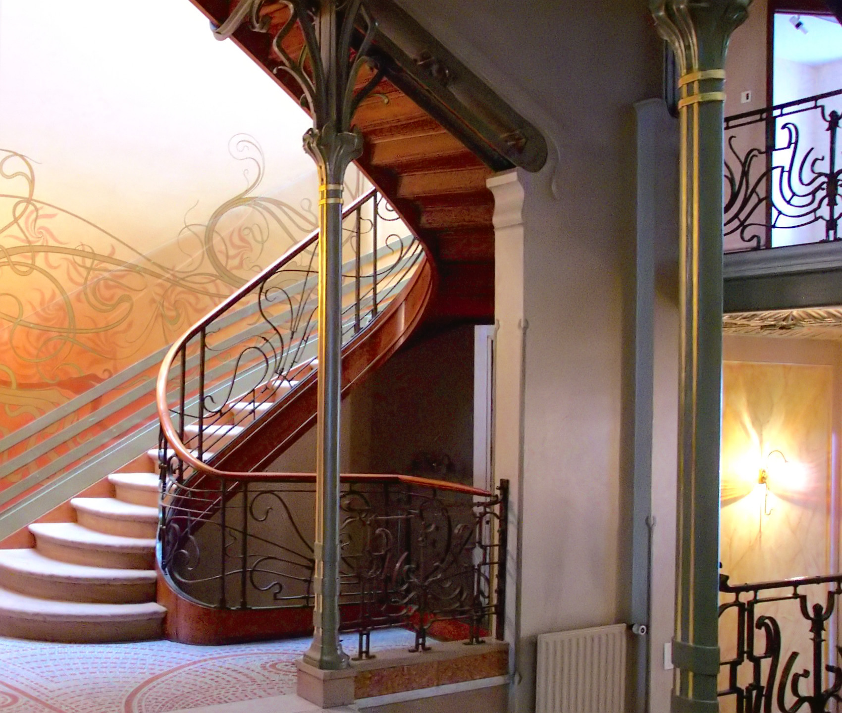
Victor Horta, Tassel House, Brussels, 1893 (photo: Henry Townsend, CC0)
Victor Horta’s Tassel House in Brussels is one of the earliest examples of the Art Nouveau style. Horta designed the building’s architecture and every detail of the interior decoration and furnishings, making the house into a Gesamtkunstwerk, or total art work in multiple media. The repeated use of organically curved, undulating lines — often called whiplash lines — unifies the design, repeating in the floor tiles, wall painting, ironwork, and even in the structure of the spiraling staircase and surging entryways.
A modern style using modern materials
Art Nouveau artists and designers created a completely new style of decoration, rejecting the widespread nineteenth-century practice of copying historical, and especially Classical and Medieval, forms. While each designer invented their own decorative motifs, organic, often plant-based, forms and the whiplash line became hallmarks of Art Nouveau design, appearing in multiple media and contexts.

Victor Horta, Horta House, detail of column (photo: public domain)
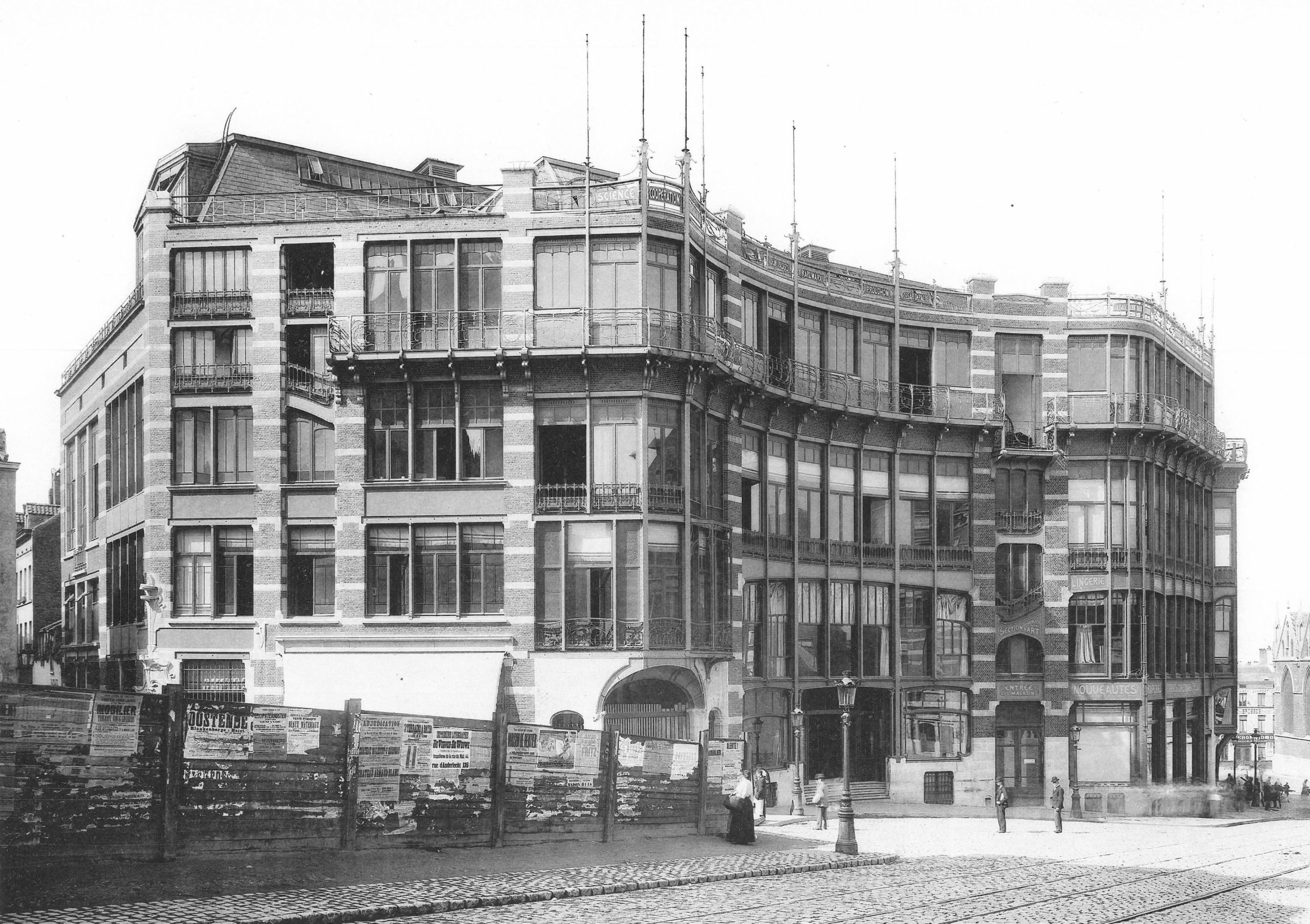
Art Nouveau architects and designers also embraced modern building materials, notably cast iron. Cast iron is both stronger and more flexible than traditional wood or stone and allows for much thinner supports, like the slender columns in Horta’s own house. Iron support structures also made it possible to create curved facades with large windows, which became prominent elements in many Art Nouveau buildings, including Horta’s Maison du Peuple.
An international style
Art Nouveau is only one of many names given to this international fin-de-siècle style, which had many regional variations. The term (French for “New Art”) derives from La Maison de L’Art Nouveau, the Paris art gallery run by Siegfried Bing, who was a major promoter of the new style, as well as of Japonisme and the Nabis. In addition to marketing individual objects, Bing commissioned artists and designers to create model rooms in his gallery to display Art Nouveau ensembles that included furniture, wallpaper, carpets, and paintings.
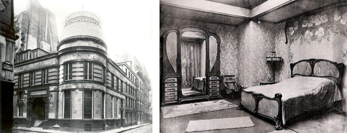
Left: Siegfried Bing’s Maison de l’Art Nouveau, Paris (demolished); right: Eugène Gaillard, Bedroom for the Pavillion de l’Art Nouveau Bing, 1900
In addition to Paris, major centers of the modern fin-de-siècle style included Brussels, Glasgow, Munich (where it was known as Jugendstil or Youth Style), and Vienna (where it was called Secession Style). Barcelona’s Catalan Modernism, especially Antoní Gaudí‘s architecture and decorative designs, is also closely related to Art Nouveau.
Luxury design for the masses
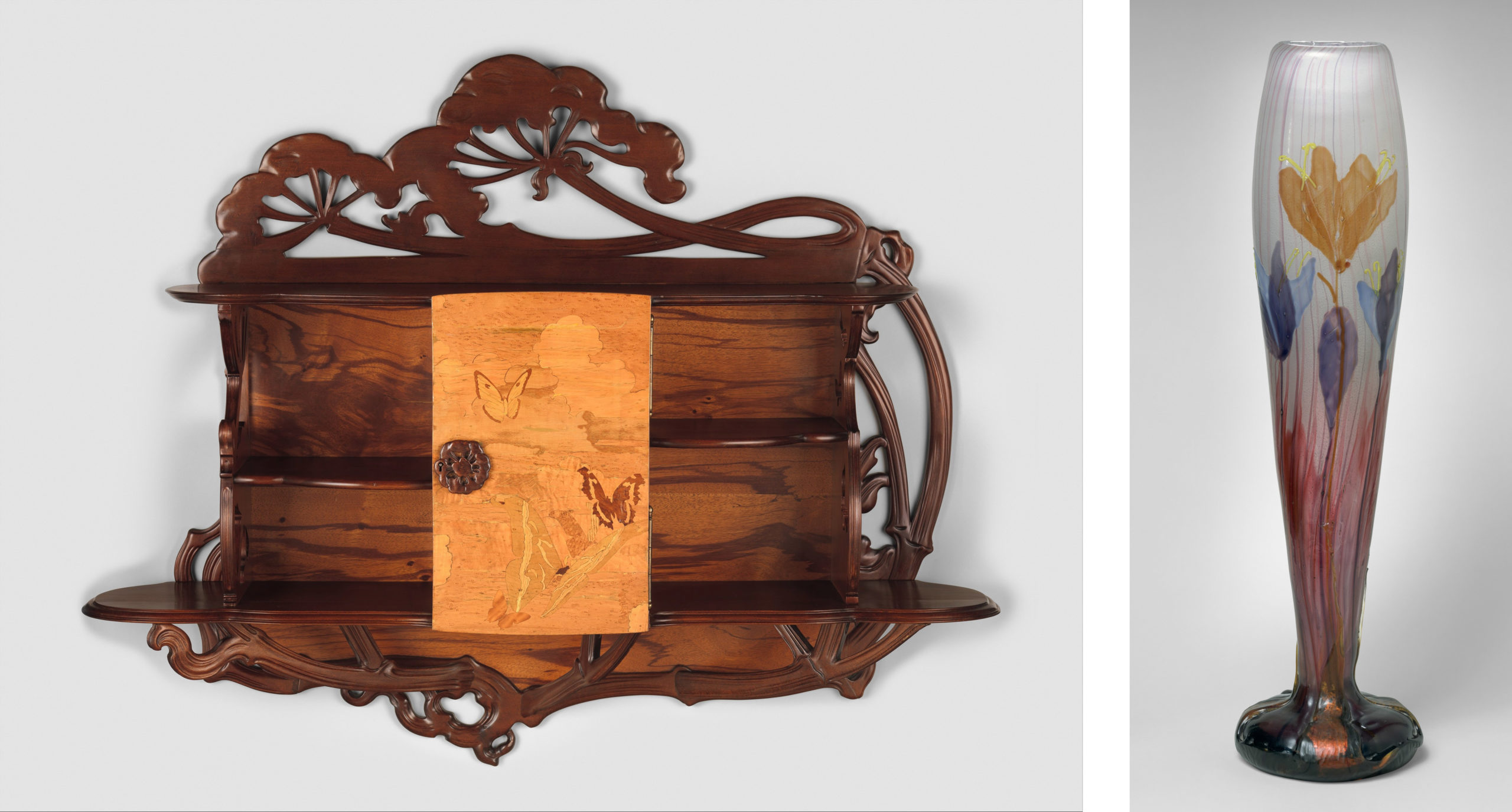
Left: Emile Gallé, “Ombellifères” Cabinet, c. 1900, various woods, 40 x 49 ½ x 12 inches (The Metropolitan Museum of Art, New York); Right: Emile Gallé, Autumn Crocus Vase, c. 1900, glass, 17 3/8 x 3 ¾ inches (The Metropolitan Museum of Art, New York)
French Art Nouveau was linked to government-supported efforts to expand the decorative arts and associated craft industries. Private residences and luxury objects were the focus for many Art Nouveau designers, including Emile Gallé, who made both decorative glass and furniture. Despite the close association of Art Nouveau with luxury items, the style is also apparent in urban design, public buildings, and art for the masses. Horta’s Maison du Peuple was the center for the socialist Belgian Workers’ Party, and among the most famous examples of Art Nouveau style are Hector Guimard’s entrances to the Paris Metro, the city’s new public transportation system.
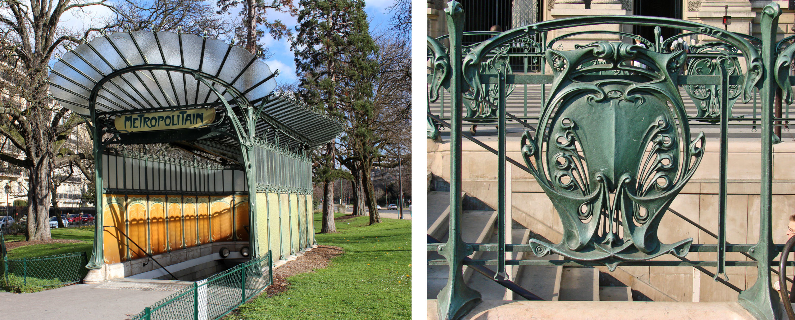
Left: Hector Guimard, Porte Dauphine, Metro entrance, 1900, Paris (photo: Chabe01, CC BY-SA 4.0); Right: Hector Guimard, Metro ironwork, detail (photo: Jean-Pierre Dalbéra, (CC BY 2.0)
Like Horta’s designs for the Tassel House, Guimard used cast iron and invented stylized motifs based on plant forms. Industrially fabricated in modular units, the cast iron was relatively cheap, but it was painted green to resemble oxidized copper, a much more expensive material that adds a sense of luxury to the elaborate entrances. The use of modules made it possible to individualize each station while maintaining stylistic unity throughout the city.
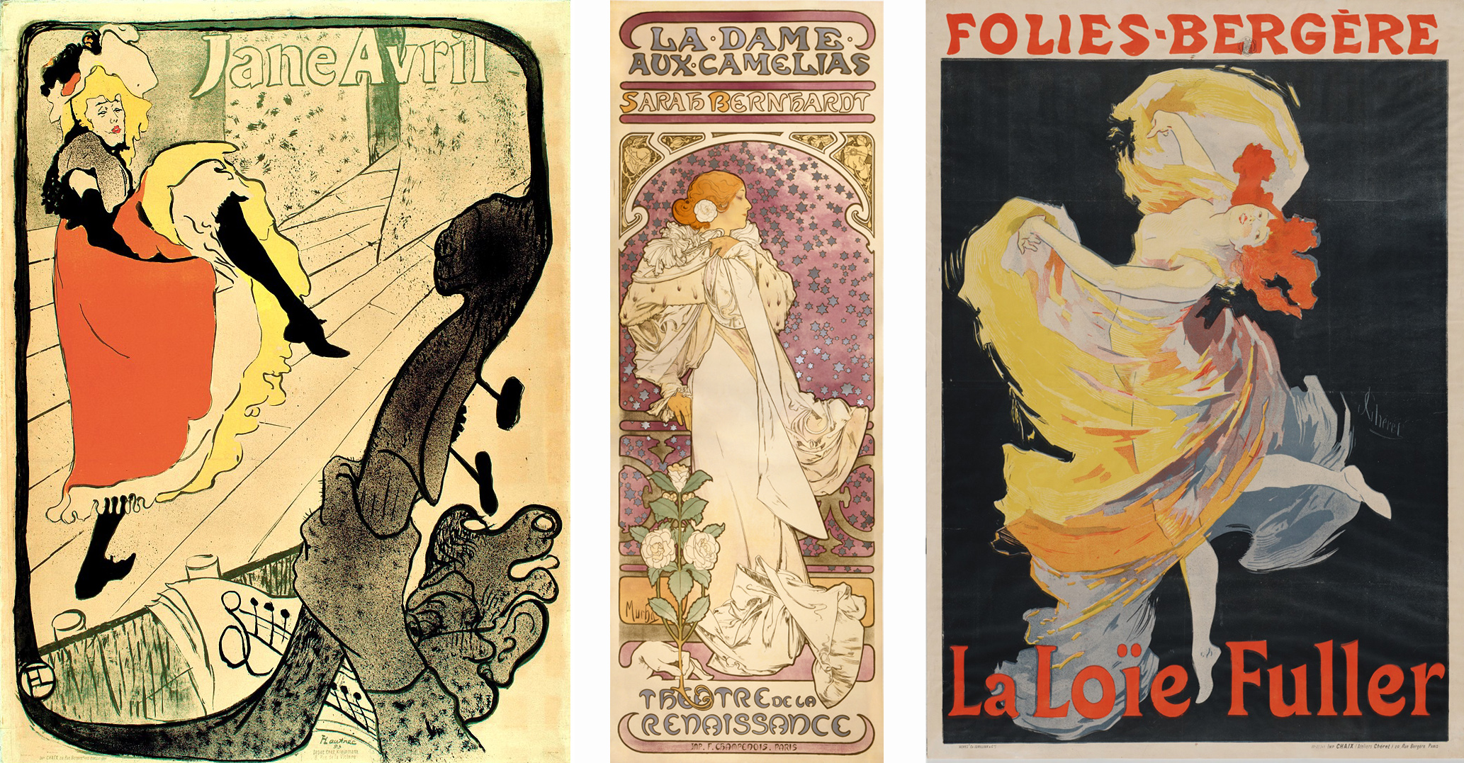
Left: Henri de Toulouse-Lautrec, Jane Avril, 1893, lithograph, 129.1 x 93.5 cm (The Metropolitan Museum of Art, New York); Center: Alphonse Mucha, La Dame aux Camelias, 1896, lithograph, 207.3 x 72.2 cm (Library of Congress); Right: Jules Chéret, La Loïe Fuller, 1893, lithograph, 123.2 x 87.6 cm (MoMA)
Art Nouveau designs were also widely visible in the advertising posters that decorated Paris. Henri de Toulouse-Lautrec, Alphonse Mucha, and Jules Chéret depicted famous fin-de-siècle performers such as Jane Avril, Sarah Bernhardt, and Loïe Fuller. Their posters stylized the female body and used sinuous whiplash lines, decorative plant forms, and flattened abstract shapes to create vivid decorative images.
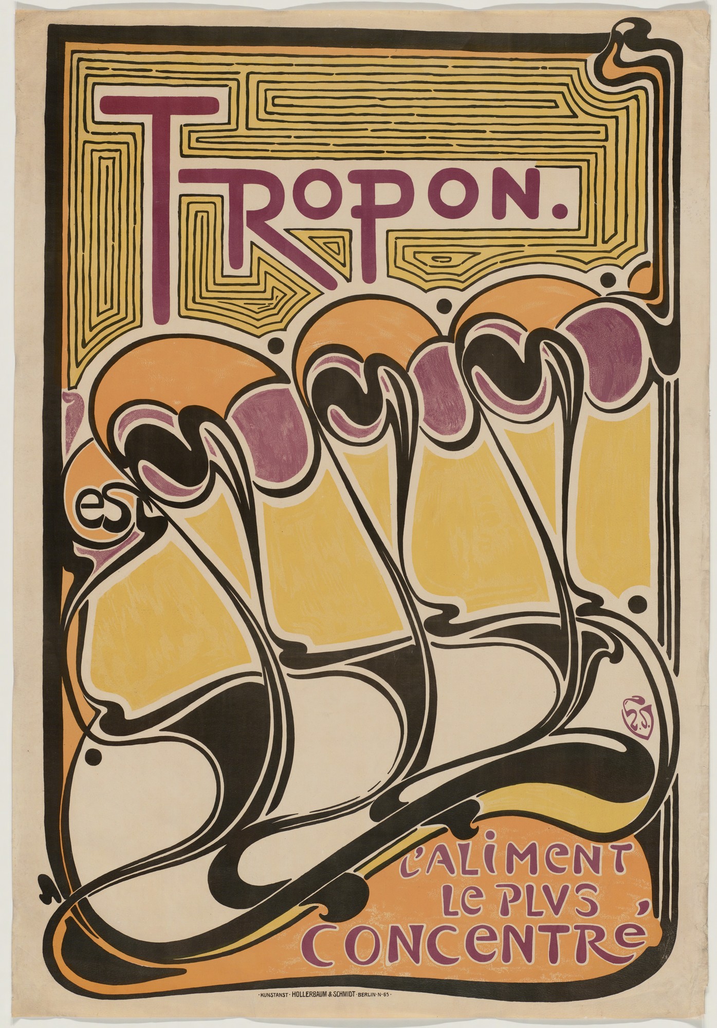
Henry van de Velde, Tropon poster, 1899, lithograph, 44 x 30 3/8 inches, (MoMA)
In a poster for the nutritional supplement Tropon, Henry van de Velde explored the decorative and suggestive potential of non-representational forms, using the whiplash line to create an abstract design of organic shapes that suggest both plant-like growth and dancing figures in the rising diagonal of repeated forms.
A holistic approach
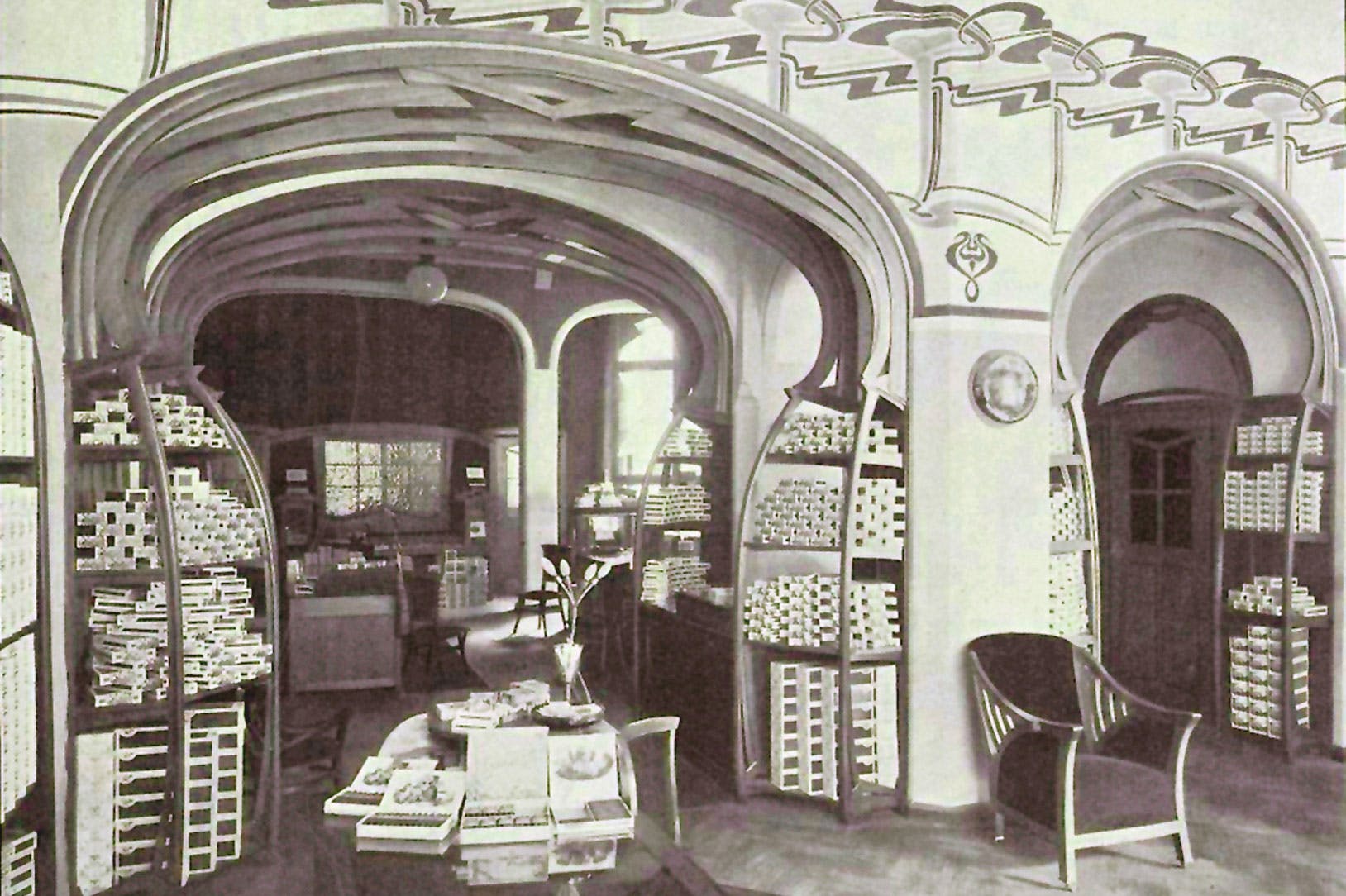
Van de Velde worked in many different media, designing buildings, interiors, furniture, and decorative objects as well as posters. In the Continental Havana Company building in Berlin he used sinuous curves to integrate the shelving, doorways, alcoves, furniture, and walls into a unified organic whole.
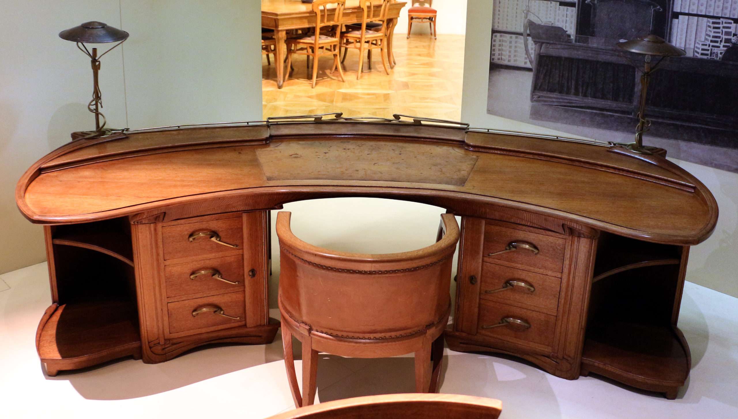
Henry van de Velde, Desk, c. 1899, oak, gilded bronze, copper and leather,128 x 268 x 122 cm (Musée d’Orsay, photo: Sailko, CC BY 3.0 )
The English designer William Morris and the English Arts and Crafts Movement that he initiated were a key influence on van de Velde and many other designers associated with Art Nouveau. Morris promoted a holistic approach to interior decoration as well as advocating for the social importance of design and high quality craftwork. In 1907 van de Velde founded the School of Arts and Crafts in Weimar, Germany, which promoted similar values. It later became the famous modern art and design school, the Bauhaus, which maintained the tradition of integrating art, craft, and design for the improvement of society.
Glasgow style
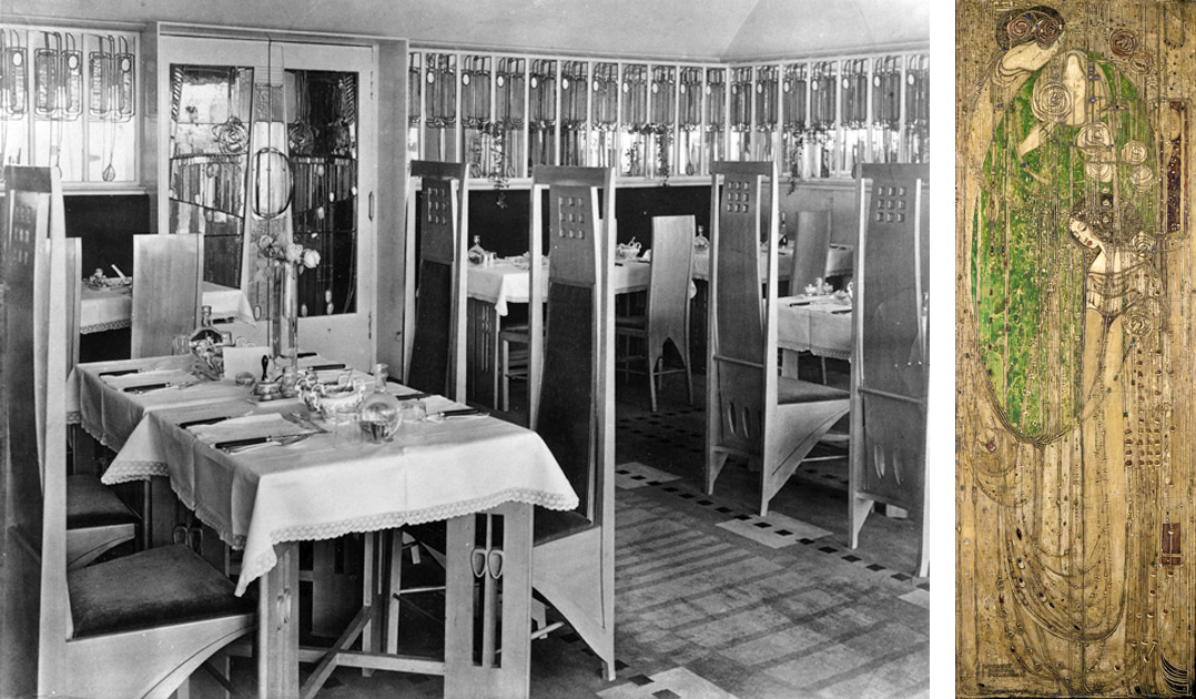
Left: Charles Rennie Mackintosh, Room de Luxe, Willow Tea Room, Glasgow, 1903; right: Margaret Macdonald, O ye, all ye that walk in Willowwood, decorative panel for Willow Tea Room, 1903, gesso and beads on burlap, 164 x58 cm (Kelvingrove Art Gallery and Museum, Glasgow)
Curving whiplash lines are a common characteristic of French and Belgian Art Nouveau, but architects and artists working in Glasgow developed a more rectilinear style exemplified by the Willow Tea Room. Charles Rennie Mackintosh and Margaret Macdonald designed every component of the tea room, including the architecture, stained glass, decorative panels, furniture, cutlery, and staff uniforms. In keeping with Art Nouveau artists elsewhere they developed original stylized design motifs based on plant forms, but theirs were rigidly contained within elongated rectangles rather than expanding into supple curves.
Vienna Secession style
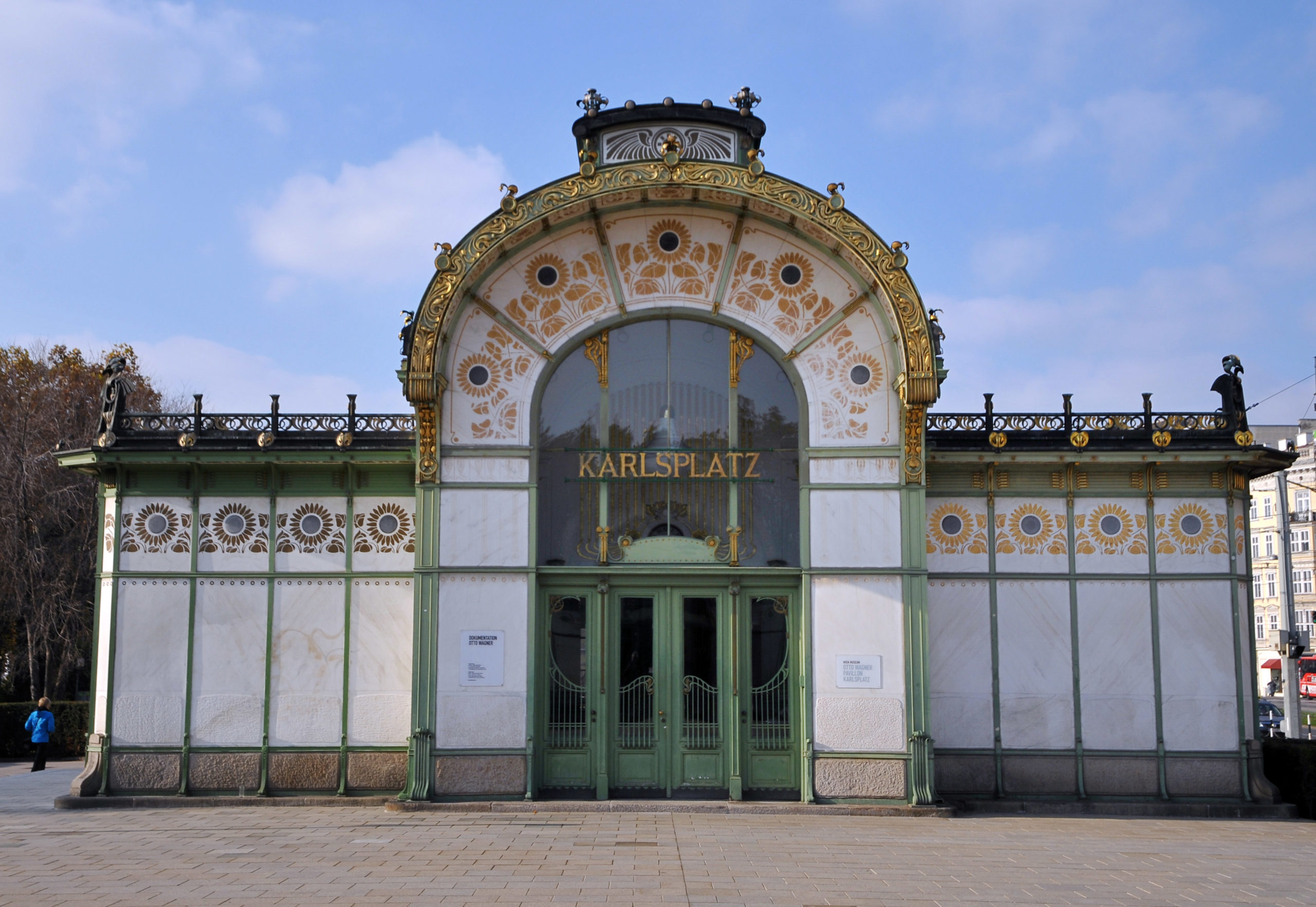
Otto Wagner, Karlsplatz Station, Vienna, 1899 (photo: Böhringer Friedrich, CC BY-SA 3.0 AT)
The Viennese Secession style also combined strict geometric forms with stylized organic decoration. Like Guimard’s entrances to the Paris Metro, Otto Wagner’s stations for Vienna’s public transportation system displayed the city’s modernity and wealth in their iron construction and their luxurious gold sunflower-motif decoration.
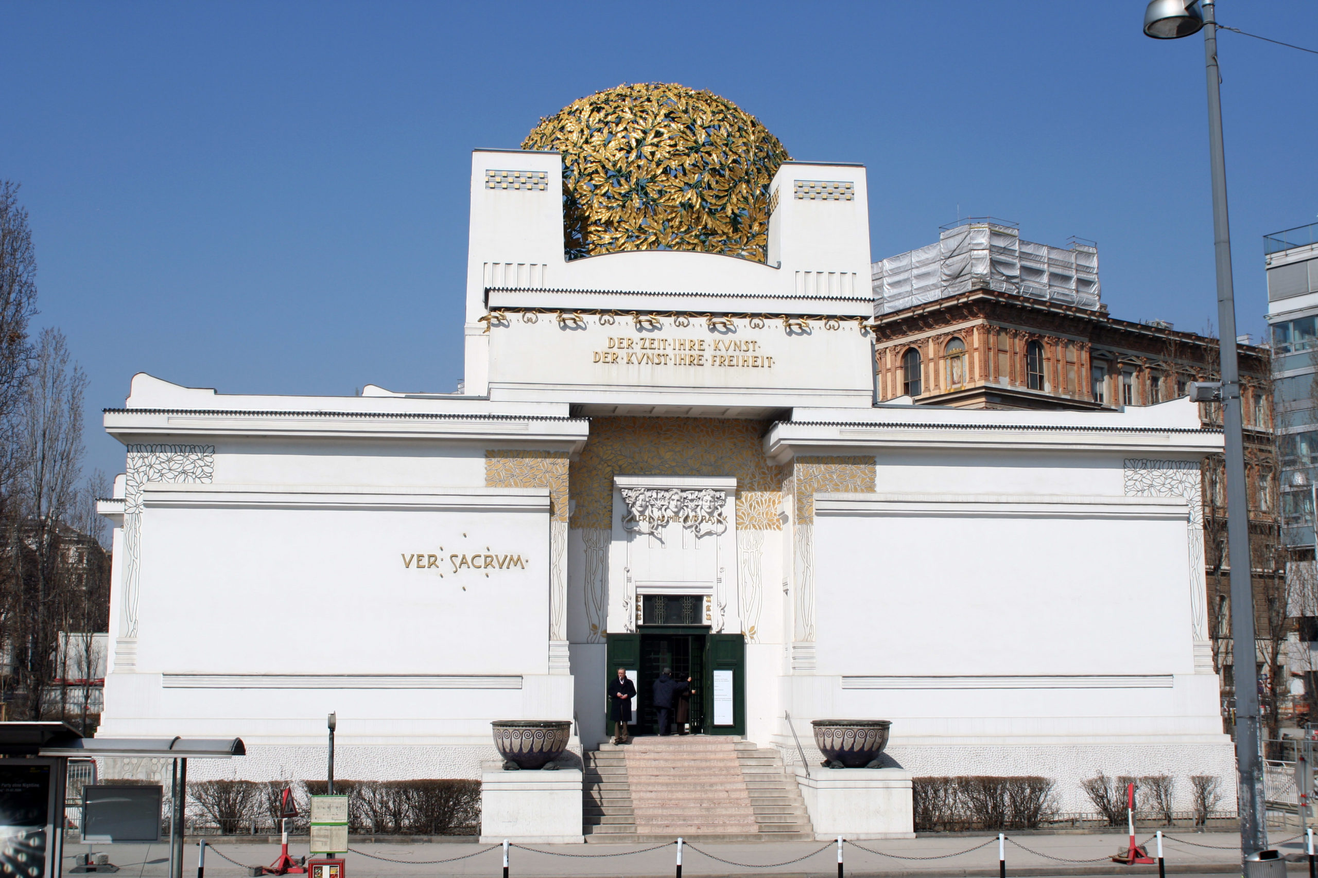
Joseph Maria Olbrich, Secession Building, Vienna, 1898 (photo: Thomas Steiner, CC BY-SA 3.0)
Joseph Maria Olbrich’s Secession Building proclaimed the goals of the rebellious group of artists who seceded from the Austrian art establishment in order to embrace avant-garde modern art. They displayed their work inside Olbrich’s building as well as hosting international exhibitions of modern art. The stylized decoration of the building is based on plant forms, while the structure emphasizes the harmonious balance of basic geometric shapes.

Gustav Klimt, Choir of Angels from the Beethoven Frieze, 1902, casein, stucco, gold, and semi-precious stones on plaster (Secession Building, Vienna)
The leader of the Vienna Secession, Gustav Klimt, decorated the interior walls of the main exhibition hall with a long decorative mural dedicated to Ludwig von Beethoven. The Beethoven Frieze combines naturalistic representation of the human body, stylized figures, and complex abstract patterns in a variety of materials. Gold leaf and semi-precious stones enhance the decorative quality of the surface, making it a dramatic union of luxurious ornament and figurative painting.
Art Nouveau was fashionable for only a brief period around the year 1900, but the movement was part of a long-term modern trend that rejected historicism and Academicism and embraced new materials and original forms. In the modern period artists and designers increasingly recognized that the health and well-being of society and all its members were supported and enhanced by well-designed objects, buildings, and spaces. The unified designs of Art Nouveau presaged the innovations of the Bauhaus as well as architects such as Frank Lloyd Wright and Le Corbusier.

