
Main text of a Tang Dynasty copy of Wang Xizhi’s Lantingji Xu (Orchid Pavilion Preface) by Feng Chengsu (馮承素). Throughout Chinese history, many copies were made of the Lantingji Xu, which described the beauty of the landscape around the Orchid Pavilion and the get-together of Wang Xizhi and his friends. The original is lost. This Tang copy made between 627–650 is considered the best of the copies that has survived (Palace Museum in Beijing)
Art of the line
Calligraphy is the world’s oldest abstract art—the art of the line. This basic visual element can also hold a symbolic charge. Nowhere has the symbolic power of the line manifested itself more fully than in Chinese calligraphy, a tradition that spans over 3,000 years. The aesthetics of calligraphy are important to the history of art in East Asia, where during much of its premodern era classical Chinese was the lingua franca (or common language).
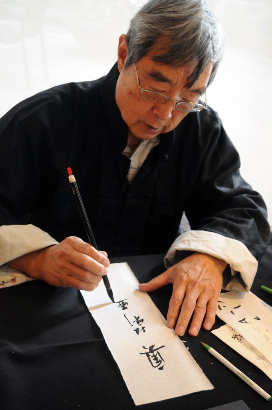
Chinese calligrapher at Lunar New Year event, Trammell & Margaret Crow Collection of Asian Art, Dallas, Texas, 2 February 2013 (photo: Joe Mabel, CC BY-SA 3.0)
Knowing how to read and write Chinese characters is not a prerequisite for appreciating the unique charm of calligraphy. The characters are fundamentally ideographic in nature, meaning they can symbolize the idea of a thing rather than transcribe its pronunciation. A calligrapher wields a pliant brush, dips its tip fashioned with animal hair into ink made from grinding on an ink stone with water, and writes on paper or silk that could have different absorbency rates depending on how it has been treated. Brush, ink, ink stone, and paper are collectively referred to as the “Four Treasures of the Study” 文房四寶.
A capable calligrapher can achieve a surprisingly wide and rich array of artistic effects that eloquently convey the personality of the artist and the ambience of the moment of inspiration. The responsiveness of the pliant brush lends itself to registering the subtle changes in pressure, direction, and speed in the force transmitted from the shoulder of the calligrapher, to his arm, wrist, and finally fingertips. This accounts for calligraphic brushstrokes’ unique facility in capturing with great vividness and immediacy the kinetic energy that coursed through the calligrapher’s body during the creation process.
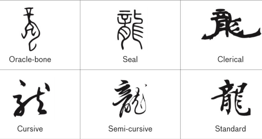
The 5 major calligraphic scripts that developed in China. This diagram shows the character for dragon (long) (Asian Art Museum)
The vocabulary of calligraphy
There are five major script types used today in China. In the general order of their appearance, there are: seal script, clerical script, cursive script, running script, and standard script. Each script type has its own defining visual traits and lends itself to different kinds of textual content and function. Being able to recognize these five script types constitutes the first step in understanding Chinese calligraphy and its nuanced visual vocabulary. As the calligrapher chooses the script type that best suits the occasion of writing and his mood, being able to discern the differences between these types amounts to possessing the key to deciphering the calligrapher’s mind at the moment of creation. An additional reason is that calligraphies had been historically categorized by script type rather than by the content of the text, a fact that highlights the primacy of the visual form in the critical conversations associated with this art.
It is also possible to have more than one script type in the same work of art, usually in the form of colophons (on handscrolls) or inscriptions (on hanging scrolls), as the calligrapher who appended his comments to the original work felt compelled to use a particular type of script.

Seal script title at the start of The Night Revels of Han Xizai 韓熙載夜宴圖, handscroll by Gu Hongzhong 顧閎中. Five Dynasties period, 10th century (Palace Museum, Beijing)
Seal script—the first script type to emerge in this sequence—was solidified during the Qin dynasty (221–207 B.C.E.). The seal script signified authority, permanence, and orthodoxy, qualities befitting of the first imperial dynasty that unified China and standardized the writing system. Arranged in orderly columns, each character fits in an imaginary square. The strokes are of relatively even thickness, and the speed of execution is steady and slow. The solemnity of the seal script made it (and still makes it) a popular choice for commemorative titles carved onto the head of stone steles for public display or in frontispieces that announce the title of a handscroll painting. Even though this script type was most associated with the short-lived Qin dynasty, it served as the script of choice for titles of artworks such as a 10th-century masterpiece, called The Night Revels of Han Xizai, that documented a sumptuous party at a court minister’s house.
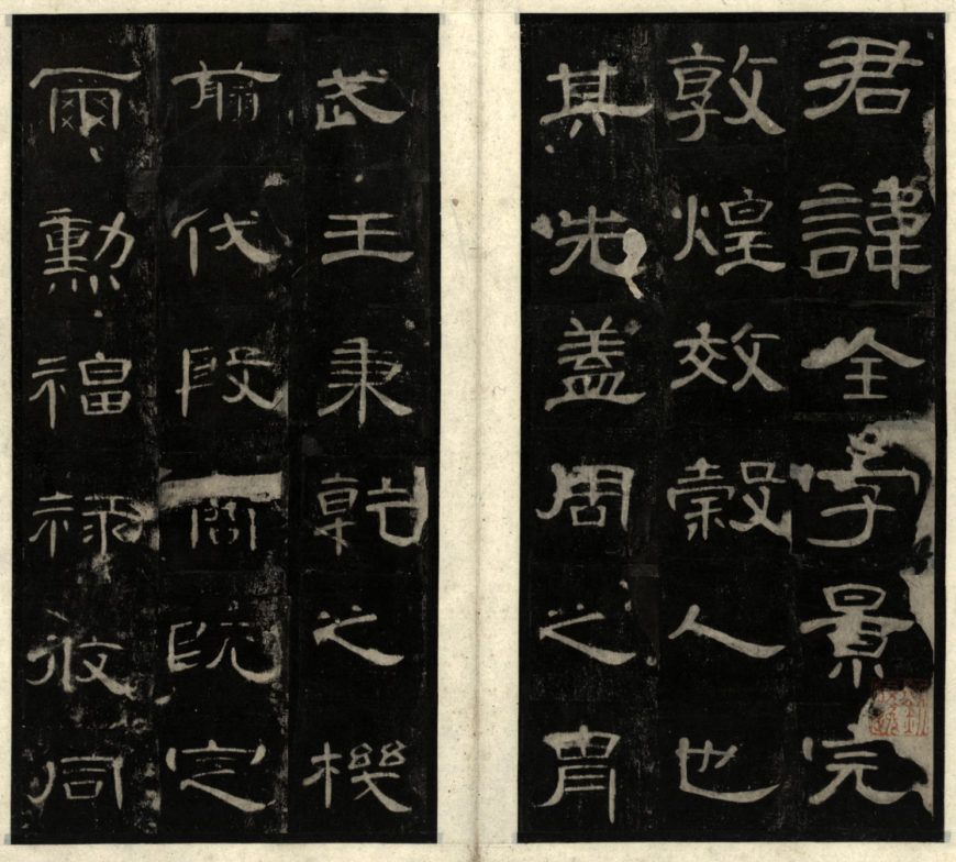
An example of clerical script. Rubbing of the Cao Quan stele (Cao Quan bei 曹全碑), detail, Eastern Han dynasty, 185 C.E. (National Library of China)
Clerical script reached its height in the Eastern Han dynasty (25–220 C.E.). The character in general has a squatter silhouette when compared to its predecessor the seal script, introducing the possibility for greater rhythm in the composition. The strokes start displaying modulations and inflections (note the elegant flaring brush movement in the horizontal strokes), reflective of the different amount of pressure in the brush. This marks the calligrapher’s conscious exploration of the brush’s expressive potential. Clerical script takes less time to write than seal script, and it likely emerged out of a need for more efficient record keeping demanded by an expanding empire (the territory of the Han dynasty was much larger than that under the Qin). The name for the script also suggests that it was initially used by government clerks. The clerical script is popular for commemorative texts carved into stone steles, such as we see on the Cao Quan stele.

An example of cursive script. Huaisu 懷素, Autobiography (Zixu tie自敘帖), detail, Tang dynasty, 8th century (National Palace Museum of Taipei)
Cursive script is the most expressive of all five script types; it affords a calligrapher remarkable freedom thanks to this script’s relaxation of the orthographic constraints of the seal and clerical scripts. Essentially an informal shorthand of the more complex forms of characters, cursive script was widely seen in epistolary writing (correspondence by letter), due to the expedient nature of its execution. Because the characters are more simplified, more freedom is allowed on the calligrapher’s part to improvise and to take more liberty with the shape of the character. Since its maturation in the 4th century, the cursive script has been the choice for many master calligraphers to demonstrate their individuality. Calligraphy done in cursive script readily reveals the speed in which each character was brushed, sometimes so fast that two or more characters are interconnected by ligatures (the fusion of the final stroke of the first character into the first stroke of the second). Some of the most renowned cursive calligraphers were Buddhist monks who often were most inspired in a state of inebriation. Historically, some of the most famous cursive calligraphers were Chan monks, as the expressivity of the cursive script lends itself well to the unrestricted spirit associated with Chan Buddhists. Buddhist monasteries were important centers of learning in premodern China.
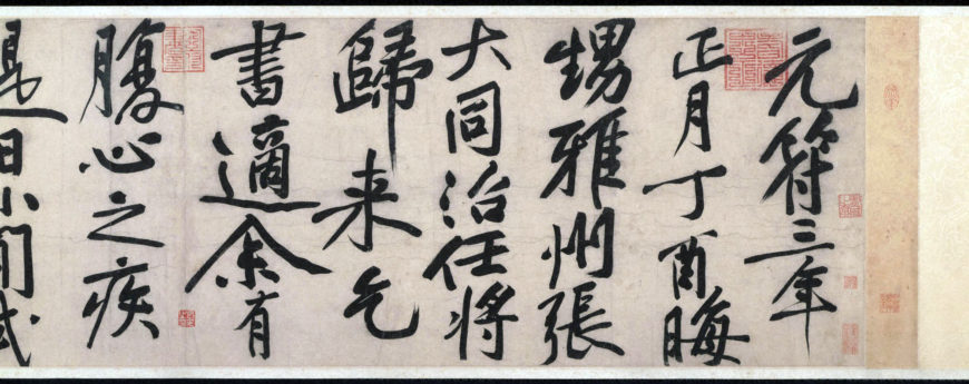
A example of running script. Huang Tingjian 黃庭堅, detail of scroll for Zhang Datong (Zhang Datong tie 張大同帖), (1045–1105), Northern Song dynasty (Princeton Art Museum Collection)
Running script combines the legibility of standard script and the expressivity of cursive script. The Song dynasty (960–1279 C.E.) with its literati calligraphers (scholar officials who obtained government posts after passing the civil service examination) saw a flowering of calligraphy in running script. This script became the preferred one for the greatest Song calligraphers because it lends itself to the trend at the time towards more personal—even idiosyncratic—styles. Calligraphy in this script type allows a wide range of speed in the execution of the strokes, and gives the calligrapher an opportunity to demonstrate familiarity with great calligraphers of the past. The Chinese calligrapher derives artistic legitimacy by demonstrating mastery of a repertoire of calligraphic styles that constitute the canon of Chinese calligraphy.
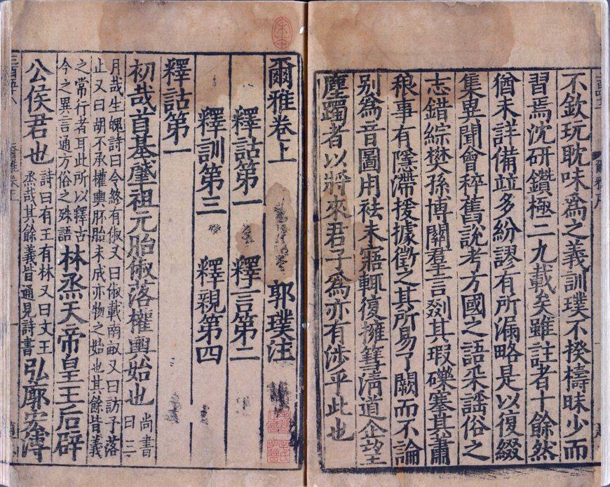
An example of standard script. Erh-ya, annotated by Kuo P’u (Chin Dynasty), Southern Song (1127-1279) (Imprint by the Directorate of Education, National Palace Museum, Taipei)
Standard script—the script type that most learners of Mandarin today encounter first during their studies—appeared the latest in the evolutionary sequence of Chinese calligraphy. Standard script reached its zenith during the Tang dynasty (618–907 C.E.) and it is associated with the moral uprightness of the calligrapher, due to its emphasis on the balance around a central axis in its form. It is the ubiquitous script for almost all kinds of printed media in the Chinese language, because it is the most legible of all five script types. Each character can be assembled using a standardized repertoire of brushstrokes that consist mainly of orthogonal (at right angles) strokes, making it fairly easy to reproduce texts in this script type using woodblock printing technology. The world’s earliest extant example of this technology was printed in China in the 7th century, and later during the 11th century (in the Northern Song dynasty) movable-type printing was invented. It is fair to say that the standard script made a unique contribution to the dissemination of knowledge in premodern East Asia.
An important distinction needs to be made between the script type and the style, as within each script type calligraphers further formulate their distinct personal styles.
The Crown Jewel of Chinese Calligraphy: Wang Xizhi’s 王羲之 Ritual to Pray for Good Harvest (Xingrang tie 行穰帖)
Wang Xizhi 王羲之 (303–361) is the most revered calligrapher in the history of East Asia. His works have been venerated since his lifetime. The Ritual to Pray for Good Harvest, currently in the collection of Princeton University Art Museum, is a 7th-century traced copy of a 4th-century letter by Wang Xizhi. The calligraphy (the central two lines) has been long celebrated as the crown jewel of Chinese calligraphy: done in cursive, the characters are rhythmic, fluid, and dynamic. The inscriptions in running script that flank Wang Xizhi’s calligraphy were brushed by the Qianlong Emperor (1711–1799), a Manchu ruler of China who upheld these two brief lines of fifteen characters as one of the three best works of calligraphy in his massive and prestigious collection of Chinese art. In so doing, the Qianlong Emperor joined the long list of Chinese emperors who treasured Wang Xizhi’s calligraphy. By endorsing Wang’s calligraphy and the immense cultural capital that this work represents in Chinese history, the Qianlong Emperor, as someone who was ethnically non-Han (he was Manchu), asserted the legitimacy of his rule over China.
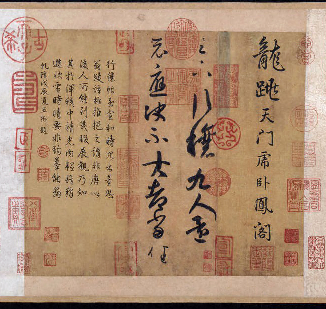
Wang Xizhi 王羲之(303–361), detail of Ritual to Pray for Good Harvest (Xingrang tie 行穰帖), 7th-century traced copy of the 4th-century original (Princeton University Art Museum)
Similar to the French saying “Le style c’est l’homme même” (“The style is the man himself”), Chinese have long believed that a man’s calligraphy is capable of revealing his moral qualities and temperaments. An important reason why the Ritual to Pray for Good Harvest has been so treasured in China by generations of collectors is the reputation of Wang Xizhi as an upright scholar and virtuous statesman with a good pedigree. In a world before Instagram and Facebook, a public figure’s image is strongly intertwined with how his calligraphy looks. This is clearly demonstrated by the abiding fascination with Wang Xizhi’s works shared by both Chinese and Japanese emperors, whose unrelenting promotions elevated the Wang Xizhi style as a model with which all later calligraphers felt the need to reckon.
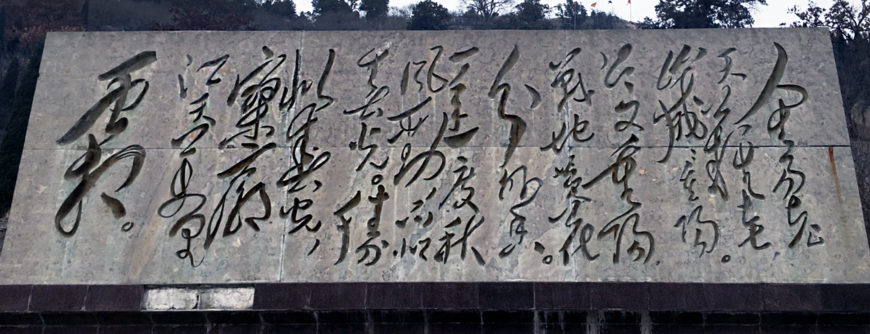
Stone slab with Mao’s calligraphy, China (photo: Xaiohan Du)
On a hiking trip near my hometown in China a few summers ago I encountered this heavy stone slab on which calligraphy has been incised. The calligrapher did not include his name; however, it would not have been necessary—any educated Chinese person would be able to recognize at first glance that this powerful calligraphy in the wild cursive script is brushed by none other than Chairman Mao, thanks to the ubiquitous reproduction of Mao’s calligraphy in textbooks and on major public monuments throughout China. Mao’s unbridled calligraphy could not be further away from the elegant and balanced style of Wang Xizhi, befitting perhaps of his larger-than-life persona and overly romantic vision for China in mid-20th century. The expressive power of this ancient art of the line continues to occupy a very special place in the visual environment in East Asia.

