Louis Sullivan, Carson, Pirie, Scott Building

Sullivan believed that “form must ever follow function” and designed this department store with that adage in mind.

Louis H. Sullivan, Schlesinger & Mayer Building (later Carson Pirie Scott and now the Sullivan Center) Chicago, 1899–1903. Speakers: Dr. Beth Harris and Dr. Steven Zucker

0:00:06.5 Dr. Steven Zucker: We are at the very busy intersection of Madison and State in the loop in Chicago, looking at one of the great examples, Chicago School of Architecture, this is Louis Sullivan’s Schlesinger and Mayer Building, later known as Carson, Pirie, Scott, but now known to most people in Chicago, likely by the store that occupies its bottom floors, Target.

0:00:28.7 Dr. Beth Harris: And I think to fully appreciate this building, we need to do a little bit of time travel back to the 1890s and early years of the 20th century to a time when department stores were new and exciting places. You could shop there, you could eat there, there were phone booths for making phone calls. The buildings along State Street that were designed as department stores were meant to entice viewers into the stores to purchase and to have an experience.

0:01:00.5 Dr. Zucker: And that experience was not so different from what Chicagoans and people from all over the country, and for many parts of the world had experienced just a few years earlier when Chicago had hosted a great world exposition known as the White City. Where goods from all over the world, manufacturing techniques, new technology had been put on display, but here in Schlesinger Mayer, luxury goods could be purchased.

0:01:25.9 Dr. Harris: And so you had this idea that the buyers at a store like Schlesinger Mayer, were scouring the world for the finest products, the best workmanship, and bringing it all here to this building designed by Louis Sullivan. And the fact that the building was designed by Sullivan was part of its draw.

0:01:46.4 Dr. Zucker: Sullivan had gained fame most recently for the Auditorium Building in Chicago, and he’s taken his talents and applied them to this commercial retail environment. And what is most notable about his design is an incredibly intricate and dynamic ornament that brings the surface to life. It’s literally as if the building is teeming with a kind of organic growth.

0:02:10.1 Dr. Harris: We see floral forms, forms that look like they are tendrils and interlacing, and just an incredible depth that speaks to a commercial culture that embodied ideas of freedom and the city, and a kind of cosmopolitanism.

0:02:27.3 Dr. Zucker: This was a modern building in a modern city. The center of the city of Chicago had been burned to the ground in the Great Chicago Fire in 1871, but the city was commercially dynamic, its economy was exploding, and so architects flocked around the country because so much rebuilding needed to be done here.

0:02:45.9 Dr. Harris: And the kind of building that was so ambitious where retailers competed to have the most accommodations for shoppers.

0:02:56.5 Dr.  Zucker: And modern architects had a problem that they needed to solve, which is that buildings of this scale had little precedent. This is a 12-story building, which was possible only because of the passenger elevator that had been developed in the 19th century, and building on this scale created a series of problems, how do you create an elegant structure of this size? This building uses the newest technology, that is, it uses a steel skeletal frame. All of that is completely hidden from our view, but can be made out in the thicker piers between the windows, and what results is a facade that is known as a curtain wall. That is, that all of the material that we’re seeing on the exterior is actually hung from the interior structure at each story. And so unlike older buildings where one brick or one stone was placed atop the next to help support the structure, this structure is supported by a steel armature from within.

0:03:50.8 Dr. Harris: And one of the great benefits of that was that the walls would be able to be opened up to have larger windows, and that was especially crucial on the ground floors where Sullivan designed some of the widest windows for displaying goods that would entice customers into the store.

0:04:09.7 Dr. Zucker: Sullivan had been working with Schlesinger and Mayer on an earlier structure, and the building was expanded. But what it leaves us with is this unified facade that is incredibly captivating. The bottom is by far the most ornate. It’s metal that has been electroplated with a thin layer of copper bronze, which allows for this incredibly intricate metal work. And then above that, the curtain allowed Sullivan to use this white terracotta, which is actually created in molds, and so is a kind of mass production that carries his ornament up to the highest stories.

0:04:46.8 Dr. Harris: And so, instead of carefully cut expensive stone work, we’re using a modern material that’s easily reproducible. The same thing for all of the decorative iron work that we see, so combining that serious artistry and level of design with modern technology.

0:05:07.3 Dr. Zucker: One of my favorite aspects of this building is the curved corner, which creates a kind of pivot point that unifies both flanks of the building. But it doesn’t just turn horizontally from one street to the next, it also brings our eye upward with these beautiful Gothic inspired, engaged colonnettes that rise up to one of the most decorative elements of this building, which is the cornice. In the late 19th and early 20th centuries, it’s common to see large buildings with substantial cornices. This is actually a reference back to the palazzo architecture of Renaissance Italy. It creates a kind of end point for our eyes to that while we can revel in the verticality of the building, almost like a hat, it ends the building. Our eye does not continue up to the sky.

0:05:53.5 Dr. Harris: And one of the things that looks so modern to me is the emphasis on the horizontal, so that between each floor, the terracotta of the ceramic tiles form continuous horizontal bands that are uninterrupted. And there’s something about the horizontality that reads to me as very streamlined and very modern and differentiates it, I think, from so many of the other department stores that were going up at this time, like Marshall Fields.

0:06:22.0 Dr. Zucker: It’s so easy to imagine an early 20th century consumer being attracted to this opulent palace of dry goods because this was a time before the term “department store” was common.

0:06:32.1 Dr. Harris: Well, we know that it was primarily women who went shopping in these stores, and that kind of shopping experience in the city was born of a new kind of freedom that was available to women at the turn of the century. Elizabeth Sparhawk-Jones in 1911 actually gives us an image of the inside of one of these department stores where you get the sense of the bustle of women who are shoe shopping.

0:06:56.7 Dr. Zucker: And the sense of dynamism in that painting is a perfect reflection of the dynamism of the ornament on the exterior. This is a city that is growing, that is on the move and everything was changing. You can get a real sense of what this building meant when it was first opened by looking at some of the many advertisements that Herald did in its opening.

0:07:16.2 Dr. Harris: Here’s one from five days before the building opened: Our new building, which will be formally opened Monday, October 12th, is a modern building of steel and stone 12 stories above ground and three below. It has no old parts reconstructed. We threw away the old as we have built the new. We have the best location, we believe, in Chicago. With our commercial advantages, this should give us the best opportunity in Chicago to develop another great store of the first class and like no other. We built new from top to bottom and all between. Not a detail in structure, equipment, furnishing, stock or method that would facilitate convenience and comfort has been overlooked.

0:08:03.5 Dr. Zucker: This is such a testament to what modern meant in the early 20th century.

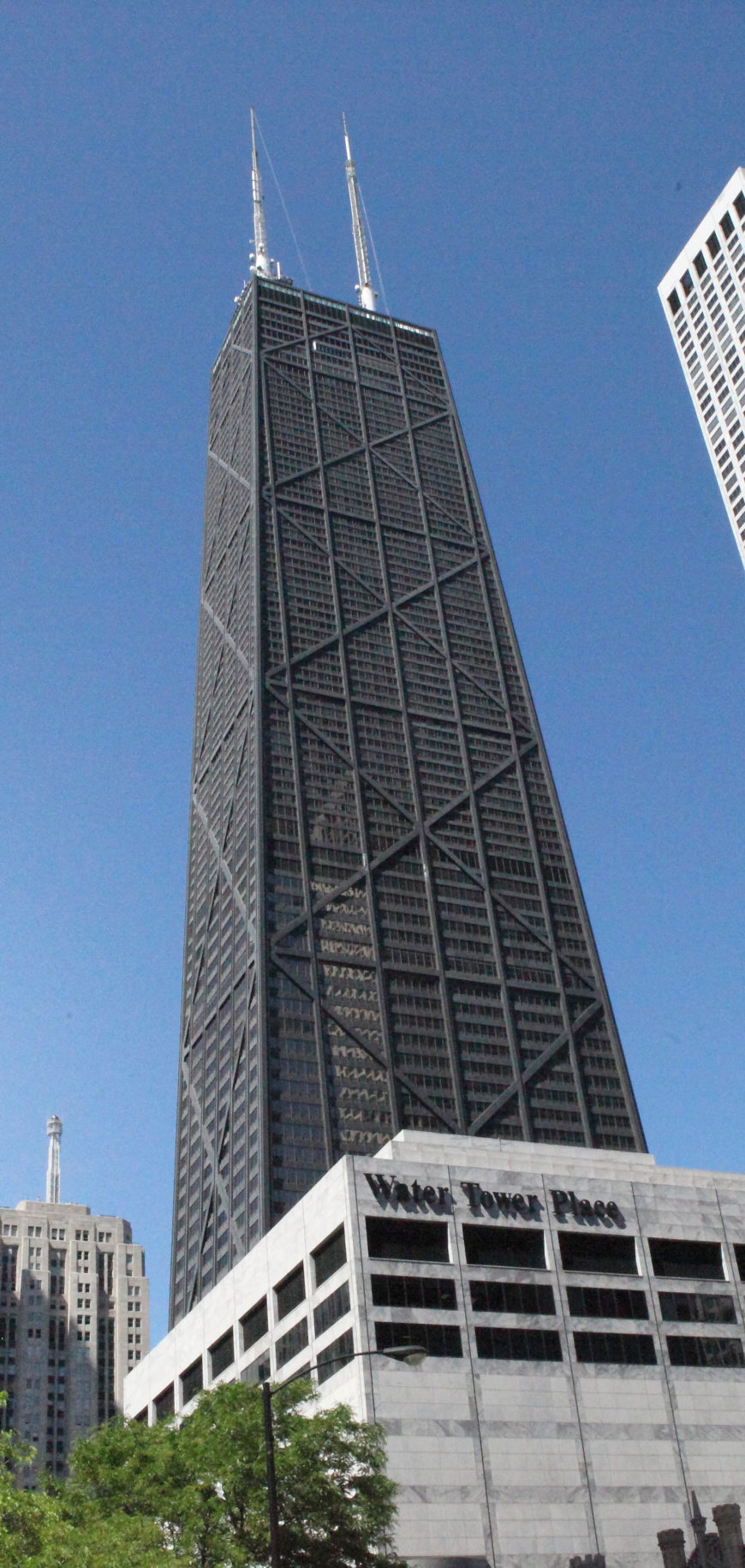
Hancock Building, Chicago (photo: Steven Miller, CC BY 2.0)

Hancock Building, Chicago (photo: Steven Miller, CC BY 2.0)

Walking amidst the endless crowd of tall buildings in Chicago’s downtown neighborhoods, the twenty-first century viewer, overwhelmed by the colossal Hancock Tower (1970) almost misses the comparatively stocky, whole-block office buildings and stores in Chicago’s Loop that first gave rise to the term “skyscraper” in the late nineteenth century. At the intersection of State and Madison Streets, however, one building with large glass windows and a rounded corner entryway covered with lavish decoration stands out. In contrast to its relatively plain neighbors, the pedestrian’s eye is immediately attracted to the structure’s bronze-colored ground floor and broad white façade stretching twelve stories above it. This is Louis Sullivan’s Carson, Pirie, Scott building, a department store constructed in two stages in 1899 and 1903–04.
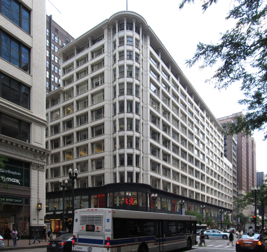
Louis Sullivan, Carson, Pirie, Scott Building, 1899 and 1903-04, Chicago (photo: Scott Fisher, CC: BY-NC 2.0)

Louis Sullivan, Carson, Pirie, Scott Building, 1899 and 1903–04, Chicago (photo: Ken Lund, CC: BY-NC 2.0)

Sullivan’s building is an important example of early Chicago skyscraper architecture, and can also be seen as a fascinating indicator of the relationship between architecture and commerce. The firm of Adler & Sullivan first became known in Chicago in the early 1880s for the design of the Auditorium Building (see below) and other landmarks utilizing new methods of steel frame construction and a uniquely American blend of Art Nouveau decoration with a simplified monumentality.
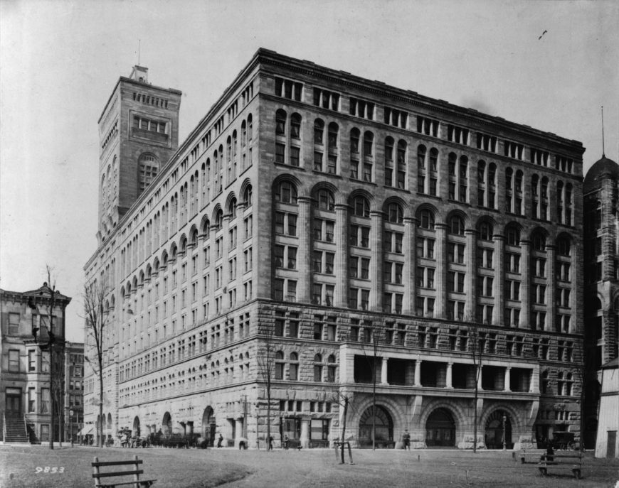
Dankmar Adler & Louis Sullivan, Auditorium Building, 1889, Chicago

Dankmar Adler & Louis Sullivan, Auditorium Building, 1889, Chicago (photo: JW Taylor, 1890, Library of Congress)

By the mid-1890s, Sullivan struck out on his own and wrote his treatise on skyscraper architecture, “The Tall Office Building Artistically Considered.” In it, Sullivan analyzed the problem of high-rise commercial architecture, arguing with his famous phrase “form must ever follow function” that a building’s design must reflect the social purpose of a particular space.
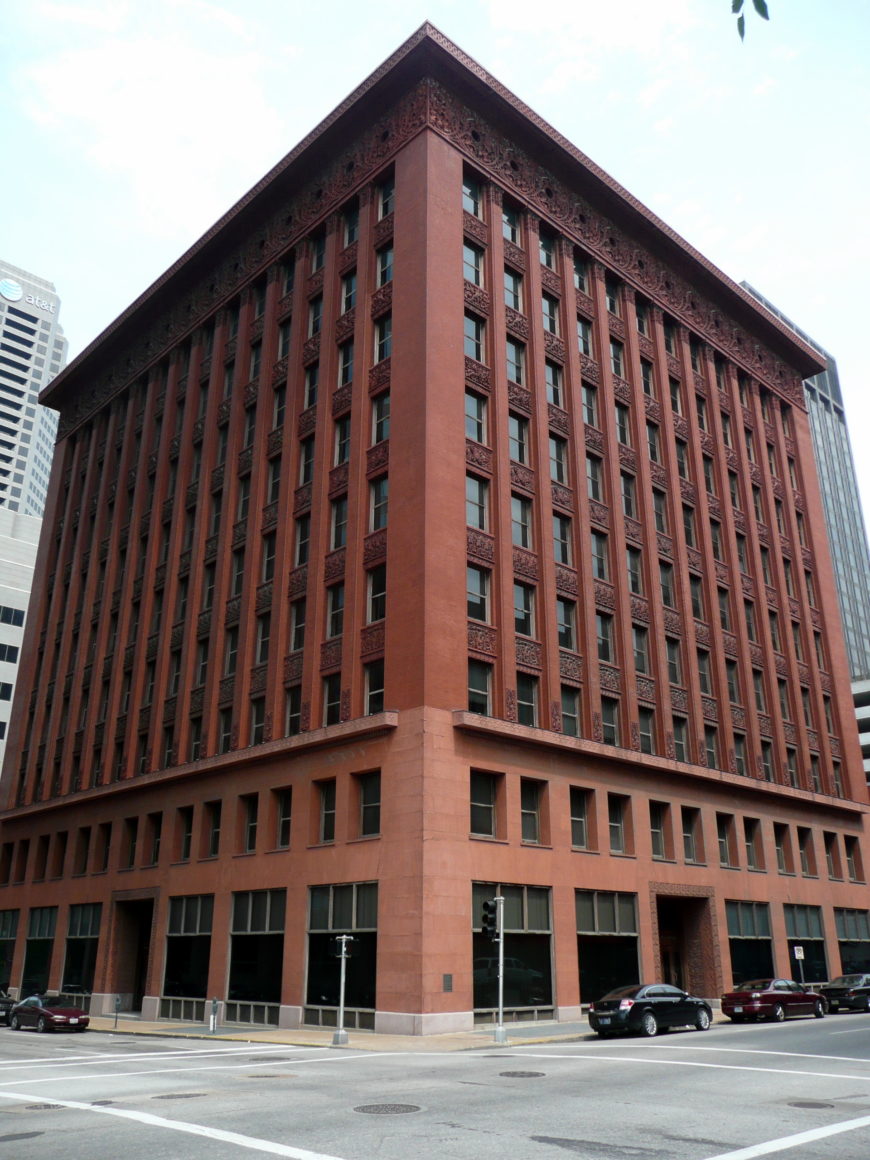
Louis Sullivan, The Wainwright Building, 1891, St. Louis (photo: Tom Bastin, CC: BY 2.0)

Louis Sullivan, The Wainwright Building, 1891, St. Louis (photo: Tom Bastin, CC: BY 2.0)

Sullivan illustrates this philosophy by describing an ideal tripartite skyscraper. First, there should be a base level with a ground floor for businesses that require easy public access, light, and open space, and a second story also publicly accessible by stairways. These floors should then be followed by an infinite number of stories for offices, designed to look all the same because they serve the same function. Finally, the building should be topped with an attic storey and distinct cornice line to mark its endpoint and set it apart from other buildings within the cityscape. For Sullivan, the characteristic feature of a skyscraper was that it was tall, and so the building’s design should serve that goal by emphasizing its upward momentum.
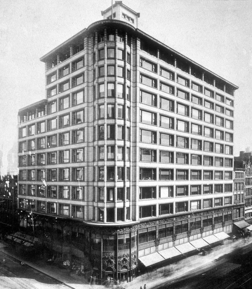
Louis Sullivan, Carson, Pirie, Scott Building, Chicago (while still Schlesinger & Mayer, with original cornice and before addition at right)

Louis Sullivan, Carson, Pirie, Scott Building, Chicago (while still Schlesinger & Mayer, with original cornice and before addition at right)

By the turn of the century, Sullivan adapted these ideas to a new context, a department store for the Schlesinger & Mayer company that was soon purchased by Carson, Pirie, Scott. In contrast to Sullivan’s earlier office buildings (like the 1891 Wainwright Building in St. Louis—image right), Carson, Pirie, Scott in downtown Chicago was intended to meet its patrons’ needs in a much different way. Instead of emphasizing the beehive of identical windows meant to reflect the identical work taking place in each individual office, in the Carson Pirie Scott building, Sullivan highlighted instead the lower street-level section and entryway to draw shoppers into the store. This was done in a number of ways. The windows on the ground floor, displaying the store’s products, are much larger than those above. The three doors of the main entrance were placed within a rounded bay on the corner of the site, so that they are visible from all directions approaching the building.
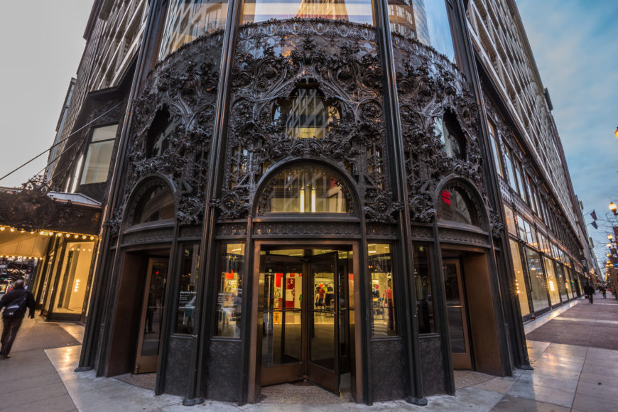
Detail of corner entrance, Louis Sullivan, Carson, Pirie, Scott Building, 1899 and 1903-04, Chicago (photo: Chris Smith, CC: BY-NC-SA 2.0)

Detail of corner entrance, Louis Sullivan, Carson, Pirie, Scott Building, 1899 and 1903–04, Chicago (photo: Chris Smith, CC: BY-NC-SA 2.0)

The corner entryway and the entire base section are differentiated from the spare upper stories by a unified system of extremely ornate decoration. The cast-iron ornament contains the same highly complicated, delicate, organic and floral motifs that had become hallmarks of Sullivan’s design aesthetic. For Sullivan, the decorative program served a functional project as well: to distinguish the building from those surrounding it, and to make the store attractive to potential customers.
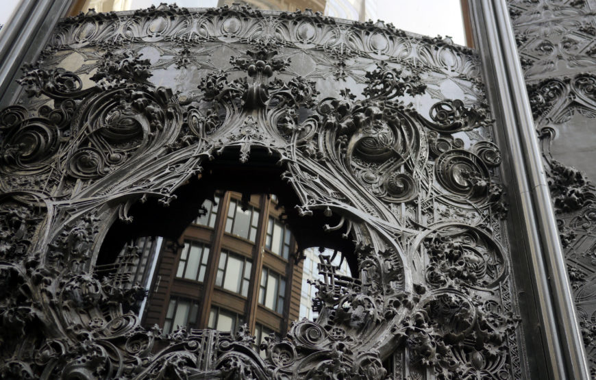
Detail of corner entrance, Louis Sullivan, Carson, Pirie, Scott Building, 1899 and 1903-04, Chicago (photo: Dauvit Alexander, CC: BY-NC-SA 2.0)

Detail of corner entrance, Louis Sullivan, Carson, Pirie, Scott Building, 1899 and 1903–04, Chicago (photo: Dauvit Alexander, CC: BY-NC-SA 2.0)
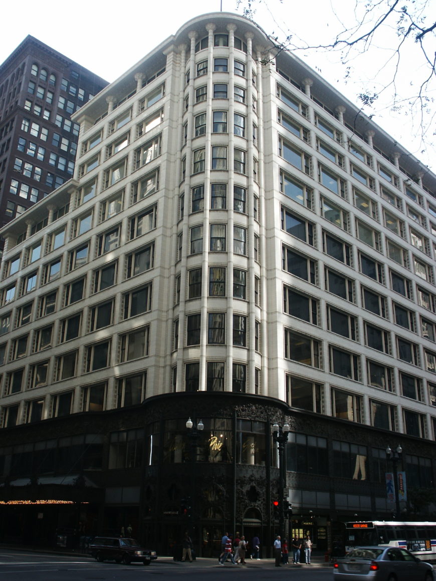
Louis Sullivan, Carson, Pirie, Scott Building, 1899 and 1903–04, Chicago (photo: artistmac, CC BY-SA 2.0)

Louis Sullivan, Carson, Pirie, Scott Building, 1899 and 1903–04, Chicago (photo: artistmac, CC BY-SA 2.0)

The upper parts of the Carson, Pirie, Scott building also reflect Sullivan’s adaptation of his skyscraper theory to a department store. Each successive story of the white terra-cotta façade contains identical windows, in this case the three-sectioned “Chicago” window common to late nineteenth-century skyscrapers in the city. There is an overhanging cornice at the very top that seems to signify the end of the building’s ascent, and makes the slightly set-back attic level distinct from the broad mid-section and the dark cast-iron decoration of the base level.

Unlike Sullivan’s office buildings, however, the building’s primary thrust is horizontal rather than vertical. Sullivan’s design emphasizes the long, uninterrupted lines running under each window from each side of the building towards the entry bay, while the decorative base at the bottom and the cornice line at the top flow seamlessly around the corner.

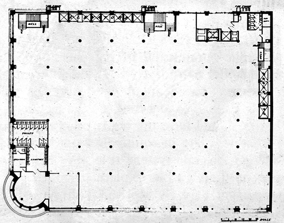
Louis Sullivan, Open floorplan of Carson, Pirie, Scott Building

Louis Sullivan, Open floorplan of Carson, Pirie, Scott Building

The wide rectangular window frames and relatively squat twelve-story frame were intended to meet the specific requirements of a department store, whose mission called for expansive open spaces to display products to customers, not endless individual offices.

Some later critics like Lewis Mumford and Sigfried Giedion viewed the lower, ornamental section of Sullivan’s Carson Pirie Scott building as an uncomfortable disruption to the otherwise stripped-down, planar style they favored. Nevertheless, the building’s continuous operation well into the twenty-first century speaks not only to the prestige of Sullivan’s name, but also to the sustained value of architecture as a corporate symbol.
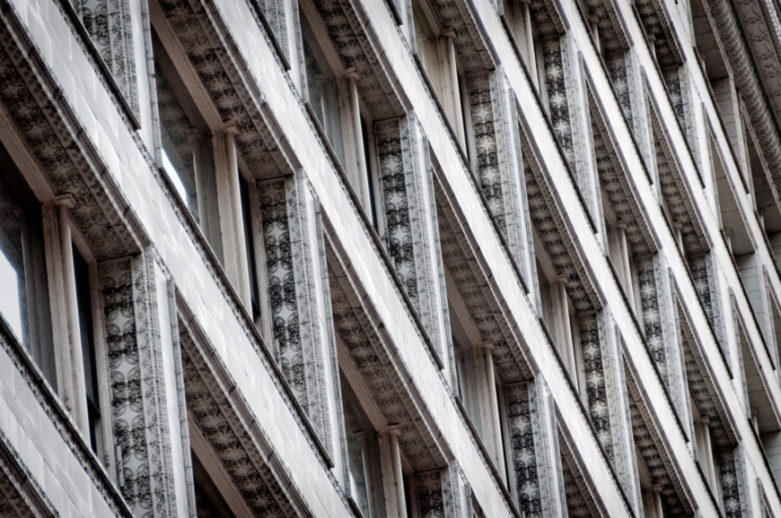
Terracotta detail, Louis Sullivan, Carson, Pirie, Scott, 1899, 1903-04,  Chicago (photo: Steve Minor, all rights reserved, by permission)

Terracotta detail, Louis Sullivan, Carson, Pirie, Scott, 1899, 1903-04,  Chicago (photo: Steve Minor, all rights reserved, by permission)

With its elaborate decorative program and attention paid to the functional requirements of retail architecture, Sullivan’s design was a remarkably successful display for the department store’s products, even if it diverged from the wholly vertical effect of his earlier skyscrapers.

Cite this page as: Dr. Margaret Herman, "Louis Sullivan, Carson, Pirie, Scott Building," in Smarthistory, August 8, 2024, accessed November 10, 2024, https://smarthistory.org/sullivan-carson-pirie-scott-building/.