
Josef Albers, Homage to the Square: Soft Spoken, 1969, oil on masonite, 121.9 x 121.9 cm (The Metropolitan Museum of Art, New York)
Looking deeply
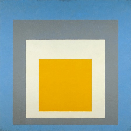
Take a moment to really look deeply at this example of Josef Albers’ extensive series, Homage to the Square. The composition of this painting is simple enough – four progressively smaller squares within each other, each in a different color, and all aligned closer to the bottom of the composition than to the top.
So stand back from this Homage to the Square and look at the whole thing. What is the relationship between the squares? Are they stacked on top of each other, like cut out pieces of construction paper? Are they sinking underneath each other, as if you are looking at a painting of a tunnel? Do some appear to push toward you and others to fall away? And how does it change between each version of the painting? Looking at the pieces, you may find that you are able to force your eyes to see a stack of blocks or a tunnel, or you may find that you are instinctively drawn to one interpretation of how the squares are arranged. This is exactly the principle that Albers experimented with as he produced hundreds of variations on this theme over a period of about 25 years. These included paintings, drawings, prints, and tapestries—but each explored the same basic question: can an artist create the appearance of three dimensions, using only color relations?
The Bauhaus
Josef Albers, Homage to the Square: “Ascending,” 1953, oil on composition board, 110.5 × 110.5 cm (Whitney Museum of American Art)
Though Albers began work on the Homage paintings in 1950, he was introduced to color theory very early in his career, when he enrolled as a student at the Bauhaus in 1920. The Bauhaus was a revolutionary school of art and design in Germany, founded by Walter Gropius in 1919. Its philosophy was to integrate the principles of fine art and functional design, and many of the most important artists in Europe were teachers there. When Albers was a student, the foundation for all Bauhaus education was the Vorkurs, or preliminary course, taught by Johannes Itten. The course covered the fundamentals of material, composition, and color theory, and was one of the most influential and widely disseminated aspects of Bauhaus curriculum.

Left to right: Josef Albers, Marcel Breuer, Gunta Stölzl, Oskar Schlemmer, Wassily Kandinsky, Walter Gropius, Herbert Bayer, László Moholy-Nagy and Hinnerk Scheper on the roof of the Bauhaus, Dessau, 1928
Many studies done by students as part of the Vorkurs can be seen in museums and exhibitions, and they often bear a resemblance to Albers’ Homage paintings: a repeated series of shapes, each in different color combinations. The goal of these exercises was for the students to understand how colors related to each other. Many years later, Albers used the Homage paintings to go into even more depth with those lessons, and bring them to audiences, as well as art students.
From Dessau to Black Mountain

Josef Albers, Study for Homage to the Square, 1950, oil on artist board 26.67 x 26.67 cm
In 1925, the year that the Bauhaus moved from Weimar to their iconic building in Dessau, Gropius invited Albers to be the first student of the Bauhaus to join the faculty. Albers worked with Paul Klee in the stained glass workshop and was the longest-serving member of the faculty when the school was shut down by the Nazis in 1933. But the Bauhaus was to be only the first of Albers’ celebrated and influential teaching positions. When that school was shut down, Albers and his wife, Anni—herself an influential artist and Bauhaus alumna—emigrated to the United States, where he was invited to teach at the revolutionary Black Mountain College in North Carolina, and later Yale University, where he began the first Homage paintings in 1950. An encouraging but strict teacher, Albers brought Bauhaus ideas to a new country, introducing his disciplined approach to color theory to the next generation of the artistic vanguard in America.

Mark Rothko, Orange and Red on Red, 1957, oil on canvas, 174.92 x 168.59 cm (The Phillips Collection)
For all their variety of color, the Homage paintings are relatively cold and clinical. It is interesting to compare them to paintings by Mark Rothko, who produces canvasses that have strong similarities to the Homage series. Albers and Rothko both use roughly square or rectangular forms in solid colors, and both take the relationship between colors as their subject matter. But while Rothko’s paintings use variation of color to suggest or inspire certain emotional reactions, Albers’ paintings are exploring the creation of space through the use of color. He experiments with subverting the limits of two-dimensional space.
Tradition and variation

Leonardo da Vinci, The Virgin of the Rocks, c. 1491-1508, oil on panel, 189.5 x 120 cm, (National Gallery, London)
The idea of creating space through color goes back to a technique known as atmospheric perspective. The best examples can be seen in landscapes of the Dutch Golden Age and Italian Renaissance artists such as Leonardo da Vinci. The principle of atmospheric perspective is that objects that are far away are less saturated in color, and have less contrast. Looking at the mountains behind Leonardo’s Virgin of the Rocks, each set of mountains that is farther away is closer in color to the sky than the set of mountains in front of it.
This technique had been used to create space in representative paintings going back to antiquity, but Albers was revolutionary in applying it to abstract art. His experiments in the Homage series paved the way for artists such as Bridget Riley and a whole generation of Op artists, who also pushed the limits of two-dimensional media by creating large-scale optical illusions. Though Homage to the Square may seem boring and repetitive to some, their simple beauty is often compared to classical music, like the work of Bach: a study on theme and variation.

Josef Albers, Homage to the Square I-Sa, 1968, silkscreen, 54.6 × 54.6 cm (Dallas Museum of Art)
“If one says “Red” (the name of a color) and there are 50 people listening, it can be expected that there will be 50 reds in their minds. And one can be sure that all these reds will be very different.” —Josef Albers, Interaction of Color (1963)


