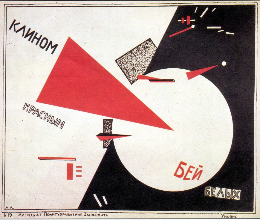
Beat the Whites with the Red Wedge is a propaganda poster designed by El Lissitzky using the abstract visual language of Suprematism, an art movement founded by Kasimir Malevich in 1915. Made in support of the efforts of the Bolshevik Red Army to overcome the anti-communist White Russians, the poster creates a powerful dynamic composition using basic geometric shapes in red, white, and black.
The few words are aligned with the diagonal trajectory of the red triangle so the act of reading follows the overall movement of the design. The red triangle pierces the white circle like a pin in a balloon, implicitly freeing it from the surrounding darkness. A smaller triangle and circle repeat the same theme in the upper right, and throughout the design small red rectangles dominate small dispersing white rectangles, symbolizing the Red Army’s triumph over the White Russians.
Towards a practical Suprematism
In this poster we see not only a masterpiece of modern graphic design, but also a new application of the Suprematist visual language, which signified spiritual transcendence, into a practical language intended to convey specific ideas and information about the material world. This seems like a betrayal of the aims of Suprematism, but Malevich supported this practical application of Suprematism’s forms.
In the chaotic years following the Russian Revolution of 1917 Malevich backed the creation of the new Soviet culture and believed that deploying Suprematist works throughout society would help to usher in a new spiritual era of immateriality.
This sounds naive in hindsight, given the dedicated materialism of communist ideology and Soviet society, but in the years following the revolution avant-garde artists were given substantial opportunities to help shape the new culture. Many artists, including Lissitzky, followed Malevich in seeing the Russian Revolution as a preliminary stage on the path to a new spiritual form of existence.
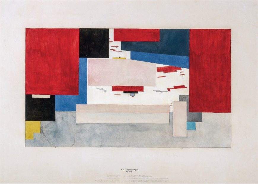
El Lissitzky and Kasimir Malevich, Study for curtains for the meeting room of the Committee to Abolish Unemployment, 1919, gouache, watercolor, graphite and ink on paper, 49 x 62.5 cm (State Tretyakov Gallery)
UNOVIS
After the Russian Revolution the art education system was re-organized, and many modern artists took teaching positions in the new art schools and workshops. In 1919 Malevich was invited to teach at the art school in Vitebsk, where he promoted his Suprematist ideals and acquired many followers among the teachers and students. They formed a group, UNOVIS (Affirmers of the New Art), dedicated to disseminating Suprematism as the visual language of world revolution.
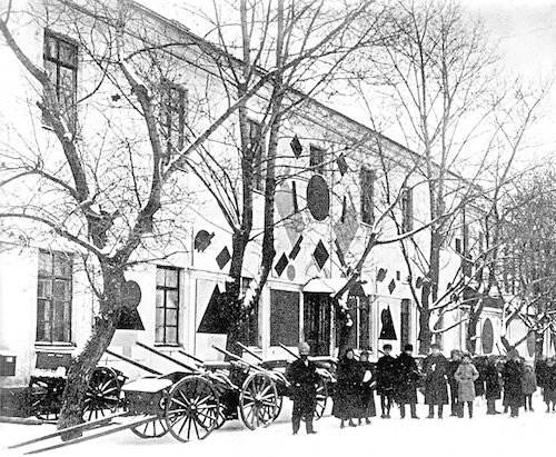
Workshop of the Committee to Abolish Unemployment in Vitebsk with Suprematist panels by UNOVIS, 1919
In keeping with communist ideals they saw themselves as a collective and signed works as UNOVIS. Most of their works have not survived as they were temporary installations or ephemeral works like posters, brochures, and signs. They used Suprematist forms to decorate public buildings and meeting rooms, such as the facade decoration and curtain design for the Committee to Abolish Unemployment in Vitebsk, which was celebrating its anniversary with a festival in 1920. This is a new stage of Suprematism, one that sees it moving out of the cloistered confines of avant-garde art exhibitions and into the real world, to test its viability in front of a general public.
Prouns
In addition to the movement from the art gallery into the real world, another key transformation of later Suprematism was the extension of its flat planes into designs suggesting volumetric forms. Lissitsky makes this move explicitly in compositions he called “prouns,” an acronym for Project for the Affirmation of the New in Russian, which he described as “the transfer point from painting to architecture.”[1]
Lissitzky’s Proun 19D and Malevich’s Painterly Masses in Motion both display abstract rectilinear forms floating in an indeterminate space. Malevich suggests some depth by relative size and by overlapping his brightly colored rectangles, but the overall design of the painting remains very flat. Lissitzky’s Proun 19D uses more muted colors and multiple textures, including collaged papers of varied sorts, foil, oil paint, and crayon. These textures already make the proun a more substantial material object than Malevich’s oil painting.
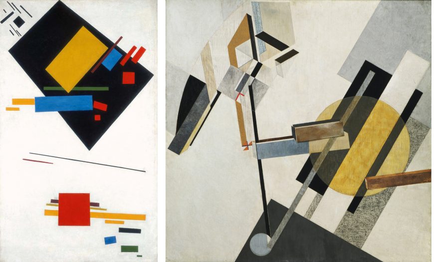
Left: Kasimir Malevich, Painterly Masses in Motion, 1915, oil on canvas, 101.5 x 62 cm (Stedelijk Museum, Amsterdam); right: El Lissitzky, Proun 19D, 1920 or 1921, mixed media on plywood, 97.5 x 97.2 cm (MoMA)
In addition, Lissitzky depicted some of his floating forms in axonometric perspective to indicate that they were three dimensional. The thin brown rectangle that juts in from the right edge of the painting has a bright side receding on the top and an even brighter end receding on the left. In the center of the work two more rectangles, one brown and one blue and beige, are also depicted in axonometric perspective, floating at the same angle. These three forms hover over and through the various flat painted planes surrounding them in the composition to create an ambiguous, but still fairly consistent sense of objects in space.
The upper left side of Proun 19D is, however, far more complex and cannot be read as a depiction of objects in the same space as the forms on the right, or even at all in many instances. For example, several of the black rectangles suggest the sides of three-dimensional geometric forms, but they are not consistently drawn, so they metamorphose into flat shapes or altogether different objects as you examine them. Which planes are receding? Which are flat? It is impossible to tell. This lack of rationally-defined space is another instance of the Suprematists’ preference for ambiguous, otherworldly spatial constructions over practical, real-world applications.
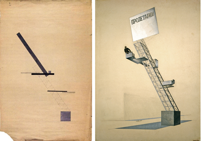
Left: Ilia Chashnik and El Lissitzky, Project for a Tribune in Smolensk, 1920, gouache, pencil and ink on paper. (State Tretyakov Gallery). Right: El Lissitzky, Lenin Tribune, 1924, gouache, ink and photomontage on cardboard. (State Tretyakov Gallery).
Making Suprematism Practical?
Despite their apparently greater materiality, Lissitzky’s prouns remain abstract and spiritual, and even when Suprematism was enlisted to make utilitarian and propagandistic objects for real-world use, it was similarly impractical. One of Lissitzky’s most famous designs, Lenin Tribune, was for a speaker’s rostrum, which was based on earlier UNOVIS designs attributed to Ilia Chashnik.
Chashnik’s earlier design employs characteristic Suprematist geometric forms, but rather than floating in an indeterminate space, the forms rise up diagonally from a square anchored to a ground line. Lissitzky’s reworking of the design employs the three-dimensional forms of his prouns: the square is now a cube, and the linear pattern of the diagonal rectangle has become a structural girder supporting the speaker’s platform.
The photo collage of Lenin speaking from the rostrum further emphasizes the material reality and function of the structure, but even so the Lenin Tribune is curiously abstract and impractical. The jutting platforms, although drawn as solid forms, serve no obvious purpose, and how did Lenin get up to the top platform? What exactly is that gray plane on the ground? A shadow? And if so, of what? The Lenin Tribune is less a utilitarian design for a speaker’s podium, and more a conceptual project intended to associate modern engineering, abstract design, and the leadership of Soviet Russia. In the end, Suprematism had great difficulty reconciling its utopian, spiritual aims with the practical applications demanded by the Soviet state.
Notes:
- El Lissitzky and Hans Arp, Die Kunstismen (1925) translated and quoted in Victor Margolin, The Struggle for Utopia, p. 33.
Additional resources:
Learn about the Russian Revolution
The Great Utopia: The Russian and Soviet Avant-Garde, 1915-1932 (New York: Guggenheim Museum, 1992).
Inventing Abstraction 1910-1925: How a Radical Idea Changed Modern Art (New York: Museum of Modern Art, 2012).
Victor Margolin, The Struggle for Utopia: Rodchenko, Lissitzky, Moholy-Nagy, 1917-1946 (Chicago: University of Chicago Press, 1997).

